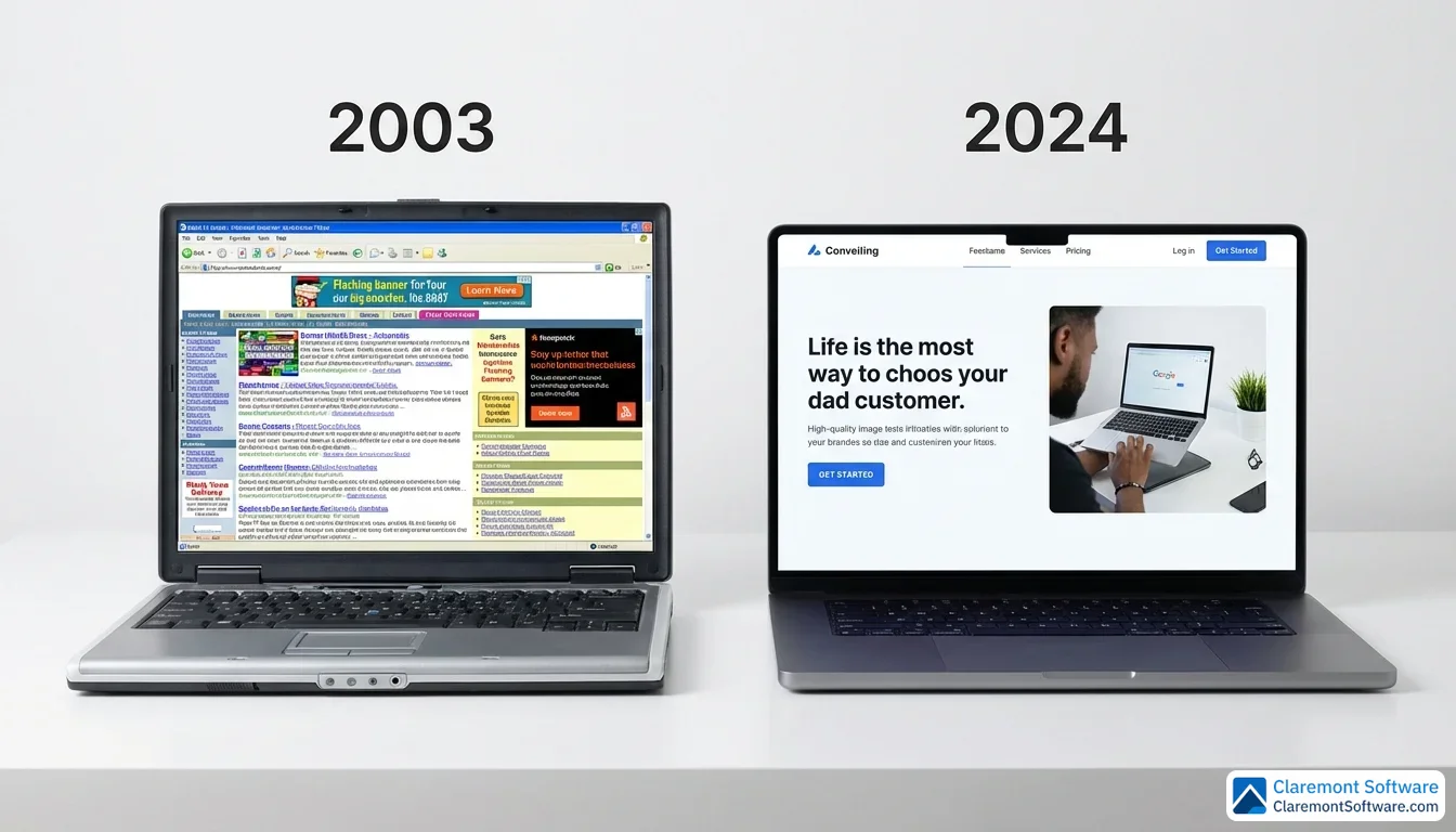
Solo law firm website design is the single biggest lever most solo attorneys underestimate. Your site is not a brochure — it is a 24/7 client acquisition machine that either earns trust in seconds or loses the case before you ever hear the phone ring. The design patterns behind the best-performing solo attorney websites are not secrets reserved for big-budget firms. They are repeatable, learnable, and available to any practitioner willing to be intentional about how their site looks, functions, and converts.
This guide breaks down the 10 design patterns that consistently separate solo law firm websites that win clients from ones that simply exist online. Each pattern is illustrated with a real-world example from our best solo lawyer websites showcase — so you can see exactly how top-performing firms put these principles into practice.
What Separates a Good Solo Law Firm Website from a Great One
Before diving into specific design patterns, it helps to understand the gap you're trying to close. There's a meaningful difference between a solo attorney website that checks the boxes and one that consistently converts visitors into consultations.
The fundamentals are the floor, not the ceiling. Fast load times, mobile responsiveness, logical navigation, professional appearance — these are prerequisites, not advantages. Any modern template delivers them out of the box. If your site fails here, you're losing clients before they read a word. But if your site only does this, you're invisible among thousands of attorneys who've achieved the same baseline.
Great solo law firm websites work like employees, not brochures. They actively qualify leads through eligibility checkers and intake questionnaires. They answer the pricing question before it becomes an objection — with flat fees, subscription models, or transparent "starting at" ranges. They book consultations automatically at 11 p.m. on a Tuesday through integrated scheduling. Each of these features removes a specific friction point between "I might need a lawyer" and "I have an appointment."
Personal branding is your structural advantage. Large firms default to corporate sameness — stock photography, committee-approved language, interchangeable attorney bios. As a solo practitioner, you can do what they structurally cannot: be a real person. Your story, your voice, your community roots, your specific perspective on the law — these aren't soft extras. They're the reason a prospect chooses you over the firm with ten times your marketing budget. We saw this play out across the 10 best solo lawyer websites we profiled — every standout site led with the attorney's personality, not a generic value proposition.
The numbers confirm it. Clio's Legal Trends Report found that firms with optimized websites achieve up to 4x faster client acquisition growth. For a solo practitioner, even a modest improvement in conversion rate — say, two additional clients per month — can transform the economics of your practice. The 10 patterns below are the specific design choices that drive those improvements.
10 Design Patterns Every Solo Attorney Website Needs
The patterns below are not theoretical. Each one is drawn from real solo law firm websites that are actively winning clients right now. We have paired each design principle with a real-world example from our showcase of 10 top-performing solo firm sites so you can see the pattern in action.
1. The Hero Section That Converts on First Glance
Few things on a solo law firm website work harder — or fail faster — than the hero section. It is the first thing a visitor sees, and on mobile, it may be the only thing they see before deciding whether to scroll or leave. For solo attorneys, that window is measured in seconds.
The strongest solo firm hero sections share a tight, three-part formula: a headline that speaks directly to the client's problem, a one- or two-sentence value proposition that answers "why this attorney," and a single prominent call to action — typically a "Schedule a Free Consultation" button that is impossible to miss. No jargon. No firm history. No burying the lead.
What elevates the best examples above the rest is professional photography of the attorney themselves. Not a stock image of a gavel. Not an empty conference room. A real person, looking directly at the camera, projecting confidence and approachability. For a solo practitioner, that photograph does something no headline can fully replicate — it creates an immediate human connection and signals that a real, accessible attorney is on the other side of that contact form.
Your hero section is not a welcome mat — it is a closing argument. Make it count before the scroll.
What This Pattern Gets Right
The best hero sections pair a short, benefit-driven headline ("Injured? Get the compensation you deserve.") with a single, high-contrast CTA button — typically in a contrasting color that pulls the eye immediately. The attorney's professional headshot fills at least 40% of the viewport, creating an instant sense of personal connection that stock imagery never achieves. On mobile, the hero stacks cleanly: headline, photo, then button — all visible without scrolling.
Where This Pattern Can Improve
Many solo firms still clutter the hero with secondary navigation links, practice area dropdowns, or rotating carousels that dilute the primary CTA. A single static hero consistently outperforms sliders in conversion testing. Adding a brief trust signal directly below the CTA — a Google rating badge or a one-line client quote — can further reduce bounce without adding visual noise.
Real-world example: See The Brilliant Brawler's homepage for a real-world example of bold personal branding in the hero section — an intro video and confident visual identity that immediately sets the tone. See the full profile in our best solo lawyer websites showcase.
2. Local Branding That Owns Your Market
If the hero section is your opening statement, think of local branding as your entire case strategy — the through-line that makes every page of your website feel coherent, credible, and impossible to replicate.
The solo firm websites that do this best do not just mention their city in the footer. They weave regional identity into the fabric of every design decision: photography that captures recognizable local landmarks, copy that references neighborhood-specific legal nuances, and community involvement sections that name-drop local organizations, causes, and events. A visitor from the area does not just feel informed — they feel recognized.
This matters strategically, not just aesthetically. When local branding is paired with disciplined local SEO — an optimized Google Business Profile, location-specific keywords embedded naturally throughout practice area pages, and consistent NAP (name, address, phone) citations across directories — it creates a competitive moat that larger firms genuinely struggle to cross. A national firm can outspend you on paid ads. It cannot out-authentic you in your own backyard.
That is the solo practitioner's structural advantage: you actually live here. You know the local courts, the judges, the community concerns. Your website should make that unmistakably clear.
Do not dilute your identity chasing a national look. Own your zip code — and let your website prove it on every page.
What This Pattern Gets Right
Sites that own their local brand embed geographic specificity into page titles, heading tags, and body copy — not just the footer address block. They reference local courthouse names, county-specific filing procedures, and neighborhood landmarks in their content. The photography feels rooted in place: real office exteriors, recognizable streetscapes, community event photos — not generic cityscapes pulled from a stock library.
Where This Pattern Can Improve
Some locally branded sites overdo the geographic repetition, stuffing city and county names into every paragraph in a way that reads as keyword spam rather than authentic local expertise. The strongest local sites mention geography where it adds genuine context — "Lake County Circuit Court requires..." — rather than mechanically inserting location names. Adding an embedded Google Map and structured LocalBusiness schema would strengthen the local signal without cluttering the copy.
Real-world example: North Shore Estate Planning in Highland Park, IL weaves bilingual community roots and local identity into every page — a masterclass in local branding for solo firms. See the full profile in our showcase.
3. Practice Area Pages That Actually Convert
Most solo attorneys treat practice area pages like brochure panels — a paragraph of general description, a bulleted list of services, and a phone number. The solo firms that consistently outperform their size treat those same pages like dedicated landing pages, each one engineered to attract a specific visitor, answer their most pressing questions, and move them toward a consultation.
The difference is depth. A high-performing practice area page does not just describe what the attorney does — it anticipates what a potential client is already Googling at 11pm. It answers questions like "how long does a contested divorce take in [city]?" or "what happens if I miss the workers' comp filing deadline?" That specificity is exactly where long-tail keyword targeting pays off: larger firms chase broad, competitive terms, leaving the specific, intent-driven queries wide open for solo practitioners willing to go deeper.
The best-structured pages follow a clear pattern: an opening that speaks to the client's situation, substantive content that educates without overwhelming, an FAQ section that addresses real objections, and a firm call to action at the bottom — not buried, not optional.
Every practice area page is a potential client's first and only stop before they call someone. Build each one like it has to close the case on its own.
What This Pattern Gets Right
High-converting practice area pages treat each service as its own mini-site: a dedicated H1, a clear problem-solution narrative in the opening paragraph, FAQ accordions with schema markup that earn featured snippets, and a contextual CTA ("Schedule your free divorce consultation") rather than a generic "Contact us." Internal links connect related practice areas naturally, building topical clusters that search engines reward.
Where This Pattern Can Improve
Even strong practice area pages often neglect process transparency — prospective clients want to know what happens after they call. Adding a simple timeline graphic ("Step 1: Free consultation → Step 2: Case evaluation → Step 3: Representation") reduces uncertainty and gives visitors a concrete reason to take the first step. Including estimated timeframes and jurisdiction-specific procedural details further differentiates these pages from generic competitors.
Real-world example: Law Office of Poorvi B. Parkhie in Denver structures her business law practice area pages around the fractional counsel model — deep, specific content that speaks directly to the exact client she serves. See how it works in our showcase.
4. The Content Engine That Drives Organic Traffic
A blog is a solo attorney's great equalizer — and the firms that understand this are quietly building traffic machines that no marketing budget can easily replicate.
The solo practitioners who get this right treat their website's content library not as an afterthought, but as a primary client acquisition channel. For a deeper look at how law firm content marketing drives a predictable flow of qualified leads, see our complete guide. Instead of writing about what they want to say, they write about what potential clients are already searching for: "what to do after a car accident in [city]," "how to contest a will in [state]," "do I need a lawyer for a minor traffic violation?" These are not glamorous topics — but they are the exact phrases real people type into Google at the moment they need help most.
The compounding effect is significant. Each well-optimized article, FAQ guide, or legal explainer becomes a permanent asset that attracts traffic month after month without additional spend. Over time, a solo attorney who publishes consistently — even just two or three substantive pieces per month — builds topical authority that search engines reward with higher rankings across the board.
This is where smaller firms have a genuine structural edge: authenticity and specificity. A solo practitioner can write from direct courtroom experience, address hyper-local legal nuances, and speak in a human voice that large-firm content factories rarely match.
Consistent, helpful content is the one SEO strategy where effort beats budget — every time.
What This Pattern Gets Right
The most effective content engines publish around the questions real clients ask — not the topics attorneys find intellectually interesting. Posts target specific, searchable queries ("Can I expunge a DUI in Illinois?") and answer them directly in the first paragraph before going deeper. Each article links to a relevant practice area page, creating a content-to-service pipeline that moves readers toward conversion. Publishing cadence is steady — two to four posts per month — which builds topical authority faster than sporadic bursts.
Where This Pattern Can Improve
Many solo firm blogs lack internal linking structure. Individual posts perform well in isolation but do not connect to pillar pages or related articles, leaving SEO value stranded. Adding a "Related Reading" section at the bottom of each post and linking to the corresponding practice area page from the introduction would tighten the content network. Updating older posts with current-year dates and refreshed statistics is another low-effort, high-return improvement most solo firms overlook.
Real-world example: The Brilliant Brawler in Oklahoma City uses his criminal defense blog as a content engine — publishing consistently around the exact questions defendants are searching for. See how content drives his traffic in our showcase.
5. The Testimonial Strategy That Builds Instant Credibility
Name recognition is a big-firm advantage that solo practitioners simply do not have — and no amount of polished copywriting fully closes that gap. What does close it is proof from people who have already been where your next client is standing.
The solo firms that do this well do not quarantine their social proof to a single "Testimonials" page that visitors may never find. Instead, they distribute it strategically throughout the site — a compelling client quote anchoring the hero section, a brief case result tucked into a practice area page, a star-rating widget visible in the footer. Social proof appears wherever doubt might surface, which is everywhere.
Video testimonials take this a step further. A 60-second clip of a real client describing how the attorney helped them through a difficult situation carries an authenticity that even the most carefully worded text review cannot replicate. Faces, voices, and genuine emotion do the persuasive work that paragraphs cannot.
Third-party credibility signals reinforce the picture: integrated Google review feeds, bar association badges, and legal directory recognitions all tell visitors that the attorney's reputation extends beyond their own website.
When a solo firm lacks the brand weight of a 50-attorney practice, client voices become the most powerful sales tool on the site. Let them speak — and let them speak often.
What This Pattern Gets Right
Effective testimonial strategies distribute social proof across the entire site rather than isolating it on a single page. A client quote appears in the hero section, star ratings sit in the sidebar, and case results are embedded within practice area pages — placing proof at every decision point. Video testimonials, even short 30-to-60-second clips, carry significantly more persuasive weight than text alone because they communicate emotion and authenticity in ways written reviews cannot.
Where This Pattern Can Improve
Most solo firm testimonial sections lack specificity. "Great attorney, highly recommend" is common but unconvincing. Coaching clients to mention the specific problem they faced and the outcome — "I was facing a felony charge and [attorney] got it reduced to a misdemeanor" — produces testimonials that speak directly to prospective clients in similar situations. Adding structured Review schema markup to testimonial sections can also generate rich snippets in search results, improving click-through rates.
Real-world example: Cary Estate Planning in Cary, NC has amassed over 800 Google reviews — proof that a solo firm can build overwhelming social proof with a deliberate strategy. See how they do it in our showcase.
6. Transparent Pricing That Builds Trust
Most attorneys treat pricing as a closely guarded secret — something to reveal only after a prospect has already invested time in a phone call or consultation. A growing number of savvy solo practitioners are flipping that logic entirely, and their websites are converting better because of it.
Publishing clear fee structures — whether flat rates for document drafting, hourly ranges for litigation support, or "starting at" figures for common services — does something counterintuitive: it builds trust before a single word is exchanged. Visitors who find transparent pricing feel respected rather than maneuvered. They arrive at the consultation already pre-qualified, already comfortable, and far less likely to ghost after learning the cost.
The friction-reduction effect is equally important. Price anxiety is one of the primary reasons potential clients abandon a law firm website without making contact. When that anxiety is addressed directly and honestly, the barrier to reaching out drops significantly.
Even in practice areas where exact pricing is genuinely impossible — complex litigation, contested divorces, multi-party disputes — solo attorneys can still signal transparency by explaining how fees are structured, what factors influence cost, and what a client can expect from the billing process.
Clients searching for solo attorneys are frequently cost-conscious and comparison-shopping. The firm that answers the pricing question openly — while competitors stay silent — earns the inquiry almost by default. Transparency is not a vulnerability; it is a differentiator.
What This Pattern Gets Right
Sites with pricing transparency use clean, scannable formats — tables or tiered cards that show flat fees, hourly ranges, or "starting at" figures for common services. The strongest examples contextualize pricing with brief explanations of what each fee includes, reducing the sticker shock that drives visitors away. They also address payment flexibility (payment plans, credit cards accepted) directly on the pricing page, removing a second layer of cost anxiety.
Where This Pattern Can Improve
Few pricing pages include a "What affects the cost?" section that explains variables like case complexity, court jurisdiction, or discovery scope. Adding this educational context helps prospects self-qualify and sets realistic expectations before the first call. A short FAQ below the pricing table — "Do you offer free consultations?" "What's included in the flat fee?" — captures additional long-tail search traffic while answering real objections.
Real-world example: The Anwari Law Firm in Falls Church, VA publishes flat-fee pricing for immigration services — a bold transparency move that pre-qualifies leads and builds trust before the first call. See the full pricing strategy in our showcase.
7. Interactive Tools That Turn Visitors into Clients
Most law firm websites are passive. They sit there, presenting information, waiting for a visitor to decide whether to make contact. The solo practitioners who are pulling ahead in 2026 have figured out something important: give visitors something to do, and they will stay longer, trust you faster, and hand over their contact information willingly.
Interactive tools — settlement estimators, disability benefit calculators, immigration eligibility checkers, fee range quizzes — transform a static website into an experience. A visitor who spends four minutes working through a guided assessment is not just browsing anymore; they are invested. They have received something genuinely useful, and they associate that value directly with the attorney whose name is on the site.
The conversion mechanics are elegant. Most interactive tools are structured so that results are delivered after the visitor enters a name and email address — a natural, low-pressure exchange that generates qualified leads without a single cold outreach. The visitor does not feel sold to; they feel helped.
Time-on-site increases, bounce rates drop, and trust accumulates before the first phone call ever happens.
Solo attorneys do not need a large team to offer a sophisticated client experience. One well-built interactive tool can do the relationship-building work of a dozen static pages — and it runs around the clock without billing an hour.
What This Pattern Gets Right
Interactive tools transform passive browsing into active engagement. The best implementations use progressive disclosure — starting with a simple question ("Were you injured at work?") and walking the visitor through a guided assessment that feels helpful rather than intrusive. By the time the tool asks for contact information to deliver results, the visitor has already invested several minutes and received genuine value, making the email capture feel like a fair exchange rather than a sales tactic.
Where This Pattern Can Improve
Some interactive tools gate results too aggressively, requiring full contact details before showing any output. This damages trust. A better approach: show partial results immediately — "Based on your answers, you may be eligible for benefits" — then offer a detailed breakdown via email. The tool should also be fully accessible on mobile with large tap targets and no horizontal scrolling, since many prospective clients encounter it on their phones during moments of stress or urgency.
Real-world example: Zafiro Law in Seattle uses multilingual intake flows and family-focused interactive elements that turn passive visitors into engaged leads across language barriers. See how it works in our showcase.
8. Mobile-First Design That Wins on Every Screen
Pull up any law firm website on your phone while you are waiting in line somewhere. If you are squinting, pinching to zoom, or waiting more than three seconds for the page to load, you already know what that attorney's conversion rate looks like.
The majority of legal searches now happen on mobile devices — and that number climbs every year. A solo practitioner whose website frustrates mobile visitors is not just losing a bad user experience point; they are losing clients to the competitor whose site loaded cleanly and had a tap-to-call button right at the top of the screen.
The solo firms winning on mobile are not just making their desktop sites "responsive." They are designing for the phone first — thumb-friendly navigation, large tap targets, compressed images that load fast on cellular connections, and consultation booking flows that work in three taps or fewer. The desktop version is an afterthought in the best possible sense: it inherits a design that was already optimized for the hardest use case.
There is a compounding benefit here that goes beyond user experience. Google's mobile-first indexing means your site's mobile performance directly influences where you rank in search results. A slow, clunky mobile experience does not just cost you the visitor — it costs you the visibility that would have brought them there in the first place.
Design for the phone first, then scale up to desktop — not the other way around.
What This Pattern Gets Right
Truly mobile-first solo firm sites feature sticky tap-to-call buttons that remain visible as the visitor scrolls, hamburger menus that expand into full-screen overlays with large touch targets, and forms with auto-advancing fields that minimize typing on small screens. Images are served in modern formats (WebP or AVIF) at appropriate sizes, keeping page weight under 1.5 MB even on image-heavy pages. The overall layout prioritizes vertical flow — no side-by-side columns that force awkward reading patterns on narrow screens.
Where This Pattern Can Improve
Even well-designed mobile sites often neglect thumb-zone optimization — placing critical CTAs or navigation elements at the top of the screen where they are hardest to reach one-handed. Moving the primary CTA to a bottom-anchored sticky bar dramatically improves tap rates. Additionally, many mobile-first sites still load desktop-weight font files and unused CSS; trimming render-blocking resources can cut Time to Interactive by a full second or more.
Real-world example: Amin Law in San Francisco features an accessibility menu and mobile-first design that ensures every visitor — regardless of device or ability — gets a seamless experience. See the mobile design in our showcase.
9. Niche Authority That Dominates a Specialty
There is a counterintuitive truth hiding inside every solo attorney's instinct to list every practice area they have ever touched: the narrower your focus, the faster you grow.
A solo immigration attorney who builds her entire website around one specific visa category — every page, every blog post, every FAQ, every image — will outrank a general practice firm with ten times the marketing budget. Not because she spent more, but because Google (and prospective clients) recognize genuine topical authority when they see it.
Niche-focused websites create a compounding advantage. When every page on a site reinforces the same subject matter — the same audience, the same legal questions, the same terminology — search engines treat that site as a subject matter expert. Rankings come faster. Conversions run higher. Visitors arrive already pre-qualified, because the site was built for exactly them.
The design follows the same logic. The imagery, the language, the testimonials, the FAQs — everything speaks to one specific person with one specific problem. There is no dilution, no hedging, no "we also handle..." footnotes that quietly signal a lack of specialization.
For solo practitioners, this is a genuine structural advantage over larger firms that feel compelled to advertise breadth.
Solo firms that go narrow go deep — and depth wins in both search rankings and client trust.
What This Pattern Gets Right
Niche-focused sites achieve topical authority faster because every piece of content reinforces the same subject. A solo immigration attorney writing exclusively about employment-based visas does not compete with general practice firms — she operates in a different category entirely. The site's internal linking forms a tight semantic cluster that search engines interpret as deep expertise. Testimonials, case studies, and blog posts all speak to the same audience, creating a cohesive experience that general-practice sites cannot replicate.
Where This Pattern Can Improve
The risk of extreme niche focus is that the site can feel one-dimensional if the content does not evolve. Adding a regularly updated "Recent Developments" or "Policy Changes" section signals that the attorney tracks current events in their specialty — not just the foundational knowledge. A resource library organized by sub-topic adds depth without diluting the niche focus and creates natural internal link targets that strengthen the cluster.
Real-world example: SaaS Law in Southern California has built an entire practice around tech and SaaS companies — complete with a .io domain and a product-like website feel that speaks directly to startup founders. See the niche authority strategy in our showcase.
10. Seamless Client Experience from Click to Consultation
Think about the last time you called a business and immediately felt like you were in good hands before anyone even picked up the phone. That feeling — of competence signaled before a single word is exchanged — is exactly what a seamlessly integrated website delivers to a prospective legal client.
The solo firms doing this best have essentially built a frictionless on-ramp from first click to scheduled consultation. Online scheduling lives where visitors expect it. Intake forms are embedded directly on the site rather than emailed as PDFs after a phone call. Secure document upload means a new client can share sensitive paperwork without resorting to unencrypted email. A client portal ties it all together, giving clients a single place to check case status, review documents, and communicate — all without a single phone tag.
What makes this more than a convenience feature is what it signals. A solo practitioner whose website handles intake this smoothly communicates something that no headline or testimonial can: I have my operation together. That professionalism closes the credibility gap with larger firms faster than almost any design choice.
Behind the scenes, the real efficiency gain comes from integration with practice management software — calendaring, billing, and CRM systems that eliminate duplicate data entry and administrative drag.
Your website should work as hard as you do — automate the intake journey.
What This Pattern Gets Right
Sites that nail the intake-to-consultation pipeline embed scheduling widgets directly on practice area pages — not behind a "Contact" link buried in the navigation. The intake form collects only what is necessary for the first conversation (name, contact info, brief issue description), avoiding the 15-field questionnaires that cause abandonment. Integration with practice management tools like Clio or MyCase means the lead flows directly into the attorney's workflow without manual re-entry, saving hours per week.
Where This Pattern Can Improve
Most integrated intake flows lack confirmation feedback beyond a generic "We'll be in touch." Adding a post-submission page that sets clear expectations — "You'll receive a confirmation email within 5 minutes" and "Your consultation is typically scheduled within 24 hours" — reduces the anxiety that follows form submission and prevents the prospect from immediately contacting a competitor. Offering a calendar link in the confirmation email that lets the client choose their preferred time slot further reduces friction in the scheduling handoff.
Real-world example: North Shore Estate Planning in Highland Park, IL integrates Clio Grow directly into its website for seamless scheduling and intake — a solo firm operating with the efficiency of a much larger practice. See the full client experience in our showcase.

Key Design Patterns You Can Steal
Look back across all 10 patterns and a handful of themes emerge with striking consistency. These are not coincidences — they are the building blocks that separate solo firm websites that quietly generate clients from ones that simply exist. For broader website design inspiration across firms of all sizes, explore our breakdown of 20 law firm sites that broke the mold.
The universal playbook looks like this:
- Personal branding over corporate anonymity — lean into who you are, not what you want to look like
- Clear, repeated calls to action — every page earns its place by moving visitors toward a next step
- Local SEO integration — your community is your competitive moat; claim it
- Consistent content publishing — helpful answers to real questions compound over time
- Strategic social proof — testimonials, case results, and credentials placed where decisions get made
- Mobile-first execution — because most of your future clients are reading this on a phone right now
The encouraging reality is that none of this requires a massive budget. Platforms like Squarespace (around $35/month) and WordPress with legal-specific themes can produce genuinely professional results when the strategy behind them is sound. The design tool matters far less than the thinking that drives it.
That said, there is a meaningful difference between possible and optimal. Law firm web design specialists — some with 20-plus years working exclusively in the legal market — bring pattern recognition that a general freelancer simply cannot replicate. If your practice is growing and your website is the bottleneck, that expertise is worth the investment.
One more thing worth saying plainly: a website is never finished. It is a living marketing asset that needs fresh content, technical upkeep, and periodic redesign as your practice evolves.
Budget Breakdown: What a Solo Law Firm Website Actually Costs
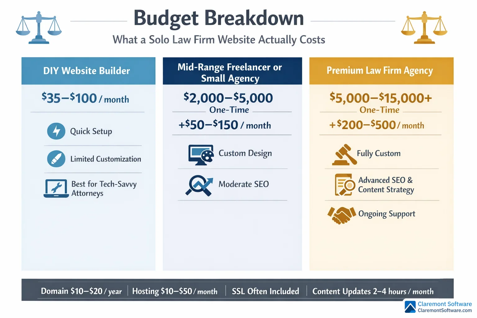
Let us be direct about something most web design articles gloss over: cost.
Solo attorneys shopping for website help encounter a frustratingly wide range of price points with little context for what each tier actually delivers. Here is how to think about it.
| Tier | Cost | What You Get | Best For |
|---|---|---|---|
| DIY | $35–$100/month | Website builder with legal templates, basic customization | Newly launched practices, tech-comfortable attorneys |
| Mid-Range | $2,000–$5,000 | Custom design on established platform, SEO foundations, practice-specific build | Most solo practitioners (sweet spot) |
| Premium | $5,000–$15,000+ | Law-firm-specific agency, SEO strategy, content development, ongoing support | Growing practices where the website is the bottleneck |
Ongoing Costs to Budget For
Regardless of which tier you choose, plan for recurring expenses: hosting, domain renewal, SSL certificate, content updates, SEO maintenance, and platform or plugin upkeep. Budget $100–$300/month for a well-maintained site.
The ROI Perspective
Firms with optimized websites report up to 4x faster client growth. At average legal fees, even two or three additional clients per year covers the entire investment — often many times over.
SEO Essentials Every Solo Attorney Website Needs
Search engines cannot reward what they cannot find — and for solo attorneys, being found by the right people at the right moment is everything. A technically sound, beautifully designed website means nothing if it is invisible to the clients actively searching for exactly what you offer. These five SEO fundamentals close that gap.
Target long-tail keywords, not broad ones. A solo practitioner competing for "personal injury lawyer" is fighting a losing battle against firms with six-figure marketing budgets. But "motorcycle accident attorney in Raleigh NC" or "wrongful termination lawyer for healthcare workers"? That is winnable territory. Long-tail, intent-driven queries attract visitors who are further along in their decision-making — and they convert at significantly higher rates.
Optimize your Google Business Profile alongside your website. Local pack visibility — those three listings that appear above organic results on local searches — often drives more calls than your website itself. Your profile and your site should reinforce each other with consistent information, practice area descriptions, and regularly updated posts.
Implement schema markup. Adding structured data (Attorney, LegalService, LocalBusiness schema) helps search engines understand exactly what your site represents and can improve how your listings appear in results. It is a technical step that many solo firms skip — which means doing it gives you a quiet edge.
Publish consistently helpful content. Answer the questions your potential clients are actually typing into Google. This is the most durable SEO strategy available to solo practitioners — and it compounds over time.
Get the technical basics right. Fast load speeds, mobile responsiveness, logical heading structure, internal linking between related pages, and optimized images are not optional extras. They are the foundation everything else sits on.
Ready to Build Your Solo Law Firm Website?
Every pattern in this guide is learnable, repeatable, and available to any solo attorney willing to be intentional about their web presence. You do not need a massive budget — you need a clear strategy and the discipline to execute it.
If you are ready to invest in a website that works as hard as you do:
- See our solo law firm website design services — built specifically for solo practitioners
- Explore our full law firm website design offering — for firms of every size
- See the 10 best solo lawyer websites we have found — real examples of every pattern in this guide
Frequently Asked Questions
How much does a solo law firm website cost to build and maintain?
The cost of a solo law firm website depends on how much customization you need. The DIY route using website builders with legal templates runs roughly $35–$100/month — a solid option for tech-comfortable attorneys. A mid-range custom site built by a freelancer or small agency typically costs $2,000–$5,000 upfront. A fully custom site from a law-firm-specific web design agency — including SEO, content strategy, and ongoing support — can run $5,000–$15,000 or more. Beyond build costs, budget for hosting, domain renewal, SSL certificates, and regular content updates. The ROI perspective matters here: firms with optimized websites report up to 4x faster client growth, meaning even a few additional clients per year can cover the entire investment.
What is the best website builder for solo attorneys in 2026?
For solo attorneys who want a reliable, professional-looking site without heavy technical overhead, Squarespace is a popular choice at around $35/month, offering built-in stability, clean design templates, and solid functionality out of the box. WordPress remains the gold standard for flexibility and SEO control, especially when paired with a legal-specific theme — though it requires more hands-on management. The best builder ultimately depends on your comfort with technology, your budget, and how much customization you need. If you plan to invest heavily in content marketing and SEO, WordPress gives you more room to grow. If you want something polished and low-maintenance, a premium website builder is a smart starting point.
How can a solo law firm website compete with larger firms online?
Solo attorneys can absolutely compete with larger firms online — and in many cases, win. The key is to lean into what big firms cannot replicate: personal branding, authentic local roots, and genuine client relationships. Strategically, this means targeting long-tail, intent-driven keywords that large firms overlook, building deeply detailed practice area pages that answer real client questions, and optimizing your Google Business Profile for local search visibility. Publishing consistent, helpful content — guides, FAQs, legal explainers — positions you as a trusted authority without requiring a massive marketing budget. Add strong social proof through client testimonials and case results, and a seamless mobile experience, and a solo firm's website can outperform firms with far greater resources.
What pages should every solo law firm website include?
At minimum, every solo law firm website should include a compelling homepage with a clear call to action, individual practice area pages for each service you offer, an attorney bio page that tells your story and builds personal connection, a contact page with multiple ways to reach you, and a client testimonials or results page. Beyond the essentials, high-performing solo firm sites also include a blog or resource library for SEO and thought leadership, a transparent pricing or FAQ page to reduce friction, and an online intake or scheduling tool to streamline the client journey. Each page should serve a specific purpose — informing, building trust, or driving a conversion — rather than simply filling space.
How important is SEO for a solo attorney's website?
SEO is one of the highest-leverage investments a solo attorney can make online. Because solo practitioners typically have less name recognition than established firms, appearing in search results for the specific queries potential clients are typing is critical. Local SEO — including an optimized Google Business Profile and location-specific keywords — helps solo firms dominate their geographic market. On-page SEO fundamentals like fast page speed, mobile responsiveness, proper heading structure, and schema markup (Attorney, LegalService, LocalBusiness) help search engines understand and surface your content. A solo attorney who publishes consistent, helpful content answering real client questions can outrank firms with far larger marketing budgets over time. SEO is not optional — it is the engine behind sustainable client acquisition.
Should solo attorneys hire a professional web designer or build their own website?
It depends on your budget, technical comfort level, and growth goals. Building your own site using a website builder is a viable starting point — modern platforms make it possible to create a professional-looking site for $35–$100/month without coding skills. However, if your website is a primary client acquisition channel (and for most solo attorneys, it should be), investing in a professional designer pays dividends. Law-firm-specific web design specialists bring expertise in legal branding, conversion optimization, and SEO that general designers may lack. A professionally built site also frees you to focus on practicing law rather than troubleshooting plugins. As a middle ground, some attorneys build their own site initially and bring in a professional for a redesign once revenue supports it.
What are the most important design patterns for a solo law firm website?
The 10 design patterns that consistently produce results for solo law firms are: a hero section that converts on first glance, local branding that owns your geographic market, practice area pages built as dedicated landing pages, a content engine that drives organic traffic, a testimonial strategy that distributes social proof across the site, transparent pricing that builds trust, interactive tools that engage visitors and capture leads, mobile-first design that works on every screen, niche authority that dominates a specialty, and a seamless client experience from first click to consultation. You do not need all 10 on day one — start with the fundamentals (hero, mobile, practice area pages) and layer in the others as your practice grows.
How often should a solo law firm update its website content?
Your website should be treated as a living marketing asset, not a one-time project. At a minimum, aim to publish new blog posts or legal guides at least twice a month to support SEO and demonstrate that your practice is active and current. Practice area pages should be reviewed and refreshed at least once or twice a year to reflect changes in the law, your services, or your target audience. Client testimonials and case results should be added on an ongoing basis as you accumulate them. Technical maintenance — checking for broken links, updating plugins, and monitoring page speed — should happen monthly. Consistent updates signal to both search engines and prospective clients that your firm is engaged, credible, and current.