
Your law firm's website isn't just a digital business card — it's the first courtroom where potential clients decide whether to trust you with their case.
Most prospective clients research attorneys online before ever picking up the phone. That means your website is working — or failing — long before you shake anyone's hand. And in a market where every firm is competing for the same searches, a cookie-cutter template or an outdated design doesn't just look unprofessional. It actively costs you clients.
The good news? You don't need an unlimited budget or a complete rebrand to build a website that converts visitors into consultations. You just need to know what works — and why.
This article breaks down 15 standout law firm website patterns across practice areas and firm sizes, spotlighting the specific design choices, conversion strategies, and branding techniques you can realistically borrow for your own site. Whether you're a solo practitioner looking to sharpen your online presence or a growing firm planning a full redesign, you'll walk away with actionable inspiration grounded in what actually moves the needle in legal website design.
What Makes a Law Firm Website Truly Stand Out?
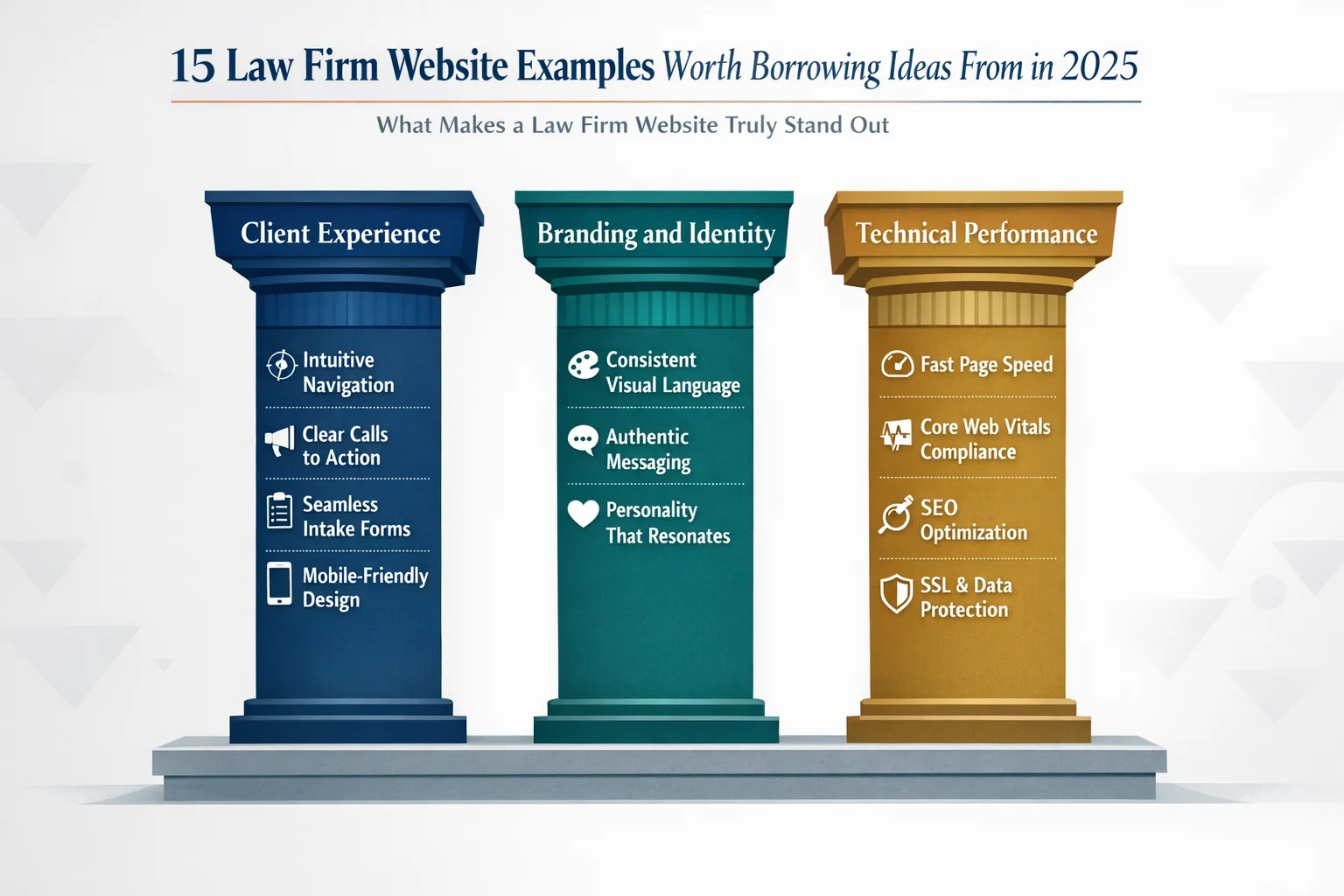
Not all law firm websites are created equal — and the gap between a site that quietly generates clients and one that silently loses them often comes down to three core factors: client experience, branding, and technical performance.
Client experience encompasses everything a visitor encounters from the moment they land on your homepage: How easy is it to find what they need? Are calls-to-action visible without scrolling? Does the intake process feel intuitive or frustrating? A site that buries its contact form or forces visitors through confusing navigation is a site that loses cases before they begin.
Branding goes deeper than a logo and color palette. It's the personality your firm projects — the tone of your copy, the authenticity of your photography, the emotional impression you leave. The best law firm websites strike a careful balance: professional enough to command respect, approachable enough to feel human.
Technical performance is the foundation everything else rests on. A visually stunning site that loads slowly, breaks on mobile, or fails to appear in local search results is effectively invisible to the clients you're trying to reach.
Beyond these three pillars, the websites that truly stand out share one more quality: they use compelling content — real client testimonials, quantifiable case results, transparent fee information, and educational resources — to build trust before a single conversation takes place. Great design attracts visitors; strategic content converts them.
15 Law Firm Website Patterns Worth Stealing
The examples that follow aren't organized alphabetically or by firm size — they're organized by design strategy and conversion technique. Each one represents a replicable pattern you can study, adapt, and apply to your own site, regardless of whether you're working with a $500 budget or a $50,000 one.
Think of these as blueprints, not blueprints. The goal isn't to copy a competitor's aesthetic — it's to understand why certain design decisions work and borrow the underlying logic for your own context. You'll find patterns drawn from solo practitioners, boutique specialty firms, and larger multi-office operations spanning practice areas from family law to criminal defense to estate planning. Whatever your firm looks like today, there's something here worth stealing.
The Hero Section That Converts Before You Scroll
Picture this: a potential client has just been served divorce papers, or rear-ended on the highway, or received a letter from the IRS. They open their phone, search for an attorney, and land on your homepage. You have roughly 3 to 5 seconds before they decide whether to keep reading or hit the back button.
That's the only job your hero section has — and most law firm websites fail it spectacularly.
The pattern worth borrowing here is deceptively simple: a bold, full-width image paired with a single headline that speaks directly to the client's pain point, not the firm's résumé. Instead of "Experienced Litigators Serving the Greater Metro Area Since 1987," the headline reads something like "Facing a DUI Charge? Here's How We Help." The shift is subtle but seismic — it signals immediately that this firm understands your problem, not just its own credentials.
Equally critical is what sits below that headline: a prominent CTA visible without scrolling. A "Schedule Your Free Consultation" button or a click-to-call phone number should be impossible to miss above the fold. Every extra scroll required to find contact information is a conversion you're quietly losing.
One more element separates the best hero sections from the rest: authentic photography. Visitors have developed a near-instant immunity to stock images of gavels, marble courthouses, and handshakes in boardrooms. Real photos of your attorneys, your office, or even thoughtfully chosen conceptual imagery communicate far more credibility than any generic library image ever could.
The lesson: Every pixel of your hero section should answer one question — "Can this firm help me?" — before the visitor has a chance to wonder.
The Boutique Firm That Leads With Bold Visual Storytelling
Most law firm websites look like they were designed by the same committee — navy blue backgrounds, stock photos of scales and gavels, and a color palette that could generously be described as "corporate beige." For the vast majority of practices, that visual sameness is a missed opportunity. For niche firms with a strong cause-driven identity, it's a genuine liability.
The pattern worth studying here is the boutique specialty firm — think environmental law, civil rights advocacy, or immigration justice — that deliberately breaks visual convention to communicate its mission before a single word is read. Rather than defaulting to traditional legal photography, these firms use conceptual, even provocative imagery that creates an immediate emotional response. Bick Law LLP, which focuses exclusively on environmental issues, is a striking example: their site features imagery so unexpected — think a rhinoceros balanced on a tightrope — that visitors stop scrolling and start paying attention.
That's precisely the point. When your firm stands for something specific, your visuals should say so instantly. Conceptual art and bold photography do what no headline can accomplish alone — they create a gut-level impression that lingers long after the visitor closes the tab.
This approach works because differentiation is survival in a crowded market. When hundreds of competitors share the same blue-and-gray palette, a single memorable image becomes a competitive advantage.
The lesson: If your firm has a distinct mission or specialization, let your visuals carry that story. Memorable imagery isn't decoration — it's positioning.
The Solo Attorney Site That Punches Above Its Weight
Here's a truth that surprises many solo practitioners: the gap between a $500 website and a $5,000 website is far smaller than you'd think — and the gap between a strategic website and an unfocused one is enormous, regardless of price.
The pattern worth borrowing here is the solo attorney who uses a modern website builder (Squarespace is a popular choice at around $35/month) to build something clean, focused, and genuinely competitive with sites that cost ten times more. The secret isn't budget — it's discipline.
What makes these sites punch above their weight comes down to three choices made well:
- A single, clear practice focus. Rather than listing every area of law they've ever touched, the smartest solo sites commit to one specialty. That focus makes the entire site feel more authoritative, not less.
- A personal "About" story that actually connects. Solo attorneys have an advantage large firms don't — a real human being at the center of the practice. A genuine, conversational bio that explains why you do this work builds trust faster than any credential list.
- Integrated online scheduling. Removing the phone-tag barrier converts curious visitors into booked consultations while you sleep.
Strategic simplicity, it turns out, often outperforms cluttered expensive designs that try to say everything at once.
The lesson: For solo attorneys, authenticity and clarity beat flashy design every time. A focused, honest solo attorney website on a modest budget will outperform an overbuilt one with no clear message.
The Family Law Firm With Empathy-Driven Design
Few areas of law demand more emotional intelligence from a website than family law. The people landing on these pages aren't browsing casually — they're often in the middle of a divorce, a custody dispute, or a painful family crisis. They're scared, exhausted, and desperately looking for someone they can trust. A website that greets them with aggressive "we fight to win" language and hard-charging imagery doesn't just miss the mark — it actively drives them away.
The pattern worth studying here is the family law firm that designs for the emotional state of its visitor first. Warm color palettes — soft greens, muted blues, gentle earth tones — replace the stark navy-and-white combinations common across legal sites. Typography choices lean toward rounded, approachable fonts rather than rigid serifs. Imagery shows real people in moments of quiet reassurance rather than courtroom confrontations.
The messaging follows the same philosophy. Instead of promising to "crush the opposition," these sites use language like "we'll guide you through this" or "you don't have to face this alone." Step-by-step process explanations replace legal jargon, giving anxious visitors a clear picture of what working with the firm actually looks like — and making the unknown feel manageable.
Reassuring client testimonials, placed thoughtfully throughout the site, do the heavy lifting that credentials alone cannot.
The lesson: Your website's tone and visual warmth should mirror the emotional state of your ideal client. In family law, feeling safe comes before feeling impressed.
The Personal Injury Firm With Social Proof That Sells
If family law websites speak to the heart, personal injury sites speak to the scoreboard — and the best ones know exactly how to use that to their advantage.
The pattern worth borrowing here is the personal injury firm that treats social proof as a design element, not an afterthought. Case results aren't buried on a separate page that visitors have to hunt for — they're woven throughout the site, placed strategically near every call-to-action button. A scrolling ticker of settlement amounts on the homepage communicates credibility within seconds, before a visitor has read a single word of copy.
The most effective versions of this pattern layer multiple forms of proof simultaneously:
- Dollar-amount case results positioned directly above or below "Get a Free Consultation" buttons, creating a powerful cause-and-effect association in the visitor's mind
- Video testimonials from real clients — not polished actors — that let prospective clients see and hear genuine relief and gratitude
- Trust badges including bar memberships, award recognitions, and media appearances displayed prominently, not hidden in a footer
The cumulative effect is deliberate. Each element reinforces the next, building a case for the firm the same way an attorney builds a case in court — with evidence, not just assertion.
The lesson: In high-stakes practice areas where clients are choosing who to trust with life-changing outcomes, quantifiable results and authentic client stories are your most persuasive design elements. Show the receipts.
The Criminal Defense Site With Transparent Pricing
Few things make a prospective criminal defense client more anxious than picking up the phone without knowing what a call might cost them. They're already dealing with one of the most stressful situations of their lives — the last thing they want is to feel ambushed by fees they never saw coming. The criminal defense firm that breaks this pattern by publishing transparent pricing directly on its website doesn't just stand out from competitors; it fundamentally changes the client relationship before the first conversation even happens.
The pattern worth replicating here is straightforward but surprisingly rare: clearly structured pricing tiers for common case types — misdemeanors, felonies, DUIs — paired with visible payment plan options, including interest-free monthly installments. Software-driven intake tools walk visitors through their situation step by step, helping them understand what tier applies to their case before they ever speak to anyone.
The results are predictable once you understand the psychology. Transparent pricing pages consistently become the highest-traffic pages on the site because they answer the one question every single visitor is silently asking. Qualified leads increase because visitors self-select based on budget fit. Phone anxiety drops because clients arrive informed rather than guarded.
The lesson: Pricing transparency isn't just a design choice — it's a trust signal. Review your state bar's advertising guidelines, then consider how much of your fee structure you can ethically share upfront. Even partial transparency can meaningfully reduce friction and pre-qualify the leads that actually convert.
The Multi-Office Firm With Seamless Location Navigation
Managing a multi-office firm's web presence is a balancing act: you need to communicate geographic reach without making visitors feel like they've landed on a corporate directory instead of a law firm.
The pattern worth borrowing here is the large firm that solves this problem through location-based landing pages — dedicated, fully developed pages for each office that function less like branch listings and more like standalone mini-websites. Each page features attorneys specific to that location, testimonials from clients in that region, and locally relevant content that speaks to the legal landscape of that community. The result is a site that feels simultaneously cohesive and local.
Navigation is where this pattern lives or dies. The best implementations use:
- Interactive maps that let visitors orient themselves geographically before diving into content
- Geo-targeted prompts that detect a visitor's location and surface the most relevant office automatically
- Clean, hierarchical menus that surface regional options without overwhelming visitors with the firm's full footprint
Critically, each location page is built with local SEO in mind — unique content (not duplicated boilerplate), localized keywords, and office-specific schema markup that helps each page rank independently in regional search results.
The navigation makes it effortless to find the right office, and the content makes it feel like that office was built specifically for the visitor's community.
The lesson: Multi-location firms should resist the urge to consolidate everything under one generic page. Treat each office as its own local practice with its own optimized presence — because that's exactly how search engines, and clients, see it.
The Immigration Firm With Multi-Language Accessibility
For many immigration clients, the journey to finding legal help begins with a language barrier — and a website that doesn't speak their language, literally or culturally, loses them in the first ten seconds.
The pattern worth replicating here is the immigration firm that goes far beyond slapping a Google Translate widget in the corner. Instead, it offers genuine, human-translated content in multiple languages — typically English and Spanish at minimum, with additional languages reflecting the firm's specific client communities. Each language version isn't a mechanical conversion of the English text; it's a culturally calibrated experience with imagery, phrasing, and messaging that resonates with that audience's specific context and concerns.
The accessibility thinking extends beyond language itself. These sites use:
- Clear iconography that communicates navigation options visually, reducing reliance on text comprehension
- Simplified menu structures that don't assume familiarity with the U.S. legal system
- Prominent language toggles positioned where first-time visitors naturally look
The result is a site that communicates something words alone can't fully express: we understand where you're coming from.
This matters enormously in a practice area where clients are often navigating an unfamiliar legal system while managing significant personal stress. A site that feels familiar and trustworthy in a visitor's native language removes a critical barrier between that visitor and a consultation.
The lesson: Auto-translated content signals low effort to the very clients you're trying to reach. If your practice serves multilingual communities, invest in professionally translated, culturally adapted content — it's one of the highest-return website investments you can make.
The Firm That Turns Its Blog Into a Client Magnet
Most law firm websites treat their blog as an afterthought — a tab in the navigation that hasn't been updated since 2021. The firms that treat it as a strategic asset tell a very different story.
The pattern worth replicating here is the mid-size firm that builds a robust content hub — not just a blog, but an organized library of articles, FAQ-style posts, and downloadable guides that collectively rank for hundreds of informational search terms. Visitors arrive looking for answers to questions like "what happens if I miss a court date" or "how long does probate take," and they find genuinely useful, plain-language explanations written by attorneys who clearly know their subject.
That credibility does two things simultaneously: it earns trust with the reader, and it earns authority with search engines.
What separates a client-magnet blog from a content graveyard comes down to structure:
- Practice area organization that mirrors the site's service pages, with natural internal links guiding readers from educational content toward attorney profiles and consultation CTAs
- Downloadable resources — checklists, guides, templates — that capture email addresses in exchange for immediate value
- FAQ-format posts that target the exact questions prospective clients type into Google
The lesson: A strategic content hub does double duty. It builds the SEO authority that drives organic traffic, and it positions your attorneys as trusted thought leaders before a potential client ever picks up the phone — making that first conversation significantly warmer.
The Firm With an AI-Powered Intake Experience
Most law firm websites go dark after 5 PM. A prospective client searching for help at 10 o'clock on a Sunday night hits a contact form, submits their information into the void, and waits — often long enough to find someone else.
The pattern worth replicating here is the forward-thinking firm that deploys an AI-powered chatbot or guided intake questionnaire to bridge that gap. Rather than presenting visitors with a static form and a promise to call back, these sites open a conversation. The tool asks simple, plain-language questions — "What type of legal issue are you dealing with?" or "Has anyone been injured?" — and uses the answers to route the visitor toward the right practice area, the right attorney, and a clear next step, all without human intervention.
What makes this work is tone. The best implementations feel conversational rather than clinical — more like a helpful receptionist than a bureaucratic intake checklist. Visitors don't feel interrogated; they feel guided.
The results are measurable. According to Clio's Legal Trends Report, firms using AI-first client approaches report 4x faster growth than those relying on traditional intake methods — largely because they're capturing leads that would otherwise disappear overnight.
The good news for smaller firms: this capability is no longer reserved for firms with enterprise-level budgets. Platforms like Claremont Software are making smart, conversational intake tools increasingly accessible for practices of all sizes.
The lesson: Every hour your website can't respond to a visitor is a potential client lost. Even a well-designed guided form — not necessarily a full AI chatbot — meaningfully improves lead capture and signals to visitors that your firm is responsive, modern, and ready to help.
The Minimalist Design That Lets Results Speak
Some of the most effective law firm websites on the internet don't look like much at first glance. No animated sliders. No sidebar widgets. No walls of practice area text competing for attention. Just clean space, confident typography, and a clear path forward.
That restraint is a deliberate strategy — and it works.
The pattern here is a firm that strips away every non-essential element in favor of generous white space, bold headline typography, and a frictionless user journey that moves visitors from the homepage to a contact form with minimal distraction. No decorative imagery that doesn't serve a purpose. No rotating testimonial carousels. No cluttered navigation menus with eight dropdown levels.
Every element earns its place on the page — or it doesn't appear at all.
The conversion logic behind this approach is straightforward: cognitive load kills action. When visitors encounter too many competing elements, they hesitate, second-guess, and ultimately leave. A minimalist design removes that friction entirely, letting the firm's results, reputation, and clear messaging do the persuading.
The lesson: When you're unsure whether to add something to a page, default to removing it instead. In legal web design, simplicity isn't a budget constraint — it's a strategic choice that respects your visitor's attention and guides them exactly where you want them to go.
The Firm With a Video-First Homepage
Picture this: a prospective client lands on a law firm's homepage and, within three seconds, they're watching the lead attorney look directly into the camera and say, "If you've been injured and don't know where to turn, here's exactly what we do — and how we can help." No scrolling required. No reading between the lines. Just an immediate, human connection.
That's the power of a video-first homepage.
The pattern worth replicating here is straightforward: replace the traditional static hero image with a short, professionally produced video that introduces the attorney and communicates the firm's mission. Where text requires effort and imagery requires interpretation, video does the work instantly. Visitors can read body language, register tone of voice, and form a genuine sense of whether they trust this person — all within the first 30 seconds.
The execution matters, though. The highest-performing homepage videos share a few non-negotiable traits: they run under 60 seconds, auto-play on mute with captions enabled (for the majority of visitors browsing in public or without headphones), and include a clear CTA overlay — a phone number, a consultation button, or both — so the momentum video creates doesn't evaporate.
The lesson: If you're comfortable on camera, a homepage video may be the single highest-impact investment you can make in your site's conversion rate. Authenticity on screen is more persuasive than any headline you could write.
The Estates Firm With Interactive Tools
Estate planning sits in a uniquely awkward space in the legal market. Clients know they probably need a will or a trust — but they're not sure where to start, what they actually need, or whether their situation is complicated enough to warrant an attorney. That uncertainty keeps them stuck in research mode indefinitely.
The smartest estates and trusts firms have found a way to break that paralysis: give visitors something useful before asking for anything in return.
The pattern here is a firm that embeds interactive tools directly into the website — think estate planning checklists, asset inventory calculators, or a short "Do I need a will?" quiz that walks visitors through a handful of simple questions and delivers a personalized recommendation. These tools do two things simultaneously: they provide genuine, immediate value to someone who arrived with vague questions, and they quietly qualify that visitor as a potential client in the process.
The downstream effects on site performance are significant. Interactive elements naturally increase time on site, reduce bounce rates, and create organic moments to capture contact information — a follow-up email with results, a prompt to schedule a consultation to discuss findings.
The lesson: The most effective trust-building move online isn't a polished bio or an impressive case result — it's demonstrating expertise by helping first. When visitors leave your site having learned something or gained clarity, they remember who gave it to them.
The Award-Winning Redesign That Doubled Inquiries
Sometimes the most instructive example isn't a firm that did one thing brilliantly — it's a firm that fixed everything at once and has the numbers to prove it worked.
The pattern here is a complete website overhaul: a firm migrates from an aging, template-based site to a custom, conversion-optimized design and documents measurable results on the other side. The before-and-after contrast is stark. Where the old site had slow load times, cluttered navigation, and contact forms buried three clicks deep, the redesigned version loads in under two seconds, guides visitors intuitively from landing page to intake form, and places a clear CTA on every single page — no exceptions.
Critically, these redesigns don't just look better. They're built around Core Web Vitals — Google's performance benchmarks for speed, interactivity, and visual stability — which directly influence search rankings. Accessibility compliance (ADA/WCAG standards) is baked in from the start, expanding the site's reach while reducing legal exposure.
The result? Inquiry volume that doubles. Not because the logo got a refresh, but because the underlying architecture finally stopped working against the firm.
The lesson: A website redesign is a business investment, not a vanity project. When the process is grounded in user experience data, technical performance, and conversion strategy — rather than aesthetic preferences alone — the return is measurable, predictable, and significant.
Essential Elements Every Law Firm Website Must Have
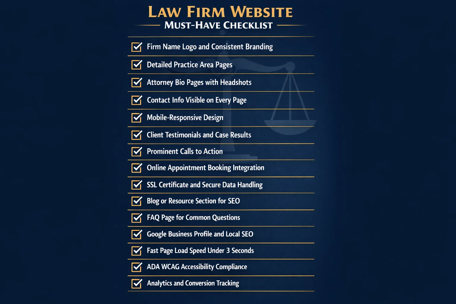
Before borrowing design ideas from the examples above, it's worth stepping back to confirm your own site covers the fundamentals. Even the most creative homepage concept won't convert visitors if the basics are missing.
The non-negotiable baseline includes your firm name and logo, a clearly organized list of practice areas, attorney bios with professional headshots, contact information visible on every page, an office location with an embedded map, and a design that works flawlessly on mobile — where the majority of legal searches now originate.
Trust builders move visitors from curious to confident. These include client testimonials, notable case results, awards and recognitions, bar association memberships, and any media appearances or press mentions. Strategically placed throughout the site — not buried on a single "About" page — these elements do continuous conversion work.
Conversion elements ensure visitors know exactly what to do next. Prominent calls-to-action (call, email, or schedule), online appointment booking, live chat, and streamlined intake forms all reduce friction at the critical moment when a visitor is ready to reach out. Every page should offer a clear next step.
Enhanced features separate good sites from great ones: FAQ pages, a legal blog, educational videos, downloadable resources, and transparent fee information all add value while building authority.
Technical essentials underpin everything else — an SSL certificate, fast page load speeds, schema markup for local SEO, ADA-accessible design, and analytics tracking to measure what's actually working.
Think of these layers as a pyramid: get the foundation right before optimizing the top.
How Much Does a Law Firm Website Cost?

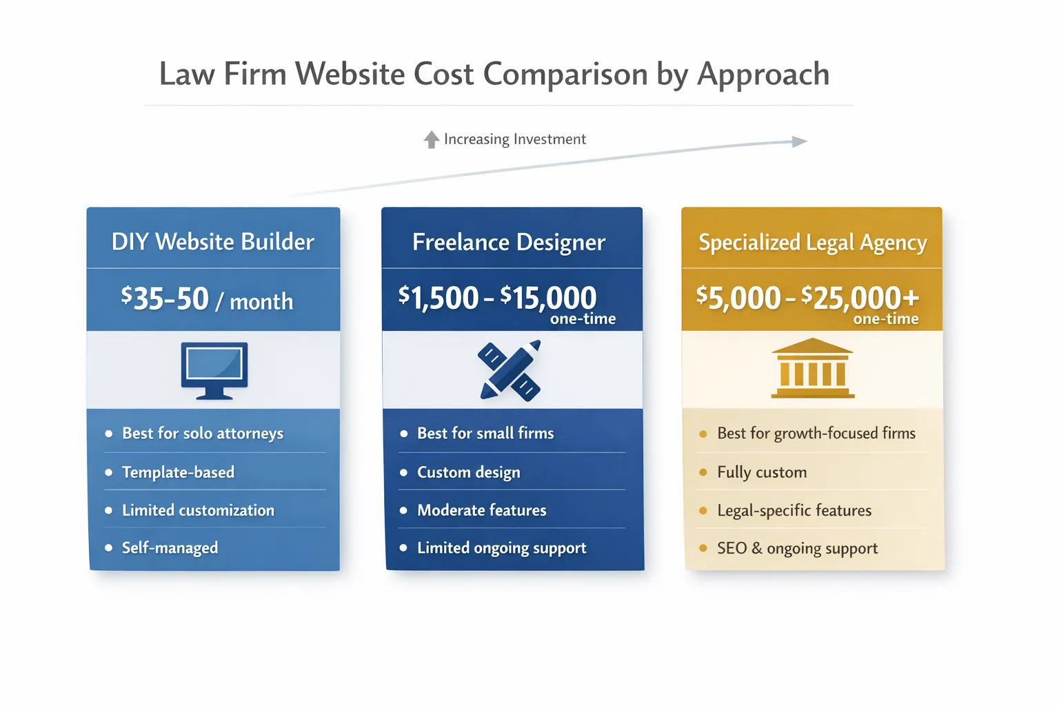
Budget shapes every website decision — but it doesn't have to determine the outcome. Here's what you can realistically expect to spend at each tier.
DIY with website builders (Squarespace, Wix, and similar platforms) runs approximately $35–$50 per month. For solo attorneys who need a polished, professional presence without a large upfront investment, this is a legitimate starting point — not a compromise. Modern templates are clean, mobile-responsive, and surprisingly capable when paired with focused messaging and a professional headshot.
Freelance designers occupy the middle ground, typically charging $1,500–$5,000 for straightforward builds and $5,000–$15,000+ for more complex, custom work. This tier suits small firms that want a distinctive look without committing to a full agency relationship.
Specialized legal website agencies start around $5,000 and can exceed $25,000 for fully custom designs with legal-specific functionality, built-in SEO strategy, and ongoing support. For firms serious about using their website as a primary growth engine, this investment frequently pays for itself.
Several factors push costs upward regardless of tier: the number of pages, custom functionality like intake forms or interactive calculators, professional copywriting, SEO configuration, and ongoing maintenance.
The more important number, though, is the cost of a cheap website: lost leads who bounce to a competitor, suppressed search rankings, and a first impression that quietly undermines every other marketing dollar you spend. A website that fails to convert isn't saving you money — it's costing you clients.
Best Practices for Building a Website That Wins Clients
A great law firm website isn't built in a day — and it isn't maintained by accident. Once you've covered the essential elements and settled on a budget, the following practices separate sites that quietly collect dust from ones that consistently win clients.
Put user experience first. Visitors who can't find what they need within seconds will leave — and they won't come back. Prioritize intuitive navigation with a logical page hierarchy, keep menus simple, and design for mobile before desktop. The majority of legal searches now happen on phones, often by people in stressful situations who need answers fast. If your site is clunky on a small screen, you're losing clients before they've read a single word.
Write for your client, not your colleagues. Professional copywriting that speaks plainly to the worried parent, the injured worker, or the small business owner will always outperform dense, jargon-heavy text written to impress other attorneys. Every page should answer the question your visitor is actually asking — and make them feel understood in the process.
Build SEO into the foundation, not as an afterthought. Optimize for local search terms from day one, create dedicated landing pages for each practice area, implement schema markup so search engines understand your content, and publish blog posts consistently. Organic search traffic compounds over time — the firms that start early build an advantage that's difficult for competitors to close.
Design every page for conversion. Each page should guide visitors toward a single, obvious next step — calling, scheduling, or submitting an intake form. Don't make potential clients hunt for your phone number or wonder what happens after they reach out. Friction at this stage is expensive.
Stay compliant. Your state bar's advertising rules apply online just as they do in print. Include required disclaimers, avoid prohibited claims, and ensure your site meets ADA accessibility standards. Non-compliance creates both ethical exposure and potential legal liability — neither of which belongs on your firm's record.
Treat your website as a living asset. Install analytics, monitor which pages generate the most inquiries, and test variations of your calls-to-action over time. A website that isn't being measured isn't being improved — and in a competitive market, standing still is the same as falling behind.
Conclusion
The 15 patterns explored in this article share a common thread: exceptional law firm websites aren't built on the biggest budgets — they're built on the clearest thinking. Whether it's a solo practitioner who chose authenticity over flash, or a multi-office firm that turned each location page into a local search powerhouse, every example reflects deliberate choices aligned with a specific practice, a specific client, and a specific goal.
Start where you are. Audit your current site against the essential elements checklist, then identify two or three patterns from these examples that you can realistically act on in the next 90 days. Add a homepage video. Introduce a transparent pricing page. Declutter your navigation. Build out your first practice area content hub. Small, strategic improvements compound quickly — and any one of them can meaningfully shift how potential clients perceive your firm.
Your website is already working around the clock, with or without your attention. The only question is whether it's working for you. Make the case for your firm as carefully as you'd make it in court — because for most clients, that website is the courtroom where they decide.
Frequently Asked Questions
What are the most important features of a law firm website?
The most important features of a law firm website fall into three categories. First, the essentials: your firm name and logo, clearly listed practice areas, attorney bios with professional photos, contact information on every page, and a mobile-responsive design. Second, trust builders: client testimonials, case results, awards, bar association memberships, and media mentions. Third, conversion elements: prominent calls to action (call, email, or schedule buttons), online appointment booking, and live chat or intake forms. Enhanced sites also benefit from FAQ pages, a legal blog, educational videos, and transparent fee information. At its core, a great law firm website must be easy to navigate, fast-loading, and designed to guide visitors toward taking the next step — contacting your firm.
How much does it cost to build a professional law firm website?
The cost of a professional law firm website varies widely depending on your needs and approach. DIY website builders typically run around $35–$50 per month — a solid option for solo attorneys who need a polished presence quickly and affordably. Hiring a freelance designer costs roughly $1,500–$5,000 for simpler sites and $5,000–$15,000 or more for complex custom work. Specialized legal website agencies charge anywhere from $5,000 to $25,000 or more for fully custom designs with legal-specific features, SEO setup, and ongoing support. Key cost factors include the number of pages, custom functionality like intake forms or chatbots, content creation, and ongoing maintenance. Keep in mind that a cheap website can cost far more in the long run through lost leads and poor first impressions.
Should I use a website builder or hire a designer for my law firm site?
It depends on your budget, technical comfort level, and growth goals. Website builders are an excellent starting point for solo attorneys or small firms on tight budgets — modern platforms offer clean templates, built-in functionality, and stable hosting at a low monthly cost. The result can look surprisingly professional when paired with strong copywriting and a good headshot. However, if you're a growing firm competing in a crowded market, investing in a professional designer or legal website agency pays dividends through custom branding, conversion-optimized layouts, and SEO-ready architecture. A good rule of thumb: start with a builder to establish your presence, then invest in a custom site once your firm's revenue justifies it.
How often should a law firm update or redesign its website?
Law firm websites should be updated regularly and fully redesigned every three to five years. Regular updates — adding blog posts, refreshing attorney bios, updating case results and testimonials, and adjusting service pages — should happen on an ongoing basis, ideally monthly. A full redesign becomes necessary when your site looks visually dated, loads slowly, isn't mobile-friendly, or no longer reflects your firm's brand and practice areas. Technical factors like Core Web Vitals performance and ADA accessibility standards also evolve, making periodic redesigns important for both search rankings and legal compliance. Think of your website as a living business development tool, not a one-time project — consistent investment keeps it working hard for your firm.
What is the best website platform for law firms (WordPress, Squarespace, or custom)?
Each platform has its strengths depending on your firm's size and goals. WordPress is the most flexible option, powering a large share of professional law firm websites — it offers deep customization, robust SEO capabilities, and a vast plugin ecosystem, though it requires more technical maintenance. Squarespace is a popular choice for solo attorneys and small firms thanks to its polished templates, ease of use, and affordable monthly pricing, making it possible to launch a professional site without a developer. Fully custom-built websites offer the highest level of control and conversion optimization but come at a significantly higher cost. For most small to mid-size firms, WordPress or a quality website builder strikes the best balance between performance, flexibility, and budget.
How can a law firm website improve its search engine rankings?
Improving your law firm website's search engine rankings requires a multi-pronged SEO strategy. Start with local SEO: optimize your Google Business Profile, include your city and practice area in page titles and headings, and build consistent citations across legal directories. Create dedicated landing pages for each practice area with unique, keyword-rich content written in plain language. Publish a regular legal blog targeting the questions your prospective clients are actually searching for — FAQ-style posts and educational guides perform especially well. Implement technical SEO basics like fast page load speeds, mobile-friendly design, SSL security, and schema markup. Finally, earn backlinks from reputable legal directories and local organizations. Consistent effort across all these areas compounds over time into strong, sustainable organic visibility.
Do law firm websites need to be ADA accessible?
Yes — ADA accessibility is both an ethical responsibility and a practical necessity for law firm websites. The Americans with Disabilities Act requires that websites serving the public be accessible to people with disabilities, and law firms are not exempt. Non-compliant sites risk potential lawsuits and complaints, which is a particularly uncomfortable position for a legal practice. Accessibility best practices include providing alt text for images, ensuring sufficient color contrast, making the site navigable by keyboard, adding captions to videos, and following WCAG (Web Content Accessibility Guidelines) standards. Beyond legal compliance, an accessible website simply provides a better experience for all users — including older visitors and those on slower connections — and can positively impact your search engine rankings as well.
What content should a solo attorney include on their website?
A solo attorney's website doesn't need to be complex — it needs to be clear, credible, and conversion-focused. At minimum, include a compelling homepage that immediately communicates who you help and how, a focused practice area page (or pages) written in plain language, and a personal About page that tells your story and builds human connection. Add a professional headshot, your contact information on every page, and a simple way for visitors to schedule a consultation — whether that's an online booking tool, a contact form, or a prominent phone number. Client testimonials and any notable case results add powerful credibility. A basic FAQ page and a few blog posts targeting common client questions round out a site that punches well above its weight.