
Your law firm's website isn't just a digital business card — it's the first conversation you have with every potential client, and most firms are losing that conversation before it even starts.
Think about it: a potential client is searching for legal help at a vulnerable moment. They land on your site and within seconds, they've already formed an opinion about whether you're the right attorney for them. That judgment happens fast, and it's rarely reversed.
The gap between good and great law firm websites is widening. The top performers aren't just looking polished — they're actively building trust, answering questions before they're asked, and guiding visitors toward a consultation with the kind of frictionless confidence that converts browsers into clients. Meanwhile, the forgettable ones are hemorrhaging leads to competitors who simply invested more intentionally in their online presence.
We reviewed dozens of award-winning and top-performing legal websites to decode exactly what separates the leaders from the laggards. What we found wasn't magic — it was a repeatable set of patterns, features, and strategic decisions that any firm can learn from and apply.
This is your blueprint.
How We Evaluated the Best Lawyer Websites
Not all law firm websites are created equal — and neither are the methods used to evaluate them. To identify what separates the best from the rest, we built our assessment around three core pillars: client experience, branding, and technical performance. These aren't arbitrary categories; they mirror the same framework used by leading industry reviewers who assess hundreds of legal websites annually.
Here's the critical distinction we kept in mind throughout: functionality, branding, marketing effectiveness, and technical execution are no longer differentiators — they're table stakes. A site that loads quickly, looks professional, and lists practice areas clearly deserves no special recognition in today's market. That's the minimum. Great websites must clear this bar and then go considerably further.
Every site we reviewed was assessed through the lens of visitor intent — the real-world questions a potential client brings to a law firm's website. Can they quickly find answers to their most pressing questions? Does the site make them feel understood and reassured? Is contacting the firm as frictionless as possible, or does it require hunting through menus and filling out clunky forms?
We also weighted innovation heavily. The websites that genuinely impressed us weren't just well-designed brochures — they actively engaged visitors through interactive tools, self-service features, and resources that delivered immediate value. A site that helps a visitor do something — estimate costs, evaluate their case, or schedule a consultation — is doing far more work than one that simply describes what the firm offers.
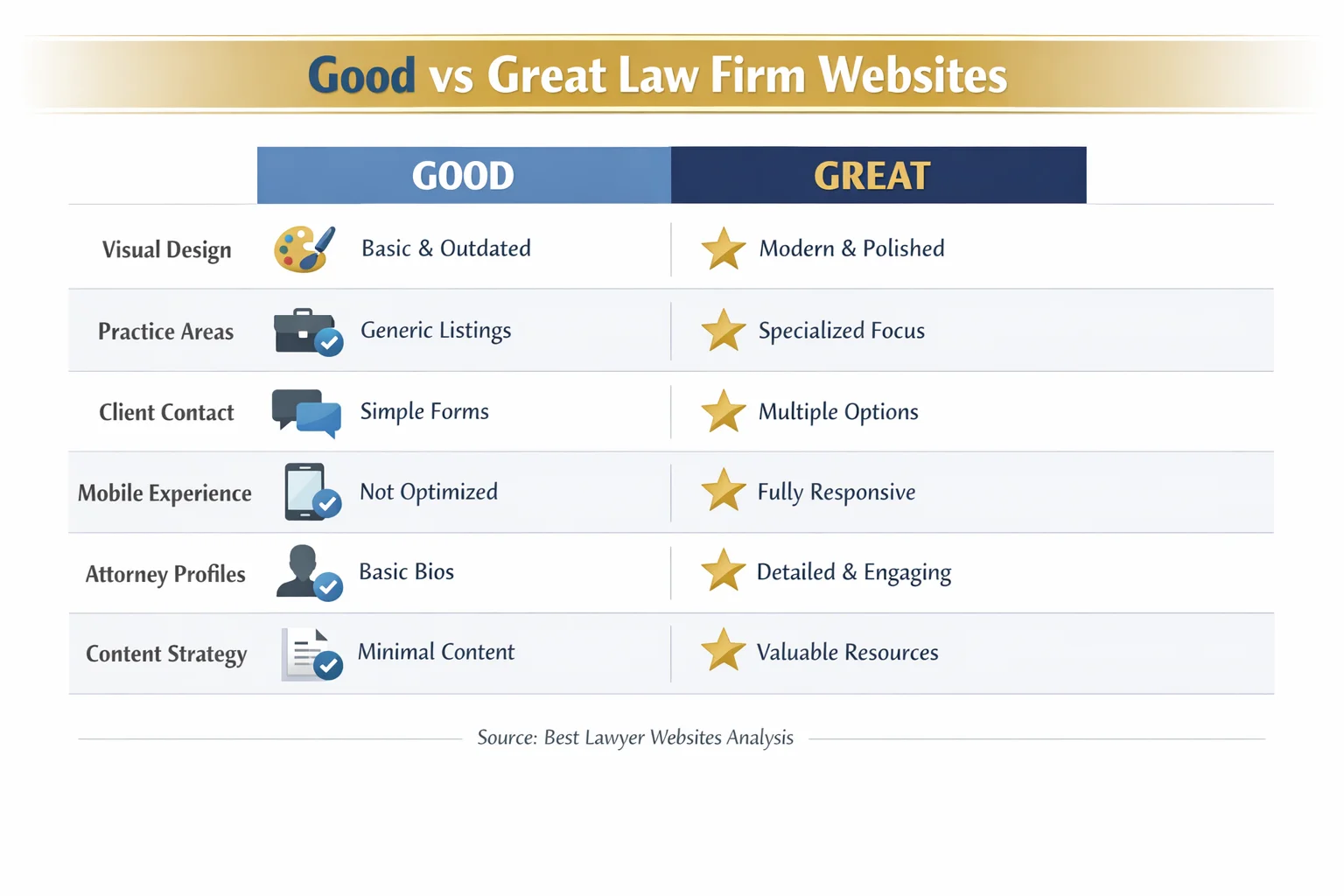
Good vs. Great: What the Best Law Firm Websites Get Right
There's a meaningful difference between a law firm website that works and one that wins — and that gap is wider than most attorneys realize.
A good law firm website covers the fundamentals: clean, professional design; mobile responsiveness; clearly organized practice area pages; attorney bios; and basic contact information. These elements matter, and firms that neglect them are at a serious disadvantage. But here's the uncomfortable truth — in today's market, nailing the fundamentals earns you a seat at the table, nothing more. Visitors have seen hundreds of professional websites. A clean layout and a contact form no longer inspire confidence on their own.
Great law firm websites do something fundamentally different: they treat the site as a 24/7 intake team member, not a static brochure. They anticipate the questions a frightened, overwhelmed, or time-pressed potential client is likely to ask — and they answer those questions before the visitor even thinks to ask them. They have a distinct personality that reflects the firm's values and the people behind it. They use interactive features that give visitors something useful to do, not just read.
One of the clearest signals of a mediocre legal website is the combination of cookie-cutter templates and generic stock photography. Today's clients are digitally sophisticated — they can spot a staged courtroom handshake photo or a recycled template layout instantly, and it erodes trust before a single word of copy is read.
The bar is also rising fast. Law firm websites across the board are improving year over year, which means standing still is effectively moving backward. What impressed clients three years ago is now expected. What impresses them today requires intention, creativity, and a genuine commitment to putting their needs first.
The Hero Section That Builds Trust Before You Scroll

You have approximately three seconds to make a first impression. That's not a metaphor — it's the reality of how quickly a visitor decides whether to stay on your website or hit the back button. The hero section, that first full-screen moment before anyone scrolls, is where that decision gets made.
The best law firm websites use this prime real estate with surgical precision. In a single glance, a visitor should understand who the firm helps, what it does, and why it can be trusted. Firms that nail this trifecta don't just reduce bounce rates — they start building a relationship before a single word of body copy is read.
Real photography is non-negotiable at this level. The top-performing legal websites feature genuine images of their attorneys, their offices, and sometimes their communities. Visitors connect with faces, not stock models in generic suits. Authentic imagery signals authenticity in everything else — including how the firm will treat its clients.
Equally important is the value proposition. The best hero sections don't open with the firm's name and founding year. They open with a statement that speaks directly to the visitor's situation — their fear, their goal, their need for resolution.
Social proof placed directly in the hero area — a notable case result, a client count, years of combined experience — dramatically increases the signal of credibility right where it matters most.
Finally, resist the temptation to include multiple calls to action. The strongest hero sections guide visitors toward one clear next step. Two competing buttons create hesitation. One confident prompt creates momentum.
Interactive Features That Turn Visitors Into Clients

Static websites inform. The best law firm websites do something — and that distinction is increasingly what separates firms that generate consistent online leads from those that watch visitors leave without ever making contact.
The most innovative legal websites have moved well beyond contact forms and practice area pages. They now include tools that deliver immediate, tangible value: disability benefit calculators that give veterans or injured workers a real-time estimate of what they may be owed, case evaluation quizzes that help visitors understand whether they have a viable claim, and cost estimators that demystify what legal representation might actually look like for their situation. These aren't gimmicks — they're answers to the questions every potential client is already asking before they pick up the phone.
Self-service legal workflows represent another leap forward. Some firms have transformed notoriously complex processes — business formation, document filing, record clearing — into clean, step-by-step digital experiences that a visitor can begin on their own. This positions the firm as genuinely tech-forward, not just tech-adjacent, and signals that working with them will be efficient and modern from day one.
Client portals are quickly becoming an expectation rather than a differentiator. Secure document sharing, online payment options, and real-time case status tracking reduce the friction that frustrates clients and clogs up staff time. Firms that offer these features aren't just more convenient — they communicate that they respect their clients' time.
Transparent pricing pages deserve special mention. Legal costs are one of the primary sources of anxiety for people considering hiring an attorney. Firms that address this head-on — including interest-free payment plan options where applicable — build trust that competitors who hide their fees simply cannot match.
The strategic brilliance of these interactive elements is that they serve two goals simultaneously: they provide genuine value to the visitor and they qualify leads, capturing contact information from people who are already demonstrating real intent.
Client Trust Signals That Actually Move the Needle
Every attorney claims to deliver results. The firms that actually convert skeptical visitors into paying clients are the ones that prove it — and they do so strategically, not just on a single testimonials page buried three clicks deep.
Client testimonials and case studies are the most powerful trust signals available to a law firm website, but their impact depends almost entirely on placement and presentation. The best legal websites treat social proof as a thread woven through the entire user journey — appearing in the hero section, alongside practice area descriptions, near contact forms, and at every other moment where a visitor's confidence might waver. Reserving testimonials for a dedicated page that most visitors never find is one of the most common and costly mistakes in legal web design.
Specificity is what separates persuasive social proof from forgettable noise. A testimonial that says "great lawyer, highly recommend" does almost nothing. A testimonial that describes a specific fear, a specific outcome, and a specific feeling of relief does a great deal. The same principle applies to case results — a "$2.3 million settlement for a construction accident victim" is exponentially more compelling than "we've recovered millions for our clients."
Third-party validation adds another credibility layer that self-reported claims simply can't replicate. Bar association memberships, peer-reviewed awards, media mentions, and recognizable "as seen in" logos signal that outside authorities have independently vetted the firm's reputation.
Video testimonials deserve particular attention. For practice areas involving personal, emotional, or high-stakes legal matters — family law, criminal defense, personal injury — a real client speaking directly to camera creates a level of trust that text alone cannot achieve. Visitors see authenticity, hear emotion, and connect in ways that written words rarely produce.
Design Patterns by Practice Area: One Size Does Not Fit All
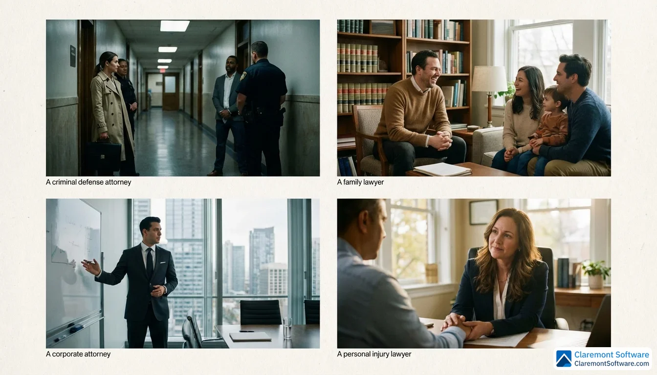
A law firm's website isn't a one-size-fits-all product — and the firms that treat it like one are leaving serious opportunity on the table. The design choices, messaging tone, and conversion strategies that work brilliantly for a personal injury practice can actively undermine a corporate law firm's credibility, and vice versa. The best legal websites are built with a clear understanding of who the visitor is, what emotional state they're arriving in, and what they need to feel confident enough to make contact.
Personal injury websites perform best when they lead with empathy and back it up with evidence. Visitors are often in pain, frightened, and uncertain — bold messaging that acknowledges their situation, paired with prominent case results and clear urgency-driven calls to action, meets them where they are. This is not the place for understated design.
Family law and immigration websites call for a warmer, more reassuring visual language. Softer color palettes, approachable photography, and copy that prioritizes emotional safety over legal jargon help visitors feel understood rather than processed. Multilingual options aren't just a nice touch here — for immigration practices especially, they're often the difference between a visitor staying or leaving.
Criminal defense websites operate under a different kind of urgency. Someone searching for a criminal defense attorney at 11 p.m. on a Saturday needs to know immediately that help is available. Prominent 24/7 contact options, fast-loading mobile pages, and direct, no-nonsense messaging are non-negotiable.
Corporate and business law websites should project sophistication and intellectual authority. Thought leadership content, industry-specific expertise, and polished design signal that the firm understands the world their clients operate in.
Solo and small firm websites have a genuine competitive advantage that larger firms can't easily replicate: authenticity. Leaning into personal branding, niche expertise, and real storytelling can make a one-attorney practice feel more trustworthy than a faceless 200-lawyer operation.
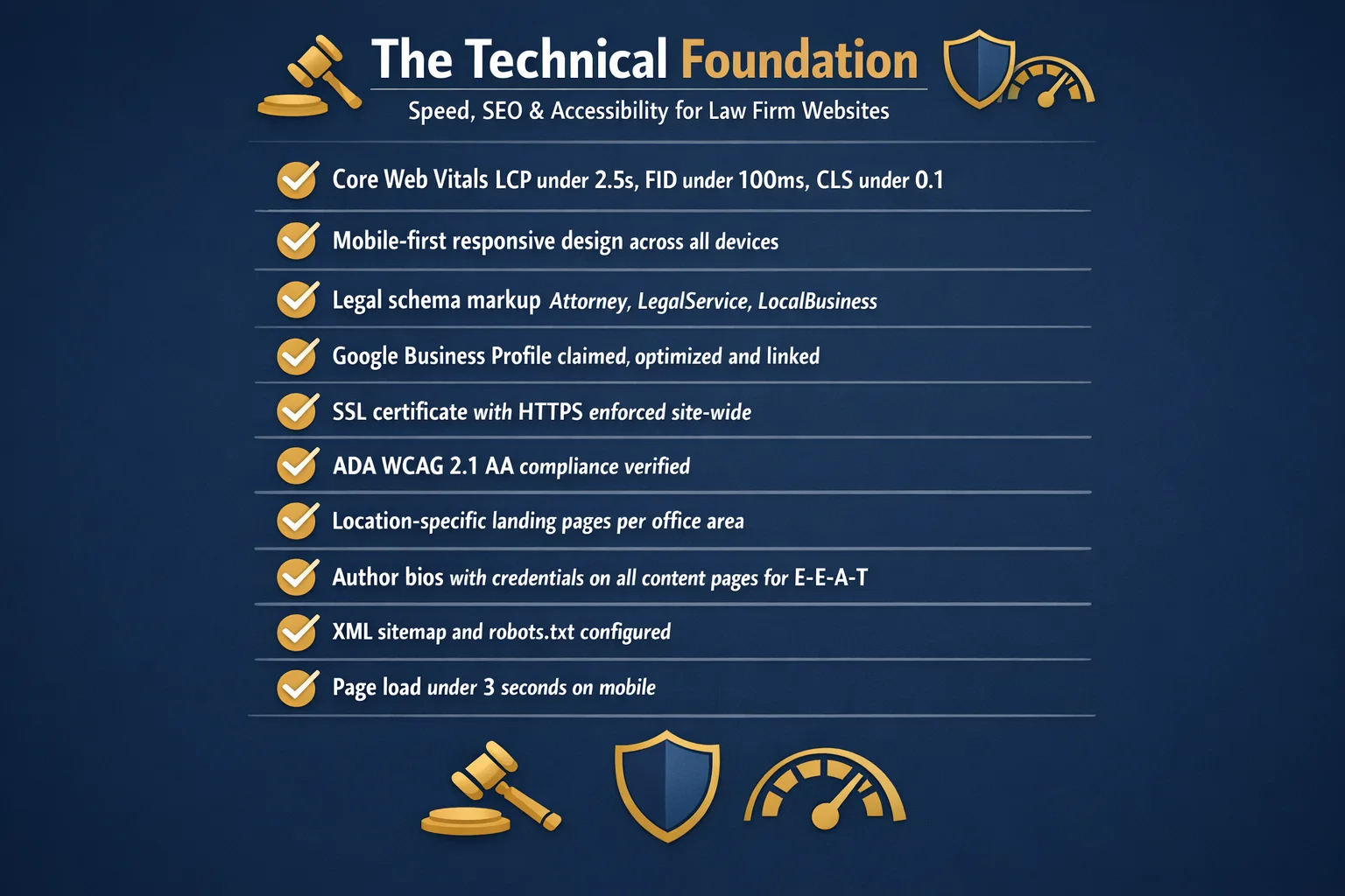
The Technical Foundation: Speed, SEO, and Accessibility
A beautifully designed law firm website means nothing if it takes six seconds to load, doesn't show up in local search results, or turns away visitors with disabilities. The technical foundation beneath your site is what determines whether all that investment in design and content actually reaches the people it's meant to serve.
Page speed isn't a nice-to-have — it's a client retention issue. Google's Core Web Vitals measure how quickly your pages load, how stable they are as they render, and how responsive they feel to user input. Poor scores hurt your search rankings and, more immediately, cost you visitors. A potential client who just experienced a car accident or received a frightening legal notice will not wait for a slow page to load. They'll hit the back button and call your competitor.
Local SEO is equally critical for the vast majority of law firms targeting clients in specific geographic markets. This means fully optimizing your Google Business Profile, building location-specific landing pages for every market you serve, and implementing legal schema markup — structured data that helps search engines understand your practice areas, attorney credentials, and office locations. These aren't advanced tactics; they're baseline requirements for visibility.
Accessibility is where many law firms face an uncomfortable irony. Websites that fail to meet ADA and WCAG compliance standards — through missing alt text, poor color contrast, or keyboard navigation issues — expose the firm to the very kind of legal liability they help clients avoid. Beyond the legal risk, accessibility is simply the right standard to hold yourself to.
Google's E-E-A-T framework (Experience, Expertise, Authoritativeness, Trustworthiness) carries particular weight for legal content, which Google classifies as a "Your Money or Your Life" topic. Detailed attorney bios with credentials, bar admissions, and published work aren't optional flourishes — they're signals that influence how your content ranks.
Finally, SSL certificates, encrypted contact forms, and clearly posted privacy policies are non-negotiable for any site where visitors share sensitive personal information. Clients need to trust your website before they'll trust you with their case.
DIY Website Builders vs. Custom Design: Choosing the Right Path
The decision between a DIY website builder and a custom-designed site is one of the most consequential choices a law firm makes — and the right answer isn't the same for every practice.
Template-based platforms and legal website builders offer a genuinely viable starting point for solo attorneys and small firms. Costs typically range from a few hundred to a few thousand dollars, and modern builders have improved dramatically in recent years. For a newly launched practice or a firm in a low-competition market, a well-configured template can cover the fundamentals without draining a limited marketing budget.
Custom design agencies specializing in legal websites operate at a different level — and a different price point. Expect to invest anywhere from $5,000 to $30,000 or more depending on scope, functionality, and the agency's track record. What you're buying isn't just aesthetics; it's a site architected around your specific practice area, client base, and competitive landscape. For firms in high-stakes markets where the website is a primary driver of client acquisition, that investment typically pays for itself.
If you're leaning toward the custom route, that's exactly the work our law firm web design team does — sites architected for a specific practice area and market, then paired with law firm SEO so the design actually gets found.
The honest framework for choosing: consider your firm size, your budget, how competitive your local market is, and how much differentiation your website actually needs to do. A niche estate planning practice in a mid-sized city has different requirements than a personal injury firm competing in a major metro.
Regardless of which path you choose, the platform underneath your site matters enormously. It must support strong SEO optimization, fast load times, and content updates you can make without calling a developer every time. WordPress and Webflow remain popular choices for good reason.
Claremont Software offers tools specifically designed to help firms bridge this gap — delivering professional-grade functionality and customization without the cost and complexity of a full custom build.
What You Can Learn From These Leaders: Actionable Takeaways

The leaders profiled throughout this article didn't build exceptional websites by accident. They made deliberate choices, tested what worked, and kept the visitor's experience at the center of every decision. Here's how to translate those lessons into action for your own firm.
Start with an honest audit. Walk through your current website using the good-versus-great framework covered earlier in this article. Does your hero section immediately communicate who you help and why they should trust you? Are your trust signals woven throughout the site or buried on a page nobody visits? Are you offering any interactive tools, or is your site still functioning as a static brochure? Identifying the gaps is the first step toward closing them.
Pick one interactive feature and add it this quarter. You don't need to overhaul everything at once. A simple online scheduling tool, a streamlined intake form, or a cost estimator can meaningfully improve conversion rates without a full redesign. Start small, measure the impact, and build from there.
Invest in real photography. This is one of the highest-return improvements any firm can make. Authentic images of your team, your office, and your community signal credibility in ways that stock photos simply cannot.
Review your site on a phone first. The majority of potential legal clients begin their search on a mobile device — often in a stressful moment when they need help fast. If your mobile experience is slow, cluttered, or hard to navigate, you're losing clients before they ever read a word.
Finally, set up proper analytics tracking. You cannot improve what you don't measure. Know where your visitors come from, which pages they spend time on, and where they drop off before contacting you.
Conclusion
The best lawyer websites share a common blueprint: they're built around the client's experience, not the firm's ego. They load fast, communicate clearly, and give visitors a reason to stay — and a reason to call. But what truly separates the leaders from the rest is a willingness to go beyond the digital brochure and create something that actively works to convert interest into consultations.
The gap between good and great comes down to three things: interactivity, authenticity, and intention. Firms that embrace all three don't just have better websites — they have a measurable competitive advantage that compounds over time.
For solo attorneys and smaller practices, our website design for small law firms applies these same patterns at a small-firm budget.
The encouraging reality is that every firm, regardless of size or budget, can move meaningfully in this direction. Start with the fundamentals. Fix what's broken. Then layer in the features — the real photography, the interactive tools, the trust signals — that match your practice area and your clients' expectations.
Your website is your most tireless employee. It works every hour of every day, making first impressions and starting conversations on your behalf. Make sure it's saying exactly what you'd want it to say — and doing everything you'd want it to do.
Frequently Asked Questions
What makes a law firm website great versus just good?
A good law firm website covers the fundamentals: clean design, mobile responsiveness, clear practice area pages, and basic contact information. A great website goes further by treating the site as a 24/7 intake team member rather than a static brochure. Great sites use authentic photography, client-centric content that anticipates questions before they're asked, and interactive features like cost calculators, case evaluation tools, and online scheduling. They weave social proof — testimonials, case results, and third-party credentials — throughout the entire user journey, not just on a single page. In short, great websites don't just inform visitors; they actively build trust and convert them into consultations.
How much does it cost to design a professional law firm website?
The cost of a professional law firm website varies widely depending on the approach. Template-based website builders offer affordable entry points for solo attorneys and small firms, typically ranging from a few hundred to a few thousand dollars. Custom design agencies that specialize in legal websites deliver unique branding and advanced functionality but generally cost between $5,000 and $30,000 or more, depending on the scope and complexity of the project. The right investment depends on your firm's size, budget, practice area competitiveness, and how much your site needs to stand out from local competitors. Regardless of budget, the platform you choose must support SEO optimization, fast loading speeds, and easy content updates.
What features should every lawyer website include?
Every lawyer website should include clear practice area pages, an easy-to-find contact form, a mobile-responsive design, and an SSL certificate for security. Beyond those basics, high-performing sites also feature authentic attorney bios with credentials, client testimonials or case results, a blog or resource section to support SEO, and a prominent call to action on every page. Increasingly, the best sites also offer interactive features such as online intake forms, appointment scheduling tools, and transparent pricing information. A privacy policy and accessible design that meets WCAG standards are also essential — both for user trust and to reduce legal risk for the firm itself.
How important is mobile responsiveness for a law firm website?
Mobile responsiveness is critical. The majority of potential legal clients begin their search on a smartphone, meaning a site that performs poorly on mobile will lose those visitors almost immediately. Beyond user experience, Google uses mobile-first indexing, so a site that isn't optimized for mobile will rank lower in search results — directly impacting how many prospective clients even find your firm. Page speed and Core Web Vitals, which are heavily influenced by mobile performance, are now direct ranking factors. For practice areas like criminal defense, where clients may be searching urgently from a phone, fast-loading and easy-to-navigate mobile pages can be the difference between winning and losing a client.
Can a solo attorney's website compete with large firm websites?
Absolutely. Solo and small firm websites can compete effectively with larger firms by leaning into advantages that big firms often can't replicate: lawyer branding, niche expertise, and authentic storytelling. A potential client searching for a specific type of legal help in a specific city doesn't necessarily want the biggest firm — they want someone they can trust and relate to. A well-optimized local SEO strategy, genuine attorney photography, compelling client testimonials, and a clear niche focus can make a solo attorney's site outperform a large firm's generic, corporate-feeling website. Tools like Claremont Software also help smaller firms access professional-grade website functionality without enterprise-level budgets.
What are the biggest mistakes law firms make with their websites?
The most common mistakes include relying on cookie-cutter templates and generic stock photography that clients can spot instantly, cluttering the homepage with too many competing calls to action, and burying contact information where it's hard to find. Many firms also treat their website as a static brochure rather than an active client acquisition tool, neglecting to update content, add fresh testimonials, or track performance with analytics. Other frequent missteps include ignoring mobile optimization, skipping local SEO fundamentals like location-specific pages and Google Business Profile integration, and failing to meet basic accessibility standards — which can expose the firm to its own legal liability.
How do I know if my law firm website needs a redesign?
Several warning signs indicate it's time for a redesign. If your site loads slowly, looks outdated on mobile, or hasn't been updated in more than two to three years, it's likely hurting rather than helping your practice. Other red flags include a high bounce rate, few or no leads generated through the site, no SSL certificate, missing or thin practice area content, and a lack of client testimonials or case results. You should also audit whether your site meets current accessibility standards and whether it reflects your firm's current branding and focus areas. If your competitors' websites feel significantly more modern and trustworthy than yours, that perception gap is costing you clients.
Are there ethics rules that affect what I can put on my law firm website?
Yes. Attorney advertising is regulated by state bar associations, and the rules vary by jurisdiction. Common restrictions govern how you describe your services, what claims you can make about results, and how you use terms like 'specialist' or 'expert.' For example, the California State Bar has specific ethics guidelines addressing law firm websites, including rules around 'Best Lawyer' claims and superlatives. Most states require disclaimers clarifying that website content does not constitute legal advice and that past results do not guarantee future outcomes. Before publishing testimonials, case results, or any comparative claims, attorneys should review their state bar's advertising rules carefully to ensure full compliance.