
Your law firm's website isn't a digital brochure — it's your highest-performing intake specialist, working 24/7 to convert strangers into signed clients.
That first impression happens fast. Research consistently shows that potential clients form judgments about your firm within seconds of landing on your site — and if what they find doesn't immediately signal trust, clarity, and competence, they're gone. Back to Google. Straight to your competitor.
The gap between a good law firm website and a great one has never been wider. In 2026, the firms winning online aren't just publishing clean pages with practice area descriptions and a contact form. They're deploying interactive tools, AI-powered intake flows, client portals, and conversion-optimized content strategies that turn passive browsers into booked consultations.
This showcase breaks down 25 of the best law firm websites in 2026 — analyzing the exact design patterns, technical foundations, and conversion strategies that make them exceptional. More importantly, it translates those lessons into actionable blueprints you can apply to your own site, regardless of your firm's size, budget, or practice area.
Whether you're a solo practitioner or managing a multi-office practice, what you're about to see will permanently change how you think about your online presence.
How We Evaluated the Best Law Firm Websites in 2026
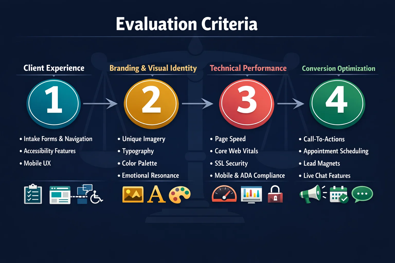
Not every law firm website earns a spot in this showcase. To separate genuine leaders from the merely adequate, we evaluated each site against four core pillars: client experience, branding and visual identity, technical performance, and conversion optimization. A site had to demonstrate strength across all four — not just one or two — to make the cut.
Client experience examined how intuitively a visitor could navigate from first landing to booking a consultation. Branding and visual identity assessed whether the firm's personality, niche, and values came through immediately and consistently. Technical performance covered page speed, Core Web Vitals, mobile responsiveness, and accessibility compliance. Conversion optimization looked at whether the site actively moved visitors toward action — or simply presented information and hoped for the best.
Critically, we prioritized sites that go beyond informing visitors. In 2026, the baseline expectation is a clean, functional website. What separates leaders is interaction — calculators, scheduling tools, client portals, and personalized content that engage visitors rather than just educate them.
Functionality, marketing integration, and SEO execution are now table stakes. Differentiation comes from how intelligently a firm uses technology to reduce friction at every step of the client journey.
To ensure these lessons apply broadly, we assessed sites across firm sizes — solo practitioners, small boutiques, mid-size practices, and large multi-office firms — and across practice areas including personal injury, family law, immigration, criminal defense, environmental law, tribal law, fintech, and corporate law.
Good vs. Great: What the Best Law Firm Websites Get Right in 2026

There's a meaningful difference between a law firm website that exists and one that works. In 2026, that gap has never been wider — and the firms on the wrong side of it are losing clients they never even knew visited.
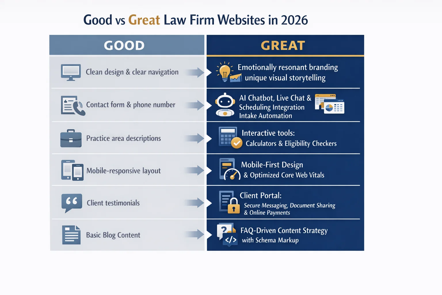
Good law firm websites have mastered the fundamentals. Clean, professional design. Clear practice area pages. Mobile responsiveness. A contact form that actually functions. These elements are no longer differentiators — they're the price of admission. Any firm still treating these basics as achievements is already behind.
Great law firm websites go further. They transform passive browsing into active engagement through tools that deliver immediate value: disability benefit calculators that give veterans personalized estimates, online company registration workflows that turn complex legal processes into self-service experiences, and transparent pricing pages with flat fees and interest-free payment plans that eliminate the anxiety of the unknown.
Client portals have emerged as a defining feature of top-performing legal websites — enabling secure document sharing, real-time case updates, and online payments without a phone call or a trip to the office. These aren't just operational conveniences; they're conversion signals that tell prospective clients this firm operates like a modern business.
The single biggest trend separating leaders from laggards is the shift from static content to dynamic, tool-driven experiences. A page that explains what a firm does informs. A tool that shows a visitor what their case might be worth, or walks them through their eligibility for record clearing, engages — and engaged visitors become clients.
The data backs this up. According to Clio's Legal Trends Report, firms that adopt AI-first client strategies are achieving 4x faster growth than those that don't — a gap that will only widen as AI-powered intake, personalization, and client communication become standard expectations rather than competitive advantages.
25 Best Law Firm Websites: The Complete 2026 Showcase
What follows isn't a gallery of pretty homepages. Every site in this showcase was selected because it does something specific and measurable to convert visitors into clients — and because the strategy behind it is one you can study, adapt, and apply to your own firm regardless of size, budget, or practice area.
Each entry is presented with three things in mind: what makes it exceptional, the specific design pattern or conversion strategy it exemplifies, and a key takeaway you can act on immediately. Think of it less as a list and more as a field guide to the decisions that separate high-performing legal websites from forgettable ones.
The showcase deliberately spans the full spectrum of legal practice — solo attorneys, boutique firms, mid-size regional practices, and large international firms — because great design isn't a privilege reserved for firms with enterprise budgets. It scales. The underlying principles that make a solo practitioner's site convert at a high rate are the same ones powering the most sophisticated large-firm experiences.
Practice areas represented include personal injury, family law, immigration, criminal defense, environmental law, tribal law, fintech, and corporate law — proof that these strategies aren't niche. They're universal.
The Hero Section That Sells Before You Scroll
The moment a visitor lands on your site, the clock starts. Research consistently shows that first impressions form in under three seconds — which means your hero section isn't just a design choice, it's your opening argument.
The best-performing hero sections do three things simultaneously, all above the fold: they state a clear, specific value proposition (not "experienced attorneys" — something that actually differentiates), pair it with an emotionally compelling image or video, and present a single, unmissable call-to-action. Remove any one of those three elements and conversion rates drop.
Some of the most memorable examples in this showcase take genuine creative risks. One environmental law firm greets visitors with the image of a rhinoceros balanced on a tightrope — an arresting, unexpected visual that communicates the firm's niche and its stakes before a single word is read. That kind of creative courage is rare in legal marketing, and it pays off in memorability.
Firms serving specific communities — tribal nations, veterans, immigrant families — use their hero sections to signal belonging. Culturally resonant imagery and language that speaks directly to a community's experience communicates something no credential can: we understand you.
Perhaps the highest-impact tactical lesson here is the embedded intake form. Hero sections that place a "Free Case Evaluation" form or scheduling widget directly in the fold — no extra click required — consistently outperform those that route visitors to a separate contact page. Every additional step is an exit opportunity.
Interactive Tools That Do the Selling for You
The most powerful sales tool on your website isn't your attorney bio or your case results page — it's the moment a visitor stops reading and starts doing.
Interactive tools create that moment. And the firms that have built them into their websites aren't just offering a better user experience — they're running a fundamentally different kind of intake operation.
Consider a veterans-focused disability law firm that replaced its standard "contact us" page with a personalized benefit calculator. Visitors input their service history and disability rating, and the tool returns an estimated monthly benefit figure — a number that's immediately meaningful and personal. That single feature transforms a passive browsing session into an engaged, emotionally invested interaction. By the time the visitor reaches the consultation booking prompt, they're not a cold lead. They're someone who already knows what's at stake.
A fintech-focused legal practice takes a different approach, offering an online company registration workflow directly through the site. What would otherwise require multiple attorney touchpoints becomes a guided self-service process — dramatically reducing the friction that causes prospective clients to abandon the journey entirely.
A criminal defense firm goes further still, deploying proprietary software that helps visitors assess their eligibility for record clearing, paired with transparent flat-fee pricing and interest-free monthly payment options displayed upfront.
The pattern across all three: interactive tools give first, then ask. They deliver genuine value before requesting contact information — which is precisely why they convert so well.
Client Portals and Payment Integration That Build Trust
The pattern established by interactive tools — give value first, then ask — extends naturally into what happens after a visitor decides they're interested. And this is where client portals and payment integration have quietly become some of the most persuasive conversion assets on a law firm's website.
Leading firms now surface their secure client portals directly on their websites, not buried in a separate app or mentioned only in the engagement letter. Visitors can see, before they ever sign anything, that this firm offers encrypted document sharing, real-time case updates, and direct communication channels. That visibility matters. It signals professionalism and technological competence at exactly the moment a prospective client is deciding whether to trust you with their most sensitive problems.
The same logic applies to online payment integration. When billing is frictionless — accessible through the same site where a client first found you, not hidden behind a separate login they'll inevitably forget — it positions the firm as genuinely client-centric rather than operationally convenient for itself.
Perhaps the most significant shift, though, is the rise of transparent pricing pages. Once considered professionally taboo, flat-fee disclosures, payment plan structures, and cost estimators are now a competitive advantage. Visitors who find pricing information readily available are more likely to book — not less — because transparency eliminates the anxiety of the unknown.
Collectively, these features do double duty: they improve the experience for existing clients and convert undecided visitors by demonstrating, before a single conversation, that this firm operates with openness and respect for the client's time and money.
Branding That Breaks the Mold: Visual Identity Lessons from Top Sites
Walk into any law firm's office built before 2010 and you'll likely find the same visual vocabulary: navy walls, framed diplomas, mahogany furniture, and somewhere — inevitably — a set of brass scales. That aesthetic communicated authority for decades. On a website in 2026, it communicates something else entirely: that you haven't been paying attention.
The best law firm websites have abandoned that inherited visual language in favor of something far more intentional. Bold, unexpected color palettes — deep forest greens, warm terracottas, high-contrast blacks — replace the default navy-and-gold combination that makes every firm look interchangeable. Custom illustrations and cinematic photography replace stock images of gavels and handshakes that visitors have learned to mentally filter out.
Niche-focused firms are particularly effective at using visual storytelling as instant positioning. An environmental practice that leads with sweeping nature photography communicates its mission before a single word is read. An immigration firm that features diverse, real-community imagery signals cultural fluency that no tagline could replicate as efficiently. Family law practices that use warm, human photography — rather than formal courtroom imagery — immediately lower a visitor's emotional guard at a moment when they're likely already stressed.
Typography is doing more work than most firms realize. The shift toward modern sans-serif fonts and generous whitespace projects clarity and confidence — qualities clients desperately want in an attorney — rather than the stuffiness that dense serif text in narrow columns tends to evoke.
Critically, the strongest visual identities don't live only on the homepage. They carry through every page consistently — attorney bios, blog posts, practice area pages — creating a subconscious coherence that accumulates into trust.
Solo and Small Firm Websites That Compete with Big Law
There's a persistent myth in legal marketing that a polished, high-converting website requires a six-figure budget and a team of enterprise developers. The best solo and small firm sites in 2026 are quietly dismantling that assumption.
Platforms and templates built specifically for attorneys have matured dramatically, giving solo practitioners access to design quality that would have required custom agency work just a few years ago. The result: small firms are showing up online with the same visual polish as firms ten times their size — without the overhead.
But the smartest small firm sites don't try to look like big firms. They lean into what large practices genuinely cannot offer: direct attorney access, personal attention, and deep community roots. Where a 500-attorney firm's homepage inevitably feels institutional, a solo practitioner's site can feel like a conversation. That intimacy is a feature, not a limitation — and the best small firm sites frame it exactly that way.
Emotional connection is where small firms consistently outperform. Authentic client testimonials, honest attorney story pages, and case results (where bar rules permit) create the kind of human resonance that no corporate brand guidelines document can manufacture.
The single most effective equalizer, though, is investing in one standout interactive feature — a consultation cost estimator, a case eligibility quiz, or a self-service scheduling tool. A visitor who engages with a well-built calculator doesn't know or care how many attorneys are on your payroll. They know you gave them something useful. That's what gets them to book.
Large Firm Websites That Still Feel Personal
Scale changes everything — and not always for the better. A firm with 2,200 attorneys practicing across 250 areas of law has an extraordinary story to tell. It also has an extraordinary opportunity to overwhelm, confuse, and ultimately lose the visitor who arrived looking for a straightforward answer to a specific legal problem. This is the corporate maze effect, and it's the defining challenge of large firm web design in 2026.
The firms navigating it best have invested heavily in intelligent navigation architecture. Rather than forcing visitors to scroll through exhaustive dropdown menus, top large firm sites deploy practice area filtering, attorney search tools sortable by specialty and geography, and personalized content recommendations that surface relevant resources based on browsing behavior. The goal is simple: get every visitor to the right attorney, in the right practice area, in as few clicks as possible.
Thought leadership content has become another powerful equalizer — and a dual-purpose one. White papers, industry reports, and on-demand webinars drive organic search traffic while simultaneously demonstrating the depth of expertise that justifies a large firm's premium positioning. Visitors who consume this content before reaching out arrive pre-qualified and pre-convinced.
The subtler achievement of the best large firm sites, though, is preserving humanity at scale. Attorney video introductions, team culture pages, and community involvement spotlights remind visitors that behind the rankings, the global offices, and the Chambers USA accolades are actual people who care about outcomes. Institutional credibility earns the click. Human connection earns the call.
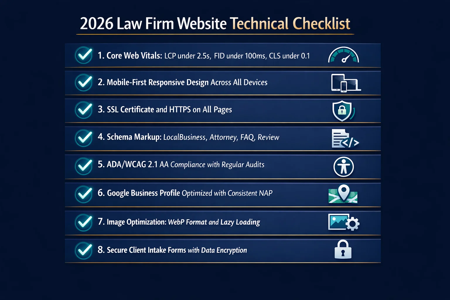
The Technical Foundation: Speed, SEO, and Accessibility
A beautifully designed law firm website that takes eight seconds to load on a mobile connection isn't a competitive asset — it's a waiting room nobody stays in. In 2026, technical performance isn't a back-end concern for developers to sort out after launch. It's a front-line business issue that directly determines how many potential clients you keep and how many you hand to a faster competitor.
Page speed and Core Web Vitals are the foundation everything else rests on. The majority of legal searches now originate on mobile devices, often from people in stressful, time-sensitive situations who will not wait. A site that fails Google's Core Web Vitals thresholds doesn't just frustrate visitors — it ranks lower, gets seen less, and converts worse across every metric that matters.
For firms serving specific geographic markets, local SEO integration is equally non-negotiable. Google Business Profile optimization, location-specific schema markup, and consistent NAP (name, address, phone) data across every directory aren't optional enhancements — they're the infrastructure that determines whether your firm appears when someone nearby searches for exactly what you offer.
Structured data markup — attorney schema, FAQ schema, local business schema — gives search engines the context they need to surface your site with rich snippets and knowledge panels, earning more real estate on results pages without requiring an additional click.
Then there's accessibility. ADA and WCAG compliance carries a particular irony for law firms that ignore it: failing to make your own website accessible creates legal exposure while simultaneously suppressing your search rankings. The best sites treat accessibility as a design standard, not an afterthought.
Finally, mobile-first design means exactly what it says. The best sites are built for phone screens and scaled up — not the reverse.
Conversion-Focused Content Strategies That Drive Client Inquiries

The most technically flawless website in the world still fails if the words on it don't connect with the person reading them. Content strategy is where the best law firm websites quietly separate themselves — not through volume, but through precision.
FAQ sections built directly from real intake questions are one of the highest-leverage content investments a firm can make. When your intake team hears the same question for the hundredth time, that question belongs on your website. These sections reduce bounce rates by answering objections before they form, and they consistently capture featured snippet positions in search results — putting your firm's answer at the very top of the page, above every competitor.
Practice area landing pages perform best when they lead with the client's pain point, not the firm's credentials. A visitor landing on your criminal defense page isn't thinking about your bar admissions — they're scared. Structure your content around their problem first, agitate the stakes, then present your firm as the solution. This problem-agitation-solution framework converts significantly better than the traditional credential-first approach.
Video content is the most underutilized asset on most law firm websites. Short attorney introduction videos and authentic client testimonial clips dramatically increase time on site and consultation booking rates — because they do something text alone cannot: they make the attorney feel like a real person before the first phone call.
Long-tail blog content — targeting searches like "how much does a divorce cost in [state]" — attracts high-intent visitors who are actively researching and close to making a hiring decision.
Finally, downloadable resources (guides, checklists, cost estimators) function as lead magnets that capture contact information while delivering genuine value — turning a single visit into an ongoing relationship.
What You Can Learn from These Leaders: Actionable Takeaways
The 25 websites in this showcase aren't just inspiration — they're a diagnostic tool. Use them to hold your own site accountable.
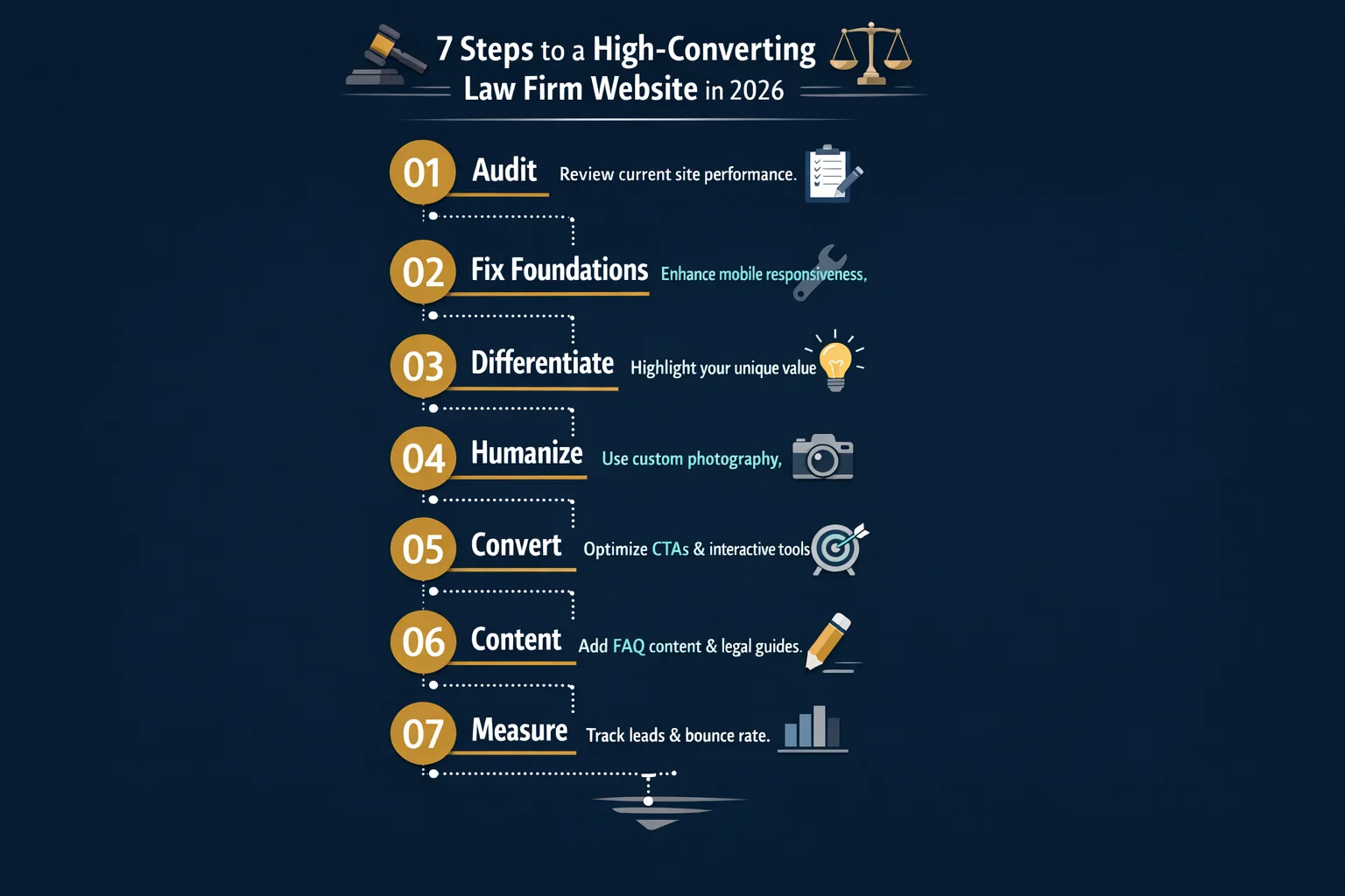
Start with an honest audit across the four pillars: client experience, branding, technical performance, and conversion optimization. Most firms have one area that's quietly costing them clients every week. Maybe your mobile experience is clunky, your hero section buries the call-to-action, or your practice area pages read like credential lists rather than client conversations. Identify your weakest pillar first and fix that before adding anything new.
Add at least one interactive element to your site. It doesn't need to be sophisticated — a simple case evaluation quiz or consultation cost estimator is enough to separate your site from the sea of static, cookie-cutter competitors. Interactive tools do two things simultaneously: they give visitors immediate value, and they qualify leads for you. That combination is difficult to replicate with any other single investment.
Replace stock photography with real images. Gavels, scales of justice, and empty courtroom columns signal nothing except that your firm looks like every other firm. Professional photography of your actual attorneys, your office, and your community creates the kind of subconscious trust that stock libraries simply cannot manufacture.
Implement client-facing technology that signals you run a modern practice. Online scheduling, a client portal, and integrated payment options aren't just conveniences — they're conversion signals that tell a prospective client you respect their time before they've signed anything.
Finally, build your content around your intake process. The questions your team answers on every initial call are the exact phrases potential clients are typing into Google. Answer them on your website, and you'll attract better-qualified visitors while your competitors wonder where their traffic went.
Conclusion
The 25 websites in this showcase share one defining characteristic: they treat every visitor as a potential client worth earning, not a passive reader to inform. That mindset shift — from digital brochure to active acquisition engine — is what separates firms that grow from firms that stagnate.
Interactive tools, client portals, and transparent pricing aren't luxuries reserved for firms with enterprise budgets. They're accessible to any practice willing to prioritize them. The same goes for the technical fundamentals — speed, mobile-first design, accessibility, and local SEO — that determine whether your site gets seen at all.
You don't need to rebuild everything at once. Start by auditing your current site against the four pillars in this guide. Find your biggest gap. Then make one meaningful improvement this month — a better hero section, a single interactive tool, real photography, or an FAQ page built from your actual intake questions.
Your future clients are already searching. The only question is whether your website is ready to answer them — or whether it's quietly sending them somewhere else.
Frequently Asked Questions
What makes a law firm website 'great' versus just 'good' in 2026?
A 'good' law firm website covers the basics: clean design, clear practice area pages, mobile responsiveness, and a contact form. These are now the minimum expectation — not a differentiator. A 'great' law firm website goes further by actively converting visitors through interactive tools (like benefit calculators or case evaluation quizzes), client portals for secure document sharing and communication, transparent pricing pages, and embedded scheduling widgets. Great sites are also technically excellent — fast-loading, accessible, and optimized for local SEO. The single biggest shift in 2026 is the move from static, informational websites to dynamic, tool-driven experiences that engage visitors, qualify leads, and reduce friction in the client journey — all before a single phone call is made.
How much does a professional law firm website cost to design and build?
The cost of a professional law firm website varies widely depending on the approach. Template-based website builders designed for attorneys can cost anywhere from a few hundred to a few thousand dollars per year, making them accessible for solo practitioners and small firms. Custom-designed websites built by a specialized legal web design agency typically range from $5,000 to $30,000 or more, depending on complexity, the number of pages, and advanced features like client portals or interactive tools. Ongoing costs — hosting, maintenance, SEO, and content updates — should also be factored into your budget. The key is matching your investment to your firm's growth goals: even a modest budget, spent strategically on the right features, can produce a high-converting site.
What are the most important features every law firm website needs?
Every law firm website should include: a clear, benefit-driven homepage hero section with a prominent call-to-action; dedicated practice area pages that speak to client pain points; an attorney bio page that builds personal trust; a mobile-responsive, fast-loading design that passes Core Web Vitals; and a frictionless contact or intake form. Beyond these fundamentals, high-performing sites in 2026 also feature online consultation scheduling, client testimonials or case results (where ethically permitted), an FAQ section built from real intake questions, local SEO elements like schema markup and Google Business Profile integration, and ADA/WCAG accessibility compliance. Adding at least one interactive tool — a cost estimator, eligibility quiz, or case evaluation form — can significantly boost conversion rates above the baseline.
Should I use a law firm website builder or hire a custom web design agency?
The right choice depends on your budget, timeline, and growth ambitions. Law firm website builders offer speed, affordability, and attorney-specific templates that can produce polished results without a large upfront investment — a strong option for solo practitioners and small firms getting started. Custom web design agencies deliver tailored branding, advanced functionality (like custom intake workflows or client portals), and a unique visual identity that stands out in competitive markets. If your firm is in a high-competition practice area or geographic market, a custom site often pays for itself through improved conversion rates. A practical middle ground: start with a quality attorney-focused builder to establish your online presence, then invest in a custom redesign as your firm grows and your needs become more sophisticated.
How can a solo attorney's website compete with large firm websites?
Solo attorneys have a genuine competitive advantage that large firms can't easily replicate: personal connection. The most effective solo attorney websites lean into this by featuring a compelling personal story, direct attorney access messaging, authentic photography, and genuine client testimonials. Rather than mimicking large firm aesthetics, the best solo sites emphasize what clients actually want — a real person who will handle their case. Strategically, adding one standout interactive feature (a consultation cost estimator, a case evaluation quiz, or self-service scheduling) can match or exceed the conversion rates of much larger competitors. Strong local SEO — including a fully optimized Google Business Profile and location-specific content — also levels the playing field significantly for solo practitioners targeting a defined geographic market.
What are the best interactive tools to add to a law firm website for lead generation?
Interactive tools are among the highest-ROI additions a law firm can make to its website. The most effective options include: consultation cost estimators or fee calculators that give visitors a personalized sense of what their case might cost; case evaluation quizzes that qualify leads while providing value; eligibility checkers (for areas like record clearing, disability benefits, or immigration status); and self-service consultation scheduling widgets embedded directly on the homepage. Online company registration workflows work well for business law practices, while disability benefit calculators are proven performers for veterans-focused firms. The key principle is that every interactive tool should provide genuine value to the visitor first — building trust and engagement — while simultaneously capturing lead information and moving the prospect toward booking a consultation.
How important is mobile responsiveness for law firm websites?
Mobile responsiveness is non-negotiable in 2026. The majority of legal searches now originate on mobile devices, meaning a website that performs poorly on a phone is actively losing potential clients. Beyond user experience, Google uses mobile-first indexing — so your site's mobile version is what determines your search rankings, not the desktop version. Core Web Vitals (loading speed, interactivity, and visual stability) are measured on mobile and directly impact both rankings and conversion rates. A slow or hard-to-navigate mobile experience causes visitors to bounce within seconds, often to a competitor's site. Best-in-class law firm websites are designed for phone screens first and scaled up to desktop — not the other way around. Mobile optimization is the technical foundation everything else is built upon.
What content should I prioritize on my law firm website to attract more clients?
Start with content that directly addresses what potential clients are already searching for. Practice area pages should lead with the client's problem — not the firm's credentials — and follow a clear problem-agitation-solution structure. An FAQ section built from real questions your intake team hears regularly serves double duty: it reduces visitor anxiety and captures featured snippet positions in search results. Blog content targeting long-tail keywords (such as 'how much does a divorce cost in [state]') attracts high-intent organic traffic from people close to hiring. Short attorney introduction videos and client testimonial clips dramatically increase time on site and consultation bookings. Downloadable resources — guides, checklists, or cost estimators — function as lead magnets that capture contact information while delivering genuine value. Prioritize content that answers real questions over content that simply promotes the firm.