
Your law firm's website isn't a digital brochure — it's your highest-performing employee, working 24/7 to convert strangers into signed clients. Yet most attorney websites fail at this job within the first five seconds.
Here's the uncomfortable truth: a potential client's first impression of your firm is almost always your website, and the majority of law firm sites look identical. Stock photos of gavels, walls of impenetrable legal jargon, contact information buried three clicks deep. They look like they were designed to impress other attorneys — not to earn the trust of someone who's scared, overwhelmed, and searching for help at midnight.
The good news? The gap between a forgettable attorney website and one that consistently generates consultations isn't about budget. It's about strategy.
This article breaks down the real patterns separating top-performing law firm websites from the ones collecting digital dust. We'll examine what works across practice areas and firm sizes, covering the design principles, conversion strategies, content frameworks, and critical mistakes that define the difference. Whether you're planning a full redesign or fine-tuning what you already have, you'll walk away with an actionable blueprint — not just inspiration.
What Makes a Great Attorney Website (It's Not What You Think)
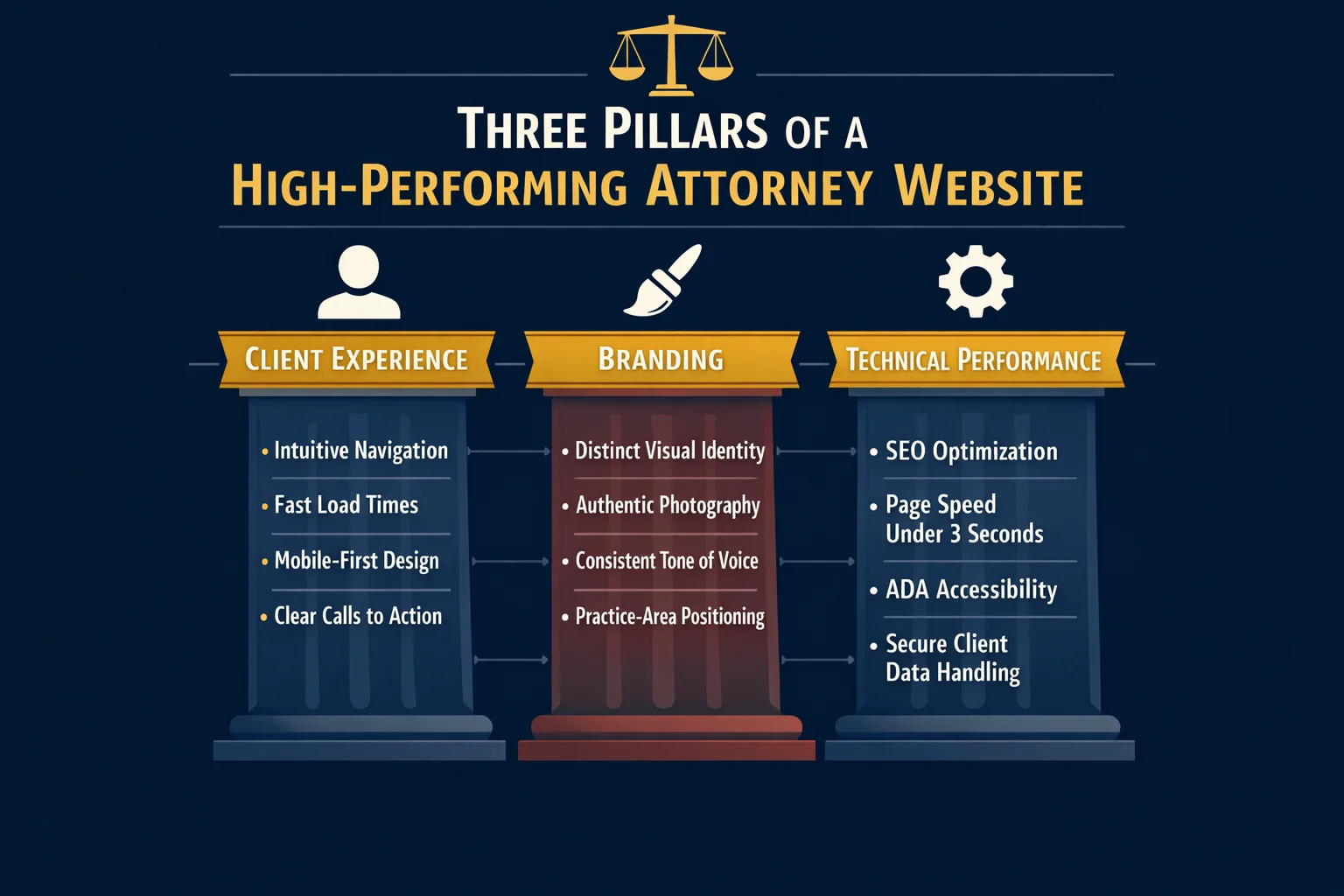
Most attorneys assume a great website is about aesthetics — a clean layout, a professional headshot, maybe a modern font. But the firms generating consistent consultations from their websites understand something different: a great attorney website is a system, not a design project.
Clio's evaluation framework captures this well. Top-performing law firm websites are judged across three distinct pillars: client experience, branding, and technical performance. The problem? Most firms pour their energy into branding alone — obsessing over color palettes and logo placement — while neglecting the experience a visitor actually has and the technical foundation that determines whether anyone finds the site in the first place.
Think about what a potential client is doing when they land on your website. They're scared, overwhelmed, or angry. They're searching for someone they can trust with something that matters enormously to them. A website that hides behind formal legal language, buries its contact information, and leads with the founding partner's biography is speaking entirely the wrong language at entirely the wrong moment.
The best attorney websites speak to the visitor's situation first — and the firm's credentials second. That shift in priority changes everything: the headline, the imagery, the page structure, and the calls to action all orient around the client's problem rather than the attorney's resume.
Cookie-cutter designs compound this problem. When every firm in a market uses the same template, the same stock gavel photo, and the same "experienced, aggressive, results-driven" tagline, none of them stand out. The firms that win online have a clear point of view, a distinct visual identity, and an intentional user journey that guides visitors from first impression to booked consultation.
That last phrase — intentional user journey — is where the gap between a good-looking website and a converting one becomes visible. Strategic calls to action, intuitive navigation, and content that answers the questions visitors are actually asking aren't design choices. They're business decisions. And they're what separates a website that works from one that simply exists.
Attorney Website Examples by Practice Area: Patterns That Win

Different practice areas attract clients in radically different emotional states — and the attorney websites that convert understand this at a fundamental level. A person searching for a criminal defense attorney at 11pm is experiencing something completely different from someone quietly researching divorce options during a lunch break. The best law firm websites are engineered around that emotional reality, not just the legal service being offered.
Personal injury websites lead with empathy and evidence in equal measure. The most effective examples open with bold hero sections that speak directly to the visitor's pain — not generic taglines about being "experienced advocates," but specific, outcome-oriented language like "We've recovered millions for injured families. Yours could be next." Case results are displayed prominently, often above the fold, because social proof is the currency of trust in this practice area. Strong testimonials, settlement figures (where ethically permitted), and clear no-fee-unless-you-win messaging remove the financial hesitation that stops injured clients from reaching out.
Family law websites take a deliberately different approach. The emotional register here is grief, anxiety, and vulnerability — and the best sites reflect that with calming color palettes (soft blues, warm neutrals), compassionate language that avoids adversarial framing, and frictionless consultation booking that respects the visitor's need for privacy. The goal isn't to impress; it's to reassure.
Criminal defense sites operate at the opposite end of the urgency spectrum. Dark, authoritative color schemes, phone numbers displayed in large type at the very top of the page, and prominent "available 24/7" messaging signal to a panicked visitor that help is immediate and accessible. Every design choice communicates: we answer when you call.
Immigration law websites face a unique trust challenge — serving clients who may be navigating an unfamiliar legal system in a second language. Top-performing sites in this space offer multilingual content as a baseline, use culturally sensitive imagery that reflects the communities they serve, and invest heavily in transparent process explanations that demystify complex visa and status pathways.
The universal pattern across all of these? The best attorney websites match their design, tone, and content strategy to the emotional state of their ideal client at the exact moment of search. That alignment — between what the visitor is feeling and what the website communicates — is what turns a browsing session into a booked consultation.
Solo and Small Firm Websites vs. Large Firm Websites: Different Playbooks
Firm size is one of the most persistent myths in law firm web design. Attorneys at solo practices often assume they're outgunned before the competition even starts — that larger firms with bigger budgets will always dominate online. The reality is more nuanced, and frankly, more encouraging.
Solo attorneys have a structural advantage that no large firm can buy: authenticity. A one-person practice can lead with a real face, a personal story, and a direct conversational tone that feels genuinely human. When a potential client lands on your website and sees you — not a rotating carousel of stock photography and partner headshots — they're already forming a connection that a 200-attorney firm simply cannot replicate. That attorney branding, expressed through real photos, a compelling origin story, and language that sounds like a person rather than a press release, is a conversion asset.
Small firms punch above their weight by getting specific. Rather than competing broadly, the most effective small firm websites own a niche and dominate a local market with hyper-targeted content. A two-attorney firm that positions itself as the go-to estate planning practice for small business owners in a specific metro area will consistently outperform a generalist competitor with ten times the headcount — because specificity builds trust, and trust drives consultations.
Large firms face the inverse problem. The challenge isn't credibility — it's approachability and navigation. When a visitor lands on a site representing dozens of attorneys across multiple practice areas, they need to find their answer fast. The best large firm websites invest heavily in intuitive filtering, clear practice area pathways, and individual attorney profiles that humanize the organization.
Budget, notably, is rarely the deciding factor. Platforms like Squarespace can get a solo attorney online for around $35 per month with professional-looking templates that hold their own against custom builds. Strategic clarity and client-centered design matter far more than what you spend.
The Hero Section That Converts Before They Scroll
Think of your hero section as a billboard on the fastest highway in your city. Drivers have roughly five seconds to read it before they're gone. The same physics apply online — except the stakes are higher, because a potential client who bounces from your homepage doesn't just drive past your sign. They click directly to your competitor's.
The top 5% of attorney websites treat this reality with the seriousness it deserves. Every word, image, and button in the hero section is chosen with a single question in mind: does this move a stranger one step closer to calling us?
The anatomy of a high-converting law firm hero section looks like this:
- A headline that addresses the visitor's problem, not the firm's identity. "Injured in an Accident? We Fight So You Don't Have To" outperforms "Welcome to the Law Offices of [Name]" every single time. The visitor doesn't care who you are yet — they care whether you can solve their problem.
- A supporting subheadline that delivers your unique value. This is where you earn the right to be taken seriously: your experience, your geographic focus, your fee structure, or your track record — stated plainly and specifically.
- Authentic imagery that features real people. As covered earlier, stock photos of gavels and handshakes are trust-killers. A genuine photo of the attorney — approachable, professional, and human — does more conversion work than any design element on the page.
- A single, prominent call to action. One button. One next step. Competing CTAs create decision paralysis and dilute the entire section.
The most common hero section mistakes are almost embarrassingly avoidable: burying the phone number below the fold, leading with the firm's founding year, and stacking three different CTAs that fight each other for attention.
What separates the best examples is intentional boldness — large typography that commands attention, colors that reflect the emotional register of the practice area, and in some cases, transparent pricing displayed upfront to immediately differentiate from competitors who hide that information. That kind of specificity signals confidence, and confidence converts.
Trust Signals That Turn Skeptics Into Clients

Potential clients searching for an attorney are almost always in a heightened emotional state — anxious, uncertain, and skeptical. They've likely visited three or four websites before yours. Your trust signals are what stop the comparison shopping and start the conversation.
Client testimonials and case results are the most powerful tools in your arsenal — but placement matters more than quantity. A single compelling testimonial positioned directly above your primary call to action will outperform a dedicated "Reviews" page buried in your navigation. The goal is to intercept doubt at the exact moment it arises, not to archive praise somewhere visitors have to go looking for it. Case results follow the same logic: specific outcomes ("$1.2M settlement for a rear-end collision victim") placed near relevant practice area content do far more conversion work than a generic results page.
Credentials and third-party recognition — bar memberships, peer ratings, media appearances, and industry awards — function as instant credibility shortcuts. A visitor who doesn't know your name will trust a recognizable logo or certification badge. Place these strategically near calls to action, not relegated to a footer where they disappear.
The transparency trend is reshaping what trust looks like on attorney websites. Top-performing firms are now openly displaying fee structures, contingency arrangements, and what clients can expect during the intake process. This breaks sharply from the industry norm of keeping costs opaque — and it works, because transparency signals confidence rather than evasiveness.
Video is the highest-converting trust format available. A 60-second attorney introduction video creates a personal connection before the first phone call ever happens, giving skeptical visitors something no written bio can replicate: a sense of who you actually are.
If you're building trust signals from scratch, start with one strong written testimonial and a genuine attorney photo. Established firms should layer in video, case results, and credential badges — prioritizing placement over volume at every stage.
Content Strategy: The Pages Every Attorney Website Needs
Your website's content isn't decoration — it's the engine that drives both search visibility and client decisions. And yet most attorney websites treat content as an afterthought, filling pages with boilerplate language that serves neither Google nor the human being desperately searching for help at 11pm on a Tuesday.
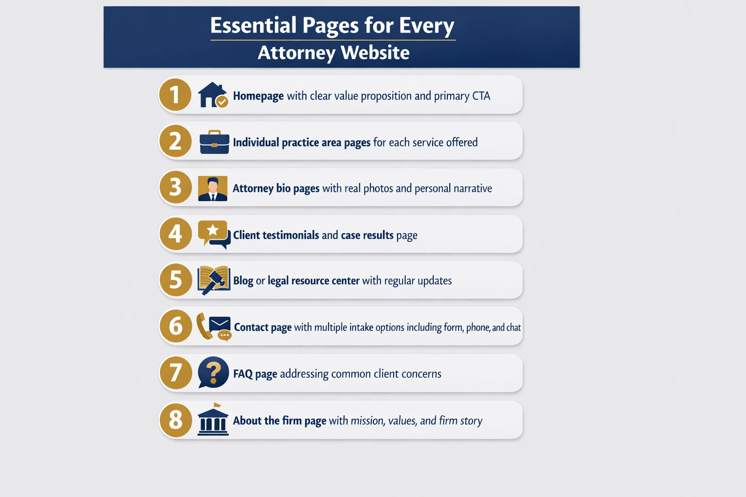
The essential page hierarchy every attorney website needs:
- Homepage — your firm's first impression and navigation hub
- Practice area pages — one dedicated page per service, not a single catch-all list
- Attorney bio pages — personal, specific, and written for clients rather than peers
- Contact and consultation page — frictionless, with multiple intake options
- Blog or resource center — regularly updated, client-focused content
Practice area pages are the workhorses of your entire SEO strategy. Each one should target a specific keyword phrase, answer the questions your ideal client is actually typing into Google, and end with a clear next step. A personal injury firm shouldn't have one generic "Practice Areas" page — it should have separate, fully developed pages for car accidents, slip and fall cases, wrongful death claims, and every other service it offers. Depth signals expertise to both search engines and skeptical visitors.
Blog content and FAQ pages pull double duty. They build the topical authority that helps your site rank for competitive local searches, while simultaneously demonstrating to prospective clients that you understand their situation before they've said a word.
Case results and client stories — where your state bar's ethical rules permit — are the most persuasive content on any attorney website. They show rather than tell. A narrative about a real outcome does more conversion work than three paragraphs of credentials.
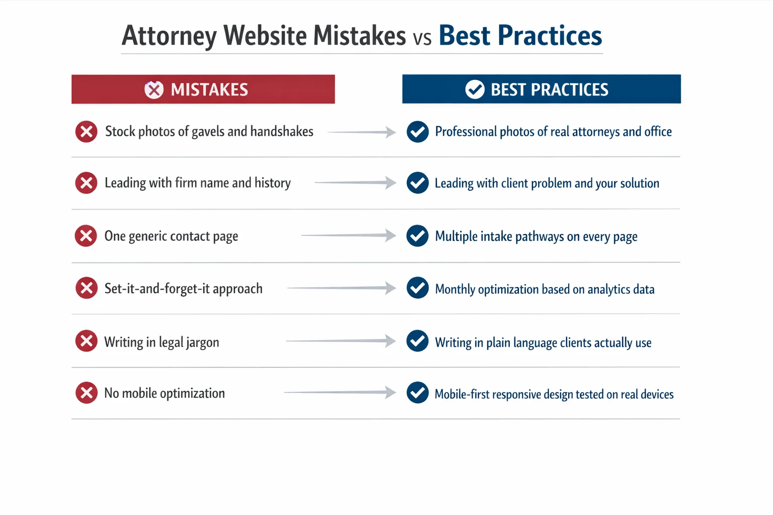
The content mistakes that quietly kill conversions: writing in legalese that only another attorney would understand, ignoring local SEO by failing to mention your city and county throughout your content, and letting pages go stale with outdated information that signals an abandoned website. Write for the person searching, not the colleague reviewing.
Technical Foundations Most Law Firms Ignore
The unglamorous truth about attorney websites is that the most impactful improvements often happen under the hood, invisible to the naked eye but felt immediately by every visitor who lands on your pages.
Mobile responsiveness isn't a feature — it's the baseline. The majority of people searching for legal help today are doing it from their phones, often in moments of stress or urgency. If your site forces mobile visitors to pinch, zoom, or hunt for a phone number buried in a desktop-formatted layout, they're gone before they've read a single word about your practice. Yet a surprising number of attorney websites still deliver a fractured mobile experience, treating smartphones as an afterthought rather than the primary device.
Page speed is a silent conversion killer. Law firm websites bloated with unoptimized images, outdated plugins, and heavy code frameworks lose visitors before the page even finishes loading. Search engines penalize slow sites with lower rankings, compounding the problem — fewer visitors arrive, and the ones who do leave faster. Compressing images, minimizing unnecessary scripts, and choosing a lean hosting environment are unglamorous fixes that pay outsized dividends.
ADA and WCAG accessibility compliance deserves more attention than most firms give it. Beyond the ethical obligation to serve all potential clients, inaccessible websites represent genuine legal exposure — an irony no attorney should be comfortable with.
Schema markup is one of the highest-ROI technical investments most competitors haven't made. Structured data for legal services, local business information, and attorney profiles helps search engines surface your firm in rich results, improving visibility without requiring additional content creation.
Finally, SSL certificates and encrypted data handling aren't optional extras. They're ethical obligations under bar rules governing client confidentiality — and visitors notice the padlock icon more than you might think.
Conversion Optimization: From Visitor to Consultation
Getting a visitor to your website is only half the battle. The other half — the half most law firms lose — is converting that visitor into a booked consultation. This requires intentional funnel design, not hope.
Think of every page on your site as a stepping stone. Each one should have a single, obvious next step that moves the visitor closer to picking up the phone or filling out a form. When pages end without direction, visitors don't improvise — they leave.
Match your intake pathways to visitor intent. Not every potential client is ready to call. Some are researching at midnight, not yet ready to speak with anyone. Others have already made their decision and want to book immediately. The best attorney websites accommodate both by offering multiple contact options:
- Live chat or chatbots for visitors who want quick answers without commitment
- Contact forms for those who prefer to explain their situation in writing
- Direct phone numbers displayed prominently for high-intent visitors ready to act now
- Online appointment scheduling for clients who want to move forward on their own timeline
That last option has quietly become a significant competitive advantage. Firms that allow potential clients to self-schedule consultations — without requiring a phone call first — consistently see higher conversion rates. Removing friction from the booking process removes the last excuse not to reach out.
CTA placement follows a simple logic: primary calls to action above the fold, secondary CTAs after trust-building content has done its work, and persistent CTAs in sticky headers or floating buttons that follow the visitor down the page without being intrusive.
The most overlooked conversion problem, however, isn't on the website at all. It's what happens after the form is submitted. Most firms lose prospective clients not because of poor design, but because of slow follow-up. Automated intake workflows — confirmation emails, instant notifications to staff, and scheduled follow-up sequences — close this gap before a competitor answers first.
Common Attorney Website Mistakes (And How to Fix Them)
Even the most technically polished attorney website can fail if it's built around the wrong priorities. These are the mistakes that quietly drain leads from otherwise capable firms — and the fixes that reverse the damage.
Stock photography is the fastest way to signal inauthenticity. Visitors have seen the same gavel-on-mahogany and handshake-in-a-boardroom images thousands of times. They register as placeholders, not people — and trust requires people. Real photos of your attorneys, your office, and your team communicate something no stock library can: that an actual human being will answer when they call. If a professional photoshoot feels out of reach, even candid, well-lit smartphone photos of your genuine workspace outperform generic imagery.
Designing for ego instead of the client is the second most common failure. Firms that lead with their founding year, their partners' credentials, and their trophy case are answering questions nobody asked. The visitor arrived with a problem — a car accident, a custody dispute, a criminal charge — and they need to know immediately whether you can solve it. Every element of your homepage should answer that question before it celebrates your firm's history.
SEO neglect compounds quietly over time. Missing title tags, no local keyword strategy, thin practice area pages, and zero content plan don't create an immediate crisis — they create a slow, invisible one where competitors steadily capture the searches you should be winning.
Ethical compliance isn't optional. Required disclaimers, state bar advertising disclosures, and carefully worded outcome language aren't bureaucratic nuisances — violations carry real professional consequences.
Finally, treating your website as a finished product rather than a living asset is perhaps the costliest mistake of all. Analytics, user behavior data, and conversion metrics tell you exactly where visitors are dropping off. Ignoring that information means repeating the same mistakes indefinitely.
Your Attorney Website Scorecard: A Self-Assessment Framework
Everything covered in this article comes down to one practical question: how does your website actually stack up right now?
Use this five-category scorecard to find out. Score each area honestly — not how you want your site to perform, but how a first-time visitor with a real legal problem would experience it.
First Impression (Hero Section & Branding) Does your headline address the visitor's problem, or does it lead with your firm name? Is there a single, prominent call to action above the fold? Are you using real photos of your attorneys, or stock imagery? A strong first impression scores yes on all three.
Trust Signals Do you have client testimonials displayed near your CTAs? Are credentials, awards, and bar memberships visible without digging? Do you include case results or client stories where ethically permitted?
Content Quality Does each practice area have its own dedicated page targeting a specific client question? Is your language written for clients, not colleagues? Is your blog or resource section current?
Technical Performance Does your site load in under three seconds on mobile? Does it pass a basic accessibility check? Is your local SEO structured correctly?
Conversion Optimization Do you offer multiple intake pathways? Is there a persistent CTA throughout the site? Can visitors book a consultation without making a phone call?
Once you've scored your site, open the top three attorney websites ranking in your local market and practice area. Compare them against the same checklist. The gaps you find are your roadmap.
When to DIY vs. hire a professional: quick wins like updating photos, adding testimonials, and fixing mobile display issues are manageable in-house. If your gaps cluster around technical performance or conversion architecture, partnering with a specialized firm like Claremont Software will accelerate results faster than trial and error.
Prioritize those quick wins in the first 30 days. Save the full redesign and content overhaul for days 60 through 90 — after you've validated what's working.
Conclusion
The gap between a law firm website that generates consultations and one that collects digital dust has nothing to do with budget. It has everything to do with strategy, client-centered design, and the discipline to treat your website as a living business asset rather than a one-time project.
Every pattern identified across top-performing attorney websites traces back to the same principle: the best law firm websites are built for the client's journey, not the attorney's ego. When design, content, and conversion architecture align around the visitor's emotional state and immediate needs, the results follow.
Start with your scorecard. Identify your highest-impact gaps — your hero section, your mobile experience, your trust signals — and fix those first. Quick wins compound quickly.
Whether you're a solo practitioner running a lean, personal brand on a modest platform or a growing firm ready for a full custom build, the fundamentals never change: clarity, trust, and a frictionless path to contact.
Your website is working for you right now. The only question worth asking is whether it's working hard enough — and if not, what you're going to do about it today. If you're ready to close that gap faster, Claremont Software specializes in exactly that.
Frequently Asked Questions
How much does a professional attorney website cost to build?
The cost of a professional attorney website varies widely depending on your firm's size and needs. Solo attorneys can get a polished, functional website on a DIY platform for as little as $35/month. Small to mid-size firms working with a specialized legal web design agency typically invest anywhere from $3,000 to $15,000 for a custom build, plus ongoing maintenance fees. Large firms with complex needs can spend significantly more. The good news: budget doesn't determine quality. A strategically designed solo attorney site on an affordable platform can outperform an expensive but poorly planned large-firm website. Focus your investment on client-centered design, strong content, and conversion optimization — not just aesthetics.
What platform is best for building a law firm website (WordPress, Squarespace, or a legal-specific builder)?
The best platform depends on your firm's size, technical comfort level, and goals. WordPress offers the most flexibility and SEO power, making it ideal for firms serious about content marketing and long-term growth — but it requires more technical management. Squarespace is a strong choice for solo attorneys and small firms, offering stable hosting, professional templates, and built-in functionality at a low monthly cost. Legal-specific website builders are designed with attorney compliance and intake features in mind, which can save time on setup. For firms that want maximum control over performance and conversion optimization, working with a specialized partner like Claremont Software ensures the platform choice aligns with your broader marketing strategy.
How many pages should an attorney website have?
At minimum, a law firm website should include a homepage, one dedicated page per practice area, individual attorney bio pages, a contact or consultation booking page, and a blog or resource section. That typically means 8 to 15 pages for a solo or small firm, and significantly more for larger firms with multiple practice areas and attorneys. Each practice area deserves its own page — not a single combined services page — because individual pages allow you to target specific search keywords, answer practice-specific client questions, and guide visitors through a tailored journey. More pages only help if the content is high quality and strategically structured.
What are the most important features of a law firm website that converts visitors into clients?
The highest-converting law firm websites share several key features: a clear, client-focused hero section that immediately communicates who you help and what to do next; prominent and easy-to-find contact options including phone number, contact form, and ideally online appointment booking; authentic attorney photos and video introductions that build personal connection; client testimonials and case results placed strategically near calls to action; mobile-optimized design since most legal searches happen on phones; fast page load speeds; and multiple intake pathways such as live chat, forms, and self-scheduling. Underlying all of these is content that speaks directly to the client's problem in plain language — not legal jargon written for other attorneys.
How often should a law firm update its website content?
Law firm websites should be treated as living business assets, not one-time projects. At a minimum, publish new blog posts or legal resource articles at least twice a month to build topical authority with search engines and demonstrate ongoing expertise to prospective clients. Practice area pages and attorney bios should be reviewed and refreshed at least once or twice a year — or whenever your services, credentials, or team change. Testimonials and case results should be added continuously as they become available. Outdated content, old staff photos, or stale information erodes trust instantly. Regular content updates also signal to search engines that your site is active and authoritative, which supports better rankings.
Do attorney websites need to comply with ADA accessibility standards?
Yes — and most law firm websites currently fail basic accessibility checks. ADA and WCAG (Web Content Accessibility Guidelines) compliance is both an ethical obligation and a growing legal risk. Websites that are inaccessible to users with disabilities — such as those relying on screen readers or keyboard navigation — can expose firms to complaints and litigation. Beyond the legal risk, accessibility improvements like proper color contrast, descriptive alt text for images, and keyboard-navigable menus also improve the experience for all users and can positively impact SEO. For attorneys, whose profession is built on upholding rights and access to justice, an inaccessible website is a particularly visible contradiction.
Should law firms display pricing on their website?
Yes, and it's becoming a meaningful competitive advantage. Transparent pricing — whether that's flat fees, hourly rate ranges, or a clear explanation of your fee structure — builds trust with prospective clients who are often anxious about cost. Most law firms hide pricing, which means the firms that display it stand out immediately and attract more qualified leads who are already comfortable with the investment. You don't need to publish an exact price for every matter; even explaining how you charge (flat fee vs. contingency vs. hourly) and what a typical consultation costs goes a long way. Transparency signals confidence, reduces friction in the intake process, and filters out poor-fit clients before they call.
What is the biggest mistake attorneys make with their websites?
The single biggest mistake is designing the website for the attorney's ego instead of the client's needs. This shows up as leading with the firm's history, partner names, and accolades rather than immediately addressing the visitor's problem and how the firm solves it. Closely related mistakes include using stock photos of gavels and courtrooms instead of real attorney photos, writing content filled with legal jargon that clients can't understand, and burying contact information. Many firms also treat their website as a finished product rather than an ongoing asset — skipping analytics, ignoring mobile performance, and never updating content. The fix is simple in principle: put the client's journey at the center of every design and content decision.