
It takes just 50 milliseconds — faster than a blink — for a potential client to judge your law firm based on your website. That snap judgment determines whether they book a consultation or click straight back to the search results.
In 2026, your website isn't just one piece of your marketing puzzle. It's the hub where every channel converges — search engines, AI chatbots, social media, directories, and referrals all funnel prospects to the same destination. A poorly designed website doesn't just look unprofessional; it actively costs you consultations every single day.
The good news? The principles that turn a mediocre law firm web design into a consultation-generating machine are well-established, proven, and entirely within your control.
This guide covers 9 actionable website design tips specifically tailored for law firms that want more leads, more booked consultations, and a stronger online presence — including visibility on the AI platforms that are rapidly changing how people find legal help.
Whether you're a solo attorney building your first site or a mid-size firm planning a full redesign, these tips will help you build a website that works as hard as you do. For a deep dive into solo attorney website design patterns that convert, see our companion guide.
For real-world examples, see the best attorney websites from solo and small firms that are outperforming larger competitors.
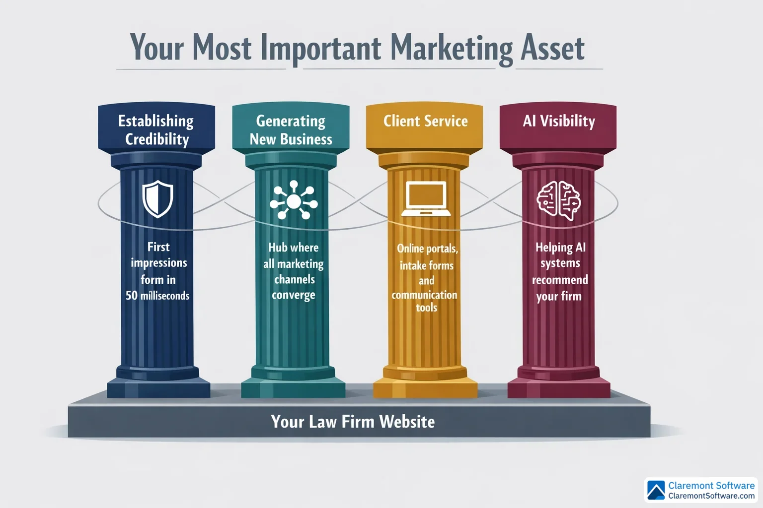
Why Your Law Firm Website Is Your Most Important Marketing Asset
Think of your law firm's website as the central nervous system of your entire marketing operation. Every channel you invest in — Google search, social media, online directories, referrals from colleagues, even AI-powered tools — ultimately funnels prospects to the same destination: your website. What happens when they arrive determines whether your marketing budget generates a return or disappears into the void.
A well-designed law firm website serves four critical functions simultaneously. It establishes credibility by signaling professionalism and expertise before a visitor reads a single word. It generates new business by converting curious visitors into booked consultations. It enhances client service by providing resources, intake tools, and communication options that make working with your firm easier. And increasingly, it builds AI visibility — a function most law firms are still overlooking entirely.
That last point deserves special attention. Generative AI tools are now recommending attorneys directly to users who ask questions like "who is the best personal injury lawyer near me?" If your website isn't structured in a way that AI systems can read, interpret, and trust, you're effectively invisible to a rapidly growing segment of potential clients. Google's AI Overviews and AI Mode are already changing how people find legal help, often delivering answers without a single click to any website.
The firms investing in their websites today aren't just chasing current traffic — they're positioning themselves for the future of legal marketing. Your website isn't a digital brochure. It's a 24/7 consultation-generating machine, and it's time to treat it like one.
Tip 1: Nail Your Homepage — The 5-Second First Impression
Remember that 50-millisecond window mentioned in the introduction? Your homepage is where that judgment happens. Before a potential client reads your headline, evaluates your credentials, or considers picking up the phone, their brain has already rendered a verdict. Your homepage either earns the next five seconds of their attention — or it doesn't.
That's why your homepage has one job above all others: communicate who you are, what you do, and who you serve before the visitor ever scrolls. This happens in the hero section — the visible portion of your page when it first loads. A strong hero section includes a clear, specific headline (think "Chicago Family Law Attorney Helping Parents Protect What Matters Most" rather than the vague "Experienced. Dedicated. Trusted."), a brief value proposition that reinforces why a visitor should choose your firm, and a prominent call-to-action button like "Schedule Your Free Consultation" that tells them exactly what to do next.
Visual hierarchy is the design principle that makes this work. Your most critical elements — the headline, the CTA button, and your phone number — should be the largest and most visually dominant items on the page. The eye naturally moves toward size and contrast, so use both intentionally.
Below the fold, don't let the page go quiet. Homepages carry more SEO weight than any other page on your site, which means this is prime real estate for keyword-rich content that helps search engines — and AI systems — understand your firm's specialties, location, and the clients you serve.
Finally, resist the urge to fill every inch of space. White space isn't wasted space — it's a design tool that guides the visitor's eye toward what matters and prevents the visual overwhelm that sends prospects clicking away.
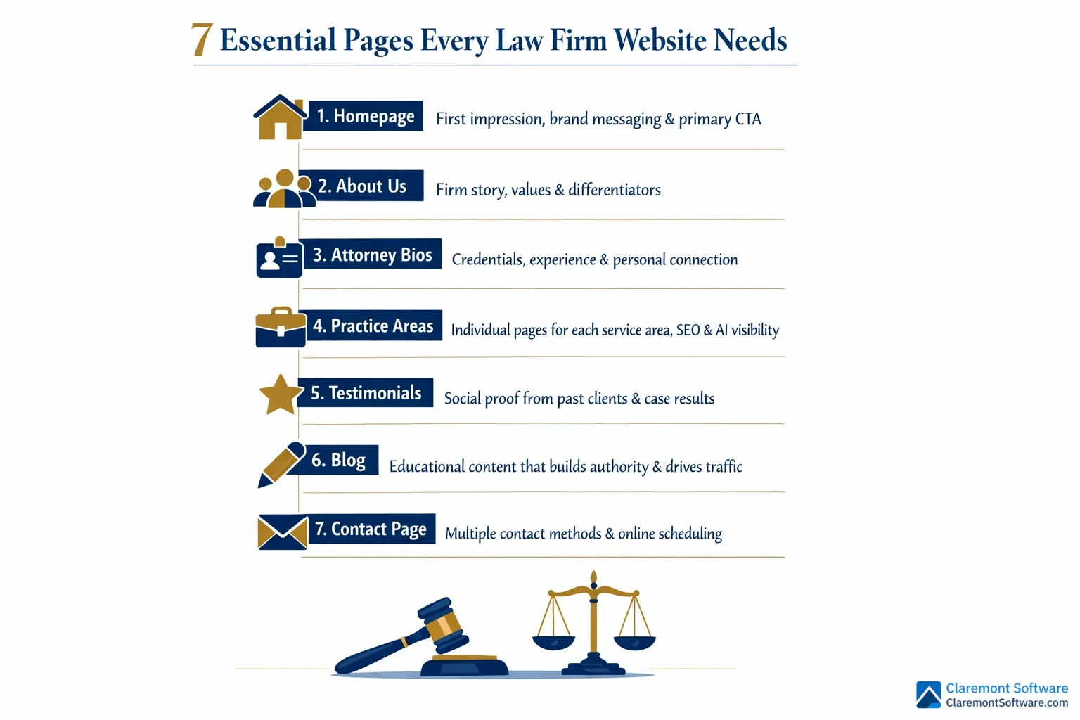
Tip 2: Build the Essential Pages Every Law Firm Website Needs
Once your homepage makes that critical first impression, visitors will start exploring — and where they go next matters enormously. A strategically structured website ensures that no matter which page a prospect lands on, they find exactly what they need to take the next step toward booking a consultation.
Every law firm website should include these core pages as a minimum foundation: a homepage, an about us page, individual attorney bios, dedicated practice area pages, a testimonials page, a blog, and a contact page. Each one serves a distinct purpose in moving a visitor from curious stranger to booked client.
Attorney profile pages deserve special investment. After the homepage, they're the most frequently visited pages on law firm websites — and for good reason. Hiring an attorney is an intensely personal decision. Prospects want to know who will actually be handling their case. A compelling attorney bio goes beyond listing credentials and bar admissions. It includes a professional headshot, a conversational tone that reveals personality, and specific details about the attorney's experience with cases like theirs. Human connection converts.
Practice area pages should be built individually, not bundled together. A single "Our Services" page that lists every area of law your firm handles is a missed opportunity — both for SEO and for the AI systems that need to clearly understand your specialties. A dedicated page for each practice area allows you to go deep on relevant keywords, answer specific client questions, and signal genuine expertise.
Your contact page should remove every possible barrier to reaching you. Include your phone number, email address, a simple contact form, your office address with an embedded map, and ideally an online scheduling tool that lets visitors book directly without waiting for a callback.
Finally, a regularly updated blog written by your attorneys does double duty: it builds topical authority that search engines reward, and it answers the exact questions your ideal clients are already searching for — feeding both traditional SEO and AI recommendation systems simultaneously.
Tip 3: Design for the F-Pattern — How Visitors Actually Read Your Site
Here's a counterintuitive truth about your law firm website: almost nobody is actually reading it. They're scanning it — rapidly moving their eyes across the page in search of the specific information that matters to them, ready to abandon ship the moment the layout makes that search feel like work.
Eye-tracking research has consistently shown that most users follow what's known as an F-pattern when they encounter a new webpage. They read horizontally across the top of the page, then move their eyes down the left side, then scan across again at a lower point — tracing the rough shape of the letter F before deciding whether to stay or leave. Understanding this pattern isn't just interesting psychology; it's a practical design blueprint.
Put your most critical information where the eyes go first. Your firm name, primary headline, phone number, and consultation CTA belong along that top horizontal bar — the first stroke of the F. This is the highest-attention real estate on your entire page, and it should be treated accordingly.
The left side of your page — the vertical stroke of the F — is where navigation menus, key subheadings, and bullet points should live. Scanning eyes naturally drift left, so anchor your most important signposts there.
For the body of your content, break up long text blocks ruthlessly. Use subheadings, bullet points, bold text, and short paragraphs to create visual entry points for scanning visitors. Front-load every section with its most important idea — don't bury the lead. A visitor who's scanning should be able to grasp the essence of each section without reading a single complete sentence.
Design for the reader you actually have, not the one you wish you had.
Tip 4: Make Mobile-First Design Non-Negotiable
Here's a reality check: more than half of all website traffic now comes from mobile devices. That means the majority of potential clients searching for an attorney at 10 PM after a car accident, a job termination, or a difficult family situation are doing it from a phone — not a desktop. If your website isn't built for that experience, you're not just losing a few visitors. You're losing most of them.
Responsive design is the baseline, not a bonus feature. A responsive website automatically adjusts its layout, images, and navigation to fit any screen size — from a large desktop monitor to the smallest smartphone. Text that's readable, buttons that are tappable, and menus that don't require pinching and zooming aren't luxuries. They're the minimum standard for a law firm website in 2026.
Click-to-call functionality is non-negotiable on mobile. Your phone number should appear on every page, and it should be tappable — one touch, immediate call. Don't make a distressed prospect copy and paste a number into their dialer. That extra step is enough friction to send them to your competitor.
Test your intake forms on an actual phone. Forms that feel simple on a desktop can become maddening on mobile — tiny fields, awkward dropdowns, and keyboards that obscure the submit button. If completing your contact form on a phone feels like a chore, prospects will abandon it before they ever reach you.
Finally, mobile load speed is critical. Compress images, minimize unnecessary code, and invest in quality hosting. Aim for a load time under three seconds — every additional second dramatically increases the chance a visitor leaves before your site even finishes loading.
Tip 5: Optimize Your Calls-to-Action for Maximum Conversions
Getting a visitor to your law firm website is only half the battle. The other half is giving them a clear, compelling reason to take the next step — and that's exactly what your calls-to-action are for. A weak or buried CTA is one of the most common and costly conversion mistakes law firms make.
Specificity converts. Vagueness doesn't. "Schedule Your Free Consultation" tells a visitor exactly what they're getting and what it costs them (nothing). "Contact Us" tells them almost nothing. The more clearly your CTA communicates value, the more likely a hesitant prospect is to click it. Phrases like "Get Your Free Case Review Today" or "Speak With an Attorney Now" create both clarity and a sense of immediacy that generic button text simply can't match.
Placement is just as important as wording. Your CTA should appear above the fold on every page — before a visitor has to scroll — and then again after key content sections and at the bottom of the page. Don't make someone hunt for how to reach you. By the time they've decided they want to call, the path forward should already be right in front of them.
Make your CTA buttons impossible to miss. Use a color that contrasts sharply with your site's background and surrounding design elements. If your site is navy and white, an amber or green button will draw the eye immediately. A button that blends in is a button that gets ignored.
Finally, consider breaking your intake form into multiple steps rather than presenting one long page of fields upfront. A simple first step — "What type of legal issue are you facing?" — feels far less intimidating than a wall of required fields, and it dramatically increases the number of visitors who complete the process.
Tip 6: Build Trust with Strategic Social Proof Placement

You've done the work to get a visitor to your site. You've given them a clear CTA and a fast, mobile-friendly experience. Now comes the moment that determines whether they actually trust you enough to pick up the phone — and that's where strategic social proof makes all the difference.
Here's the critical insight most law firms miss: it's not just what your social proof says, it's where you put it.
A glowing testimonial buried on a page no one visits does almost nothing for your conversion rate. That same testimonial placed directly beside your primary "Schedule a Free Consultation" button? It reinforces the decision at exactly the right moment — when a prospect is on the edge of committing.
Lead with your strongest proof on the homepage. Whether it's a compelling client testimonial, a significant case result, or a recognizable award, your best social proof belongs front and center, not tucked away. Think of it as a trust bridge between your value proposition and your CTA.
Dedicate a full page to testimonials and case results, organized by practice area. A visitor dealing with a DUI charge wants to see what you've done for other DUI clients — not a generic wall of praise. Relevant social proof is far more persuasive than impressive-but-unrelated social proof.
Display trust badges consistently across every page — bar memberships, peer recognition ratings, and industry awards belong in your header or footer where they're always visible, quietly building credibility in the background.
Finally, don't underestimate video testimonials. Even a straightforward recording on a smartphone carries far more emotional weight than text. A real person, speaking in their own words about how you helped them through a difficult situation, is one of the most powerful conversion tools a law firm website can have.
Tip 7: Prioritize Website Speed and Performance
Your website can have a compelling homepage, persuasive CTAs, and glowing testimonials — and still lose potential clients before they ever read a word. If your site loads slowly, visitors leave. It's that simple.
Research consistently shows that every additional second of load time drives up bounce rates, and the effect is even more pronounced on mobile devices, where the majority of your visitors are arriving. A prospect searching for an attorney after an accident or an arrest isn't going to wait five seconds for your homepage to appear. They'll hit the back button and call the firm whose site loaded first.
Images are usually the biggest culprit. Hero images and professional attorney photos are essential for building trust — but unoptimized, they can quietly destroy your site's performance. Compress every image before uploading it, and use modern file formats that deliver sharp visuals at a fraction of the file size.
Your hosting environment matters more than most firms realize. A budget hosting plan might save money upfront, but the performance cost is real. Invest in quality hosting, and consider a content delivery network (CDN) that serves your site from servers geographically close to your local visitors — reducing the physical distance data has to travel.
Audit what's running under the hood. Heavy plugins, unnecessary third-party scripts, and auto-playing videos all add load time without adding value. Trim anything that isn't earning its place.
Set a target of under three seconds for full page load, and test your site regularly using freely available speed tools from major search engines. Treat speed not as a technical detail, but as a conversion priority.
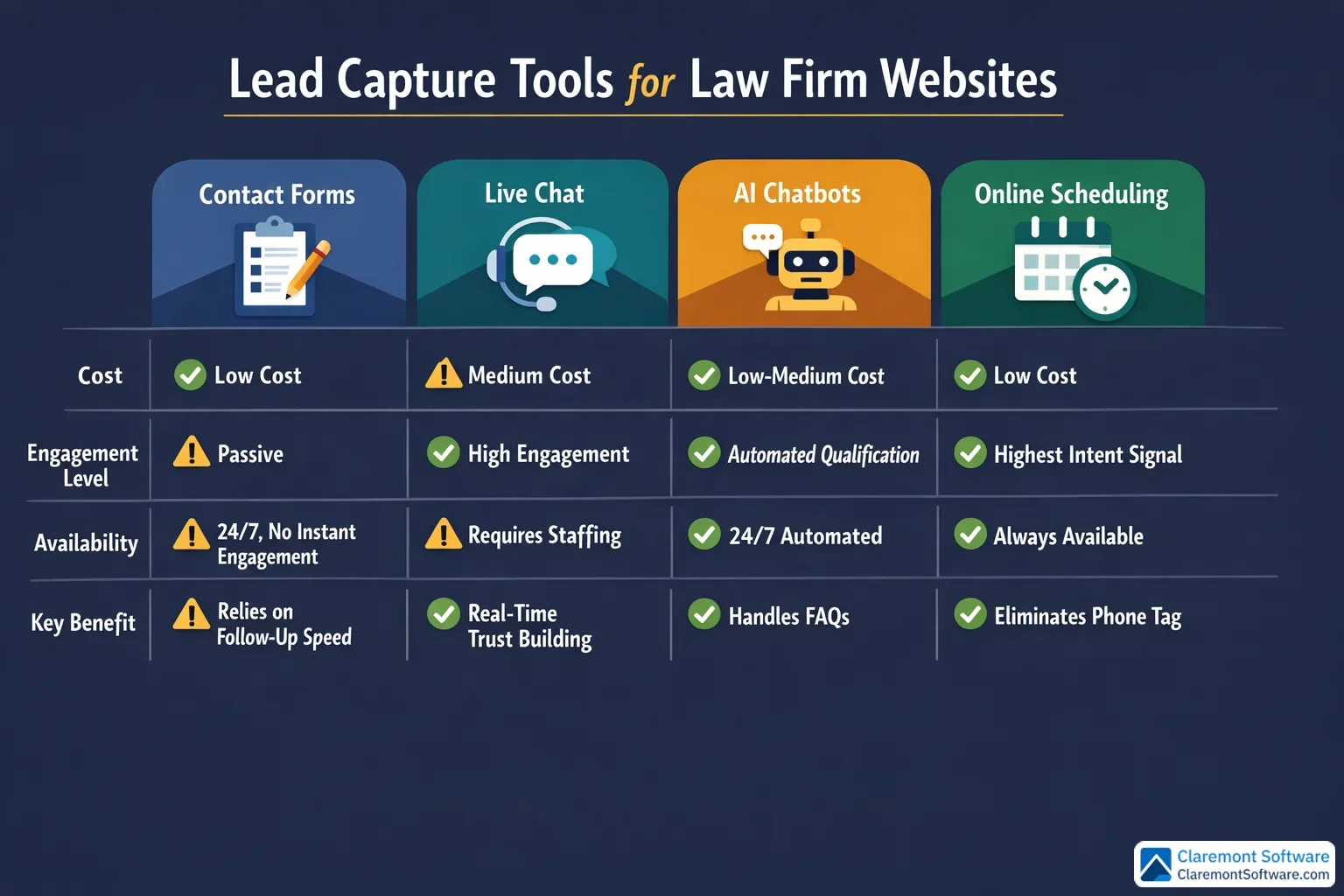
Tip 8: Integrate Smart Communication Tools That Capture Leads 24/7
Think about when people actually search for an attorney. It's rarely during business hours, sitting calmly at a desk. It's late at night after a car accident. It's a Sunday morning after a difficult conversation with a spouse. It's the moment a legal problem becomes impossible to ignore — and that moment doesn't wait for your receptionist to arrive at 9 a.m.
If your website can't capture that visitor in real time, you've lost them.
Live chat, AI-powered chatbots, and online scheduling tools exist precisely to bridge this gap. A chatbot can greet a visitor at midnight, answer common questions about your process, qualify the lead, and collect contact information — all before your team arrives the next morning. Online scheduling integrations take this a step further, letting prospects book a consultation instantly without waiting for a callback that may never come. Removing that friction alone can meaningfully increase your conversion rate.
Beyond lead capture, modern communication tools signal something important about your firm: that you're organized, efficient, and easy to work with. Electronic intake forms, client portals, and online payment options don't just streamline your internal workflow — they tell prospective clients that hiring you will be a smooth experience from day one.
That said, automation should complement human connection, not replace it. Make it effortless to reach a real person the moment a visitor is ready to talk. A chatbot that traps people in loops when they want a live conversation will cost you the very leads you're trying to capture.
The goal is availability without sacrificing warmth.
Tip 9: Optimize for SEO and AI Visibility from Day One
A beautifully designed, lightning-fast website that no one can find is just an expensive digital brochure. SEO and AI visibility are what transform your site from a passive presence into an active lead-generation engine — and both need to be built in from the start, not bolted on later. For a complete breakdown of attorney lead generation strategies beyond design, see our lead generation guide for law firms.
Start with keyword-targeted practice area pages. Each practice area your firm handles deserves its own dedicated page optimized around the terms your ideal clients are actually searching. Think "[practice area] lawyer in [city]" — specific, local, and intent-driven. A single combined "Practice Areas" page might feel tidy, but it dilutes your SEO value and makes it harder for both search engines and AI systems to understand exactly what you do and where you do it.
Implement structured data markup (schema). This is the behind-the-scenes code that tells search engines and AI platforms the specifics about your firm — your services, location, attorneys, and client reviews. As tools like Google AI Overviews and generative AI assistants increasingly surface attorney recommendations directly in their responses, structured data is what helps your firm get included in those answers rather than overlooked.
Consistency across directories matters more than most firms realize. Your firm's name, address, and phone number should be identical everywhere they appear online. Discrepancies confuse search engines and quietly erode your local rankings.
Publish educational blog content regularly. When your attorneys write content that answers the questions prospective clients are already searching for, you build topical authority that both search algorithms and AI recommendation systems reward.
Finally, don't neglect the fundamentals: meta titles, meta descriptions, header tags, and image alt text on every page. These basics still drive the majority of organic visibility — and they're entirely within your control.
Conclusion
Every marketing channel you invest in — search, social, directories, referrals, AI platforms — ultimately leads back to one place: your website. What happens when a prospect arrives there determines whether your investment pays off or quietly bleeds out.
The nine principles covered in this guide aren't isolated tactics. They work as a system. A fast, mobile-friendly site earns the visitor's patience. A clear homepage and strong CTAs direct their attention. Compelling social proof earns their trust. Smart communication tools capture them the moment they're ready to act. And solid SEO and AI optimization ensure they find you in the first place.
You don't need to implement everything at once. Start where the impact is highest: sharpen your homepage hero section, add clear CTAs to every page, and confirm your site performs well on mobile. Then build from there, measuring results as you go. For visual direction, browse our collection of website design inspiration from 20 law firm sites that broke the mold.
The firms that treat their website as a living, evolving asset — rather than a one-time project — will be the ones consistently winning clients from both traditional search and the AI-driven landscape that's already reshaping how people find legal help.
Your next consultation could be one website improvement away.
Frequently Asked Questions
How much does it cost to design a law firm website?
Law firm website costs vary widely depending on your approach. DIY website builders can cost as little as $25–$50 per month, making them accessible for solo attorneys on a tight budget. Pre-built legal website templates from theme marketplaces typically run $50–$200 as a one-time purchase. Hiring a freelance designer generally falls in the $1,500–$5,000 range, while working with a professional agency that specializes in law firm websites can range from $5,000 to $25,000 or more, depending on the scope, number of pages, and custom features. Ongoing costs — hosting, maintenance, SEO, and content — should also be factored into your budget. For most small firms and solo attorneys, a professionally designed site is one of the highest-ROI investments you can make, since even a single additional consultation per month can quickly offset the cost.
What is the best website platform for a small law firm or solo attorney?
The best platform depends on your technical comfort level and goals. WordPress is the most powerful and flexible option, offering thousands of themes and plugins, strong SEO capabilities, and full customization — but it has a steeper learning curve. Squarespace is a popular choice for attorneys who want a polished, professional look without technical headaches, with straightforward pricing around $35 per month. Wix and Webflow are also viable options with varying levels of design control. Legal-specific platforms built exclusively for law firms offer practice management integrations and compliance-friendly features that general website builders don't. For most solo attorneys and small firms, the best platform is the one you'll actually keep updated — prioritize ease of use, mobile responsiveness, and strong SEO fundamentals over flashy features.
How often should I update or redesign my law firm website?
As a general rule, law firm websites should undergo a full redesign every 3–5 years to stay current with design trends, technology standards, and user expectations. However, regular incremental updates should happen far more frequently. Content — including blog posts, attorney bios, case results, and practice area pages — should be refreshed at least quarterly. If your site looks outdated, loads slowly, isn't mobile-friendly, or no longer reflects your firm's practice areas and branding, those are immediate signals that a redesign is overdue. You should also consider an update whenever Google makes major algorithm changes, when AI search tools become more prominent, or when your firm expands into new practice areas. Think of your website as a living asset, not a one-time project.
Do I need a blog on my law firm website?
Yes — a blog is one of the most valuable tools a law firm website can have. A regularly updated blog written by your attorneys builds topical authority, drives organic search traffic for long-tail legal queries, and positions your firm as a trusted source of guidance. Beyond SEO, blog content feeds AI recommendation systems like ChatGPT and Google AI Overviews, which increasingly surface attorney content when answering users' legal questions. A blog also gives you shareable content for social media and email newsletters, extending your reach across multiple channels. You don't need to publish daily — even one well-researched, genuinely helpful article per month can meaningfully improve your visibility and credibility over time. Quality and relevance always outweigh volume.
What are the biggest mistakes law firms make with their website design?
The most common law firm website mistakes include: failing to communicate who you serve and what you do within the first few seconds of landing on the homepage; having no clear or compelling calls-to-action on key pages; neglecting mobile optimization despite mobile users accounting for more than half of all web traffic; using slow-loading pages filled with oversized images and unnecessary plugins; burying contact information instead of making it prominent on every page; combining all practice areas onto a single page instead of creating individual pages for each; skipping attorney bio pages or using generic, impersonal bios; and ignoring SEO fundamentals like meta titles, header tags, and local keyword targeting. Many firms also overlook the importance of social proof — testimonials, case results, and trust badges — which are critical for converting hesitant visitors into booked consultations.
How do I make my law firm website ADA accessible and compliant?
ADA (Americans with Disabilities Act) website accessibility ensures your site can be used by people with visual, auditory, motor, or cognitive disabilities — and it also reduces your firm's legal risk. Key steps include: using sufficient color contrast between text and backgrounds; adding descriptive alt text to all images; ensuring all site functionality is navigable by keyboard alone; providing captions or transcripts for any video content; using clear, readable fonts at 16pt or larger for body text; avoiding flashing or auto-playing content that can trigger seizures; and structuring your pages with proper HTML heading hierarchy. Tools like accessibility checkers can audit your site for common issues. Many website platforms offer accessibility plugins or built-in compliance features. For a law firm especially, demonstrating a commitment to accessibility reflects well on your brand and values.
Should I hire a professional agency or build my law firm website myself?
It depends on your budget, technical skills, and how central your website is to your growth strategy. Building your own site using a user-friendly platform can work well for solo attorneys just starting out — it keeps costs low and gives you full control. However, DIY websites often fall short in areas like SEO structure, conversion optimization, and professional design polish, which directly impacts how many consultations your site generates. Hiring a professional agency — especially one with law firm website experience — typically delivers a faster, higher-performing result with proper SEO foundations built in from day one. If your website is a primary source of new clients, the ROI of professional design almost always justifies the investment. A middle-ground option is using a premium legal website template and hiring a freelancer to customize it.
How do I track whether my law firm website is generating consultations?
Tracking website-driven consultations starts with setting up free analytics tools that monitor traffic, user behavior, and goal completions on your site. Configure conversion goals to track specific actions — form submissions, phone number clicks, live chat initiations, and online scheduling bookings. Use call tracking software to assign unique phone numbers to your website so you can attribute inbound calls directly to web traffic. If you use an online scheduling tool, monitor how many bookings originate from your site each month. Regularly review which pages drive the most traffic and which have the highest exit rates, then optimize underperforming pages. Ask every new client how they found you and record that data consistently. Combining quantitative analytics with this simple intake question gives you a clear picture of your website's true impact on consultation volume.