
Your law firm's website isn't just a digital business card — it's the courtroom where potential clients decide whether to hire you before they ever pick up the phone.
In today's hyper-competitive legal market, that first impression happens in seconds. Visitors land on your homepage, scan what they see, and make a gut-level judgment about whether your firm is the right fit for their problem. Firms that invest in bold, client-centered design are seeing up to 4x faster growth than those still relying on outdated, cookie-cutter templates — and the gap is only widening.
But what does a truly exceptional law firm website actually look like in 2025? What separates the sites that generate a steady stream of qualified leads from the ones that quietly bleed potential clients to competitors?
This article breaks down 20 real-world design patterns from law firm websites that shattered expectations — covering everything from visual branding and hero section strategy to mobile performance and conversion optimization. Whether you're a solo attorney building your first professional site or a large firm planning a complete overhaul, you'll walk away with actionable inspiration and a clear roadmap for standing out in a crowded digital landscape.
How We Evaluated These Mold-Breaking Law Firm Websites
Not every law firm website that looks stunning in a design portfolio actually works in the real world. That's why the sites featured in this article were evaluated against three interconnected pillars — not just visual appeal.
Client experience examines how easily a visitor can navigate the site, find relevant information, complete an intake form, or book a consultation. A confusing menu or buried contact form can cost a firm a client in seconds. Branding assesses visual identity, differentiation, and personality — whether the site communicates something distinct and memorable or blends into the sea of identical legal websites. Technical performance covers page speed, mobile responsiveness, SEO architecture, and accessibility compliance.
Here's the critical insight: all three pillars must work in concert. A visually striking site that loads slowly frustrates visitors before they ever read your headline. A technically flawless site with generic branding fails to build trust or stand out. The designs highlighted here succeed because they solve real client problems — reducing anxiety, building confidence, and making it effortless to take the next step — not simply because they earned aesthetic awards.
It's also worth acknowledging upfront that no single design approach fits every firm. A solo immigration attorney, a regional personal injury practice, and a large corporate litigation firm have fundamentally different audiences, goals, and conversion needs. The examples ahead reflect that diversity intentionally.
Bold Visual Identity: Firms That Dared to Look Different

Walk into any law firm's waiting room and you'll likely see the same décor: dark wood, leather chairs, framed diplomas. For decades, law firm websites followed the same unwritten rulebook — navy blue backgrounds, gold accents, stock photos of gavels, and courthouse columns. The firms breaking the mold in 2025 have torn that rulebook apart entirely.
The most memorable legal websites today reach for unexpected visual territory. Think sweeping wildlife photography, abstract geometric art, or bold illustrative homepages that feel closer to a creative agency than a traditional practice. One environmental law firm famously anchors its homepage with a rhinoceros balancing on a tightrope — an image that's jarring, thought-provoking, and impossible to forget. That's precisely the point. When every competitor looks identical, a single unexpected image becomes a powerful differentiator.
Color is another arena where bold firms are staking their claim. Deep forest greens, warm terracottas, rich burgundies, and even near-black backgrounds are replacing the tired navy-and-gold formula. These palettes still communicate authority and stability — they simply do it with far more personality and visual sophistication.
Typography is doing equally heavy lifting. The most effective law firm websites pair modern serif fonts (which carry inherent credibility and tradition) with clean sans-serif typefaces (which signal approachability and clarity). This combination lets a firm feel both trustworthy and human — a balance that resonates deeply with clients navigating stressful legal situations.
Full-bleed hero images, cinematic video backgrounds, and illustration-driven layouts round out the visual toolkit that forward-thinking firms are deploying. These aren't decorative choices — they're strategic ones, designed to stop a visitor mid-scroll and communicate a firm's values before a single word is read.
The Hero Section That Converts Before You Scroll

Three seconds. That's the window your law firm's homepage has to convince a visitor they're in the right place — before they hit the back button and click on your competitor. No section of your website carries more weight than the hero: that first, full-screen moment a visitor encounters before they scroll a single pixel.
The highest-converting law firm hero sections share a consistent anatomy. At the center is a clear, specific value proposition headline — not "Experienced Legal Counsel" or "Dedicated to Justice," but something that speaks directly to the client's situation. Phrases like "We fight for families like yours" or "Injured in an accident? We don't get paid unless you do" communicate empathy, relevance, and a reason to stay in the same breath. Jargon-heavy firm descriptions, however accurate, create distance at exactly the moment you need connection.
Alongside that headline, the best hero sections present a single, unmistakable call to action — one button, one direction. Offering visitors three or four options at this stage introduces hesitation. Pair that CTA with at least one trust signal visible immediately: a star rating, a notable case result, a recognizable award badge, or a simple client count. These elements don't require scrolling to discover — they're doing conversion work the instant the page loads.
The visual layer matters enormously, but with an important caveat: imagery should amplify the message, not compete with it. A stunning background photograph that makes headline text difficult to read is a design failure dressed as a design choice.
Finally, never design your hero for desktop alone. On mobile screens — where the majority of urgent legal searches now originate — oversized headlines collapse, background images crop unpredictably, and CTAs can disappear below the fold entirely. The mobile hero deserves its own deliberate design pass, not an afterthought.
Practice Area Pages That Tell a Story
Most law firm websites treat practice area pages as an afterthought — a wall of dense legal text stuffed beneath a generic header. The firms setting the standard in 2025 take a fundamentally different approach, treating each practice area page as its own mini landing page with a distinct visual identity, emotional tone, and conversion strategy tailored to the specific client walking through that virtual door.
The difference is immediately apparent. Rather than recycling the same layout with swapped-out text, leading firms give each practice area its own color accent, hero imagery, and typographic hierarchy. A visitor landing on a criminal defense page should feel something different than one landing on an estate planning page — because those clients are in completely different emotional states and need to be met accordingly.
Client journey narratives are one of the most powerful tools these pages deploy. Instead of simply listing services, the best practice area pages walk visitors through exactly what to expect: step-by-step visual timelines, illustrated process diagrams, and plain-language explanations of each phase from initial consultation to resolution. This transparency reduces anxiety, builds trust, and keeps visitors engaged far longer than a bulleted list of legal services ever could.
Credibility is reinforced by weaving anonymized case results and outcome snapshots directly into the page — not buried in a separate results section, but positioned precisely where a hesitant visitor needs reassurance most.
The emotional calibration varies deliberately by practice area:
- Personal injury pages lean into urgency and empathy, with bold typography and immediate CTAs
- Family law pages prioritize warmth, privacy, and reassurance over aggressive conversion tactics
- Criminal defense pages project strength, discretion, and unwavering confidentiality
For niche and environmental practices, cause-driven imagery and mission-forward language create an emotional connection that transcends the transactional — turning a practice area page into a statement of shared values.
Client Experience and Navigation That Actually Works
A law firm website can be visually stunning and emotionally compelling — and still fail completely if visitors can't find what they need within seconds of arriving. Navigation and user experience are the invisible architecture that either guides potential clients toward conversion or sends them quietly back to Google.
Mega-menu navigation has become the gold standard for firms with broad practice area offerings. When designed well, these expandable menus organize dozens of specialties into logical groupings — by legal category, client type, or outcome — without overwhelming visitors with an undifferentiated wall of links. The key is hierarchy: broad categories visible at a glance, with specific practice areas revealed only when a visitor signals interest by hovering or tapping.
Sticky headers with persistent CTAs solve one of the most persistent conversion problems in legal web design: the visitor who reads halfway down a page, feels convinced, and then has to scroll all the way back up to find a phone number. A fixed header that travels with the user — displaying a click-to-call button and live chat option at all times — removes that friction entirely. For urgent practice areas especially, that persistent accessibility can be the difference between a lead captured and a lead lost.
The most forward-thinking firms have moved well beyond contact forms, embedding online intake workflows, appointment scheduling, and client portals with payment functionality directly into their sites. This end-to-end digital experience signals professionalism and respects the client's time from the very first interaction.
ADA accessibility deserves more than a checkbox mention. The American Bar Association actively recommends prioritizing digital accessibility — and beyond the ethical imperative, an accessible site reaches a broader audience and increasingly carries legal weight for the firms themselves.
Finally, smart search and filtering tools allow visitors to self-identify their legal need quickly, routing them to the right attorney or practice area without requiring them to decode your firm's internal organizational structure.
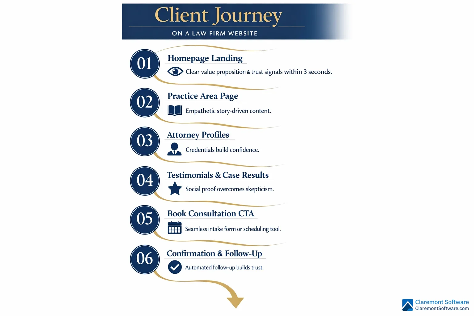
Trust Signals and Social Proof That Move the Needle
Winning a potential client's trust happens long before they sign a retainer — it happens in the quiet moments when they're reading your website alone, deciding whether you're the right firm for the most stressful situation of their life. The firms that understand this don't treat social proof as a box to check. They engineer it into the fabric of every page.
Strategic testimonial placement is one of the clearest differentiators between high-converting legal sites and forgettable ones. Rather than corralling client reviews onto a single testimonials page that most visitors never find, the best-designed sites weave them throughout the experience — positioned precisely at the moments when doubt is most likely to creep in. A testimonial placed just above a contact form, for instance, does far more conversion work than the same quote buried three clicks deep.
Case results receive equally thoughtful treatment. Animated counters displaying total verdicts recovered, card-based layouts highlighting individual outcomes, and timeline formats showing case progression all communicate credibility in ways that dense text simply cannot — while staying within the ethical guardrails that govern attorney advertising.
Attorney profile pages are perhaps the most underutilized trust asset in legal web design. Professional photography, short video introductions, and bios written in a human voice transform attorneys from credentials on a page into people a client can imagine calling. That humanization is enormously persuasive.
Third-party badges — bar associations, peer-recognition ratings, industry awards — carry real weight, but only when presented with visual intention rather than crammed into a cluttered footer.
An emerging trend worth noting: transparent fee structure pages. Firms that clearly explain contingency arrangements, flat fees, or payment plans signal confidence and respect for the client — a combination that quietly, powerfully builds trust before a single conversation takes place.
Mobile-First Design and Technical Performance
The uncomfortable truth about law firm website design is this: a site that looks extraordinary on a 27-inch monitor and loads in under a second on a fiber connection may be quietly hemorrhaging leads every single day — because the person who needed a criminal defense attorney at 11pm searched from their phone, hit a slow-loading page, and called the next firm on the list instead.
Mobile-first design isn't a trend. It's the baseline. The majority of legal searches — particularly for urgent practice areas like personal injury and criminal defense, where people need help now — originate on smartphones. Any design strategy that treats mobile as an afterthought is, functionally, a strategy for losing clients.
The technical benchmarks matter here. Core Web Vitals — Google's framework measuring loading speed, visual stability, and interactivity — directly influence search rankings. For media-heavy law firm sites with full-bleed photography and video backgrounds, optimization requires deliberate choices: compressed image formats, lazy loading for below-the-fold content, and lean code that doesn't force a visitor's phone to work harder than necessary just to read your homepage.
Responsive design patterns that genuinely work across devices go beyond simply shrinking a desktop layout. Hero sections need to be reimagined for vertical screens. Navigation must collapse intuitively. CTAs need to be thumb-friendly and immediately visible without scrolling.
The best-performing sites also bake technical SEO infrastructure directly into their design — attorney schema markup, local business structured data, and location signals that strengthen Google Business Profile visibility. These elements are invisible to visitors but enormously consequential for how — and whether — your firm appears when someone nearby searches for legal help.
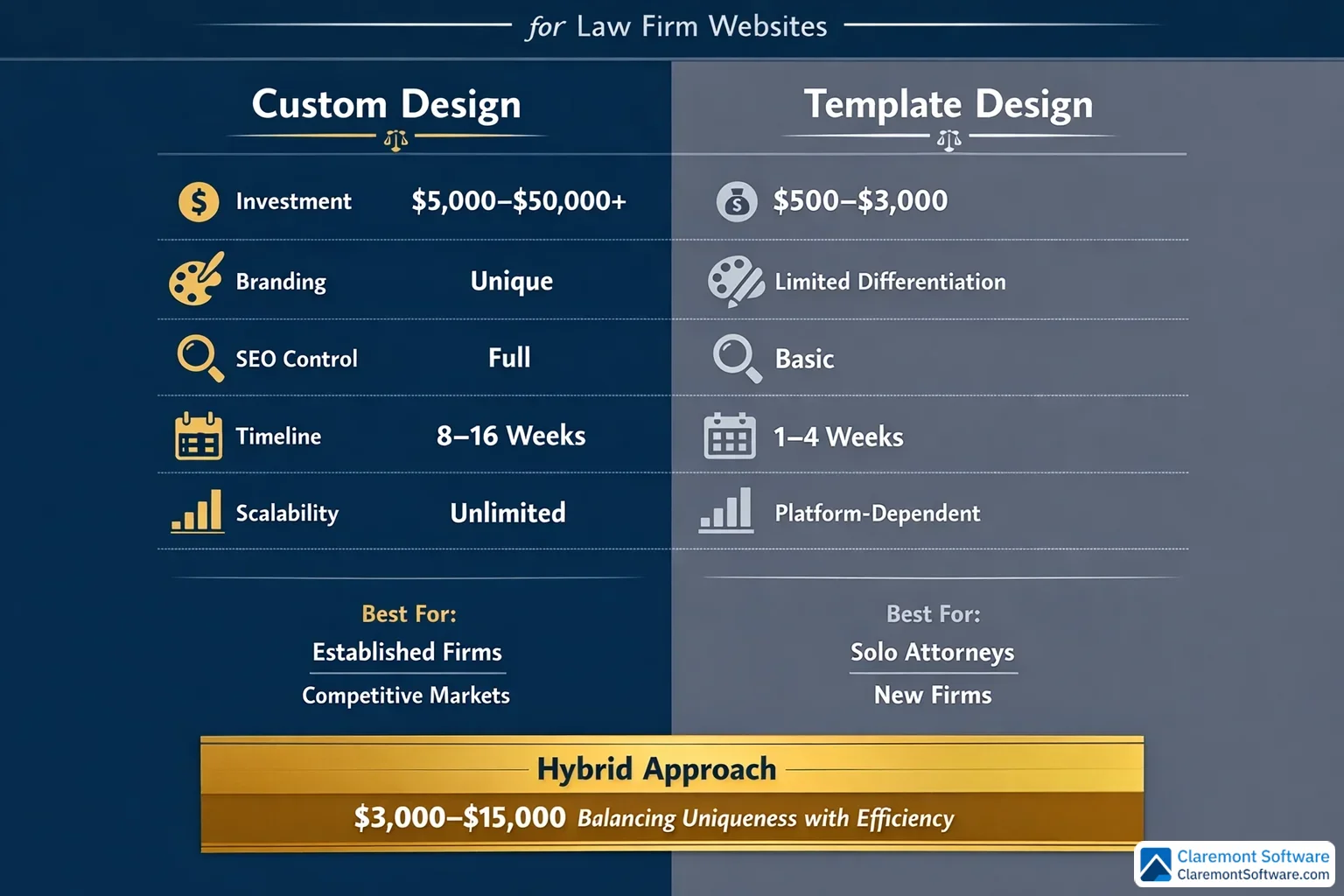
Custom Design vs. Templates: What the Best Firms Choose
The debate between custom design and templates isn't really about aesthetics — it's about whether your website can grow with your firm, rank where it needs to rank, and convert the clients you're actually trying to reach.
Custom design earns its price tag when your firm has a distinct brand identity, operates in a competitive market, or needs functionality that off-the-shelf solutions simply can't accommodate. A multi-practice firm targeting high-value clients in a saturated metro market will almost certainly outperform competitors using the same template — because differentiation is impossible when you're working from the same starting point as everyone else.
That said, a well-configured template on the right platform can deliver genuinely impressive results, particularly for solo attorneys and small practices. Platform choice matters enormously here:
- WordPress remains the gold standard for flexibility, SEO control, and scalability — ideal for firms that anticipate growth
- Squarespace (starting around $35/month) offers stability and polished built-in functionality that suits solo practitioners who need a professional presence without technical overhead
- Webflow attracts design-forward firms that want pixel-level control without custom development costs
- Specialized legal website builders offer practice-area-specific templates and compliance-aware features, though they often limit long-term branding flexibility
The hidden costs of template sites accumulate quietly — restricted SEO customization, generic visual identity, and scalability ceilings that eventually force a full rebuild anyway.
The smartest approach is often a hybrid model: custom design direction and brand expression built on a flexible, modular platform. Inspiration platforms hosting thousands of legal website projects can sharpen your creative brief before a single wireframe is drawn — ensuring your investment produces something genuinely distinctive rather than expensively ordinary.
Design Trends Shaping Law Firm Websites in 2025 and Beyond

The legal industry's visual language is changing fast — and the firms leading that charge aren't waiting for permission to look different.
Dark mode aesthetics have moved well beyond tech startups and into the legal space, with forward-thinking firms using deep charcoal, near-black, and rich jewel-tone backgrounds to project sophistication and authority. Far from feeling cold or inaccessible, these palettes — when paired with warm typography and strategic accent colors — communicate exactly the kind of quiet confidence that high-value clients find reassuring.
AI-powered features are reshaping how law firm websites function beneath the surface. Intelligent chatbots now handle initial intake conversations at 2am when no receptionist is available, qualifying leads and capturing contact information before a potential client loses momentum. Personalized content experiences — where the site adapts based on a visitor's apparent legal need — are emerging as a genuine differentiator. Clio's Legal Trends Report specifically flags AI-first client expectations as a growing design consideration firms can no longer ignore.
Micro-interactions separate polished sites from merely pretty ones. Scroll-triggered content reveals, hover effects on attorney cards, and animated case result counters guide visitor attention naturally — creating a sense of responsiveness and care without veering into gimmick territory.
Video-first homepages are replacing static hero images for firms that want to communicate personality and culture dynamically. A 30-second attorney introduction conveys warmth that no photograph can match.
Finally, radical minimalism — generous whitespace, restrained color palettes, and ruthlessly edited copy — lets CTAs breathe and guides visitors toward conversion without visual competition. Sometimes the boldest design choice is knowing exactly what to leave out.
Your Law Firm Website Redesign Action Plan
Before you hire a designer or choose a platform, you need an honest picture of where your current site actually stands. A simple self-assessment across three dimensions — client experience, branding, and technical performance — will tell you whether you need a ground-up rebuild or a targeted refresh. Score each area on a scale of one to five. If you're averaging below three across the board, a full redesign is likely the right investment. If one pillar is dragging down two stronger ones, a strategic refresh may deliver comparable results at a fraction of the cost.
The implementation roadmap looks like this:
- Audit your existing site against the patterns covered in this article
- Define goals and KPIs — leads generated, consultation bookings, organic traffic
- Gather inspiration and build a creative brief before approaching any vendor
- Choose your platform and design partner based on firm size, growth trajectory, and budget
- Design, develop, and test — especially on mobile
- Launch and measure against your baseline from day one
When evaluating design partners, ask to see law-firm-specific portfolio work, ask how they handle ethics compliance in content and testimonials, and treat vague promises about "legal industry experience" skeptically unless backed by a demonstrable track record.
Analytics setup is non-negotiable from launch day — without conversion tracking, you're flying blind on ROI.
Tools like Claremont Software can complement your redesigned site by streamlining client management and digital operations, ensuring your front-end investment is matched by equally efficient back-end systems.
Conclusion
The 20 design patterns explored throughout this article deliver a single, unmistakable verdict: law firm websites don't have to look like every other legal site on the internet. Bold branding, client-centered UX, and disciplined technical execution are what separate forgettable digital presences from firms that consistently dominate their markets.
The three pillars — client experience, distinctive branding, and technical performance — are non-negotiable and interdependent. Neglect any one of them, and the other two can't compensate.
Whether you're a solo attorney building your first professional site or a large firm planning a complete overhaul, the path forward starts with an honest audit of where you stand today. Identify the gaps, prioritize the changes with the greatest impact on client conversion, and build from there.
But above all, carry this mindset into every design decision: the legal websites breaking the mold in 2025 were built for the client first and the firm second. Adopt that principle genuinely — not as a tagline, but as a design philosophy — and your investment will pay dividends long after launch day.
Frequently Asked Questions
How much does a professional law firm website design cost?
The cost of a professional law firm website varies widely depending on your firm's size, goals, and chosen approach. Solo attorneys can launch a polished, functional site on a platform like Squarespace for as little as $35/month. Small firms using specialized legal website builders or pre-configured templates typically invest between $2,000 and $10,000. Custom-designed websites for mid-size to large firms — with unique branding, advanced UX, and technical SEO built in — commonly range from $10,000 to $50,000 or more. Ongoing costs for hosting, maintenance, content updates, and SEO should also be factored into your budget. The key is matching your investment to your growth goals: a firm generating significant revenue from its website can see a strong return even on a premium custom build.
What makes a law firm website design stand out from competitors?
A standout law firm website goes beyond generic stock photos of gavels and courthouses. The best sites combine three pillars: a distinctive visual identity (bold color palettes, compelling photography, and modern typography), a client-centered user experience (intuitive navigation, clear calls to action, and fast load times), and strong trust signals (client testimonials, case results, and attorney bios woven throughout the site). Firms that break the mold use empathetic, plain-language messaging instead of legal jargon, design practice area pages as dedicated mini landing pages, and prioritize mobile performance. Ultimately, what separates forgettable sites from high-performing ones is a simple mindset shift: designing for the client first and the firm second.
Should I use a website builder like Squarespace or WordPress for my law firm site?
The right platform depends on your firm's size, technical comfort level, and long-term goals. Squarespace is an excellent choice for solo attorneys — it offers built-in functionality, reliable hosting, and a clean aesthetic at around $35/month with minimal technical overhead. WordPress offers far greater flexibility and is ideal for firms that need advanced SEO capabilities, custom integrations, or a highly scalable site. Design-forward firms increasingly turn to platforms like Webflow for pixel-perfect custom builds without sacrificing performance. Specialized legal website builders are another option, offering law-firm-specific features out of the box. The best approach is often a hybrid: a flexible platform paired with custom design and modular components that can grow with your practice.
How often should a law firm redesign its website?
As a general rule, law firms should plan for a full website redesign every three to five years. The legal web design landscape evolves quickly — design trends, user expectations, mobile standards, and SEO best practices all shift significantly within that window. That said, a full redesign isn't always necessary. If your site's core structure and branding are solid, a strategic refresh — updating photography, improving page speed, adding new trust signals, or optimizing conversion elements — can extend its effectiveness. Key triggers for a redesign include declining traffic or lead volume, a poor mobile experience, outdated branding, or a site that no longer reflects your firm's practice areas and growth.
What are the most important pages on a law firm website?
Every high-performing law firm website should prioritize these core pages: the Homepage (your first impression and primary conversion hub), Practice Area Pages (designed as standalone landing pages with clear messaging, process explanations, and relevant trust signals), Attorney Bio Pages (professional photography, video introductions, and humanizing personal details build credibility), a Contact or Intake Page (frictionless forms, click-to-call options, and appointment booking), and a Testimonials or Results Page (case outcomes and client reviews presented compellingly). An About page that tells your firm's story and a Blog or Resources section that supports SEO and demonstrates expertise round out a complete, client-centered site architecture.
Do law firm websites need to be ADA accessible?
Yes — and the importance of ADA accessibility for law firm websites is growing on both ethical and legal grounds. The American Bar Association recommends that law firms prioritize digital accessibility, and courts have increasingly ruled that websites qualify as places of public accommodation under the Americans with Disabilities Act. Practically speaking, an accessible site — one with proper color contrast, keyboard navigation, alt text for images, and screen reader compatibility — serves a broader audience and reduces legal exposure. Beyond compliance, accessibility is a competitive advantage: firms that invest in inclusive design signal professionalism and client-first values, which resonates with a wide range of potential clients.
How does website design impact SEO for law firms?
Website design and SEO are deeply interconnected for law firms. A visually impressive site that loads slowly, lacks mobile optimization, or uses poor heading structure will struggle to rank — no matter how good the content is. Google's Core Web Vitals measure real-world user experience factors like load speed, interactivity, and visual stability, all of which are directly influenced by design decisions. The best law firm websites bake technical SEO into the design from the start: clean site architecture, schema markup for attorneys and legal services, local SEO signals, fast-loading images, and mobile-first responsive layouts. Strong design also reduces bounce rates and increases time on site — behavioral signals that reinforce search rankings over time.
What design elements help convert law firm website visitors into clients?
The highest-converting law firm websites share several key design elements. A clear, empathetic headline in the hero section — paired with a single, prominent call to action — captures attention immediately. Persistent sticky headers with click-to-call buttons and live chat options keep conversion opportunities visible as users scroll. Trust signals placed at key decision points — client testimonials, case results, attorney credentials, and third-party ratings — reduce hesitation. Frictionless intake forms and online appointment booking lower the barrier to contact. Transparent fee information is an emerging trust-builder that sets firms apart. Finally, mobile-optimized design is non-negotiable: the majority of legal searches happen on smartphones, and a poor mobile experience directly kills conversions before they start.