Why Your Business Website Layout Matters More Than You Think
Why Your Business Website Layout Matters More Than You Think
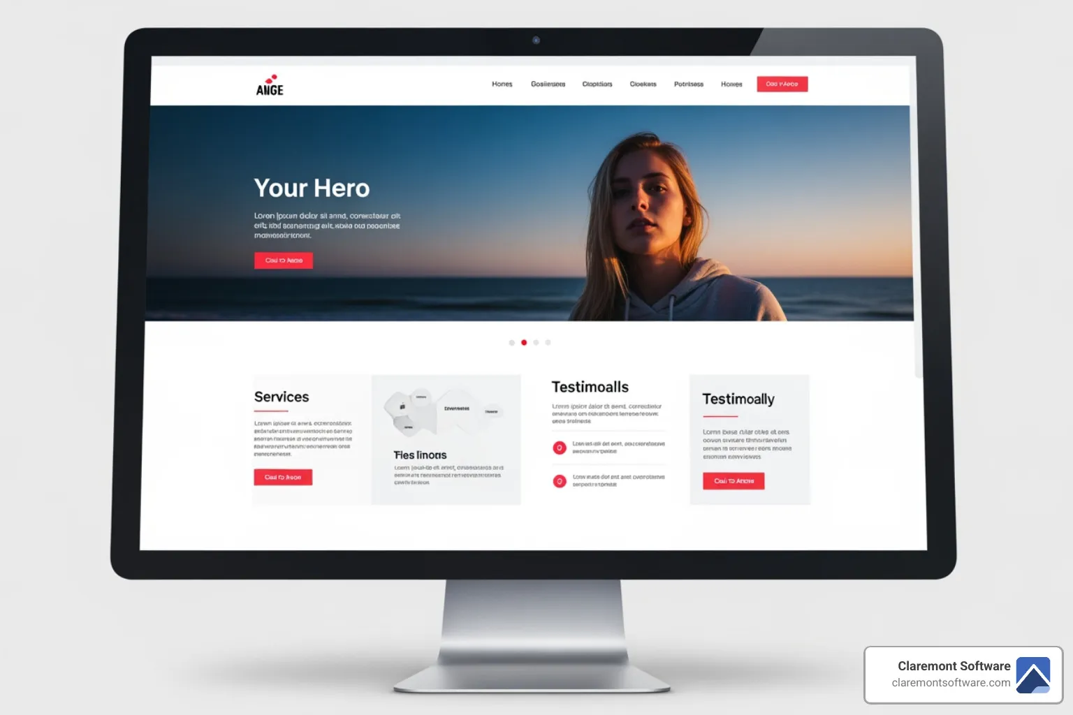
A business website layout is the strategic arrangement of visual elements on your web pages. The right layout guides visitors to take action, while the wrong one sends them straight to your competitors. Visitors decide if they like your site in less than half a second and most leave within ten seconds if they can't find what they need.
An effective layout uses visual hierarchy, follows natural user reading patterns, and uses a grid structure with ample white space to create a professional appearance. It organizes information logically, reduces friction, and builds trust. When visitors encounter familiar patterns—like top navigation or a footer with contact info—they can focus on your message instead of figuring out how to use your site.
I'm James Smith, and for over 25 years, I've designed business website layouts that convert visitors into customers. In this guide, I'll show you how to choose and implement a layout that turns your site into a revenue-generating asset.
The Foundation: Core Principles of a High-Converting Layout
Think of your business website layout as the floor plan of a store. A good one makes it easy to find what you need and encourages you to buy. A cluttered one is confusing and frustrating. The way you organize your website directly impacts whether visitors will buy your products, request a quote, or sign up for your services. Let's break down the core principles that turn a basic website into one that converts.
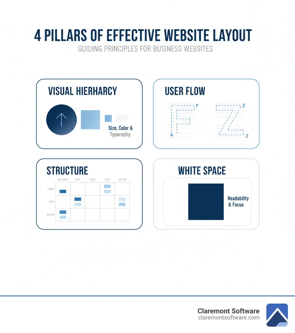
Visual Hierarchy
Visual hierarchy tells visitors what’s most important without saying a word. We use size, color, and typography to guide their attention. Your main headline should be the largest text, and your primary call-to-action button should stand out with a contrasting color. By varying the visual weight of elements, we create a clear path through your content that feels natural to follow.
Reading Patterns
People don't read websites; they scan in predictable patterns. The F-pattern is common on text-heavy pages, where users scan across the top and down the left side. The Z-pattern works well for simpler pages, where eyes move from top-left to top-right, then diagonally to bottom-left and across. Research shows these patterns are consistent. Understanding them allows us to place key information exactly where people are already looking.
White Space
White space isn't wasted space—it's the breathing room that makes your content readable and professional. It reduces cognitive load by separating elements, making information easier to process. Surrounding an important element like a "Get Started" button with white space naturally draws the eye to it. A clean, spacious layout signals quality and confidence.
Grid Systems
Grids are the invisible framework that brings order and consistency to your layout. By aligning elements to a system of columns and rows, your site looks polished and intentional. Grids are also essential for responsive design, allowing content to reflow seamlessly across desktops, tablets, and phones while maintaining a professional appearance.
Balance
Balance creates visual comfort and stability. Symmetrical balance, where elements are evenly distributed, feels formal and trustworthy, making it suitable for corporate or financial sites. Asymmetrical balance is more dynamic and modern, using elements of different visual weights to create harmony. A large image on one side might be balanced by smaller text blocks on the other, creating an energetic feel.
Proximity
Items that are close together are perceived as related. This simple principle makes your site scannable. Grouping your contact information together helps visitors understand it's a single unit. Separating service descriptions with space clarifies where one ends and another begins. Proximity helps visitors grasp your site's structure without reading every word, preventing the issues that cause websites to not bring you leads.
Key Elements of a Business Website Layout
Every effective layout includes core elements visitors expect. Their familiarity lets people focus on your message, not on navigation.
- Header and Navigation: Located at the top, it contains your logo and main menu links like Services, About Us, and Contact Us.
- Hero Section: The first thing visitors see. It needs a strong visual, a compelling headline, and a clear call-to-action to show visitors they're in the right place. For examples of effective hero section design, see how leading firms handle this critical first impression.
- Content Area: This holds your unique information, like service details or blog posts. It must be readable, using headings and images to break up text.
- Footer: Found at the bottom of every page, it contains copyright info, policies, and secondary contact details.
- Call-to-Action (CTA) Placement: CTAs must be placed in high-visibility areas like the hero section and use action-oriented language like "Get Your Free Quote."
The Significance of 'The Fold'
"The fold" is the part of your page visible without scrolling. Since visitors form an opinion in less than half a second, this area is critical. Your most important message, value proposition, and primary CTA must appear above the fold. The goal isn't to cram everything in, but to provide enough compelling information to capture interest and encourage scrolling. These elements work together to create the top website features every Gurnee small business needs.
7 Common Business Website Layouts and When to Use Them
Choosing a business website layout is like picking a floor plan for a building; the design must match its purpose. The layout you choose should align with your business goals, target audience, and content.
Certain layout patterns have proven effective because they align with how people naturally browse websites. Let's walk through seven of the most effective layouts we use at Claremont Software and when each one makes the most sense for your business.
- Single-Column Layout: A single vertical stream of content, perfect for storytelling, blogs, and landing pages where you want to guide the user through a linear narrative.
- Split-Screen Layout: Divides the page into two sections, ideal for targeting two different user segments or balancing a strong visual with text.
- Grid (Multi-Column) Layout: Organizes content into a grid of cards, best for e-commerce sites, portfolios, and news sites with many items to display.
- Hero Layout: Features a large, dominant image or video with a clear call-to-action, designed to make a strong first impression and focus on a single message.
- Asymmetrical Layout: Uses uneven element placement to create a dynamic, modern feel, great for creative brands that want to stand out.
- Magazine Layout: Mixes different content blocks in an editorial style, suitable for content-heavy sites with multiple topics.
- F-Pattern Layout: Aligns important information along the top and left side, following natural scanning patterns on text-heavy pages like articles or search results.
The right choice isn't about trends; it's about what works for your Gurnee business. The best layout makes it effortless for your visitors to find what they need and take action, turning your website into an effective tool for lead generation or direct sales.
1. The Single-Column Layout
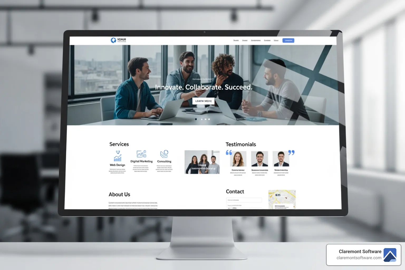
The single-column layout creates a straightforward, uninterrupted path for your visitors. Content stacks vertically down the page, one element after another, with no competing sidebars or columns. This clean, linear journey is perfect for storytelling, allowing you to walk a visitor through your service process or company story without distraction.
This layout is highly effective for blogs and long-form content, as it respects the natural top-to-bottom reading behavior research shows users follow. It's also inherently mobile-friendly, feeling natural to smartphone users accustomed to vertical scrolling.
Because it eliminates distractions, the single-column structure is ideal for landing pages with a singular goal, such as signing up for a newsletter or scheduling a consultation. By focusing attention, this business website layout turns your content into a guided experience that moves visitors toward a specific action.
2. The Split-Screen Layout
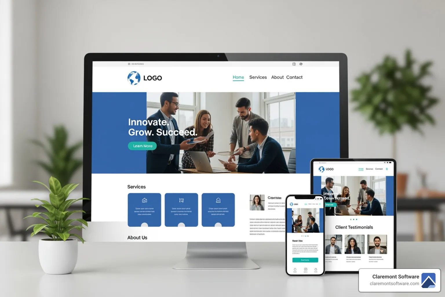
The split-screen layout divides your page into two distinct vertical sections, allowing you to present two different ideas with equal importance. This approach is highly effective when you need to target two distinct user segments, such as residential and commercial clients, or ask visitors to choose between two product categories like men's and women's apparel.
This layout also creates a powerful tension between visuals and text. One side can feature a stunning image to grab attention, while the other delivers your core message and call-to-action. While a 50/50 split is common, using asymmetrical ratios like 40/60 can create even more visual interest.
This business website layout shines for e-commerce sites, service businesses with complementary offerings, or any campaign where you want to present a clear choice. It works best when you have two equally important messages to convey.
3. The Grid (Multi-Column) Layout
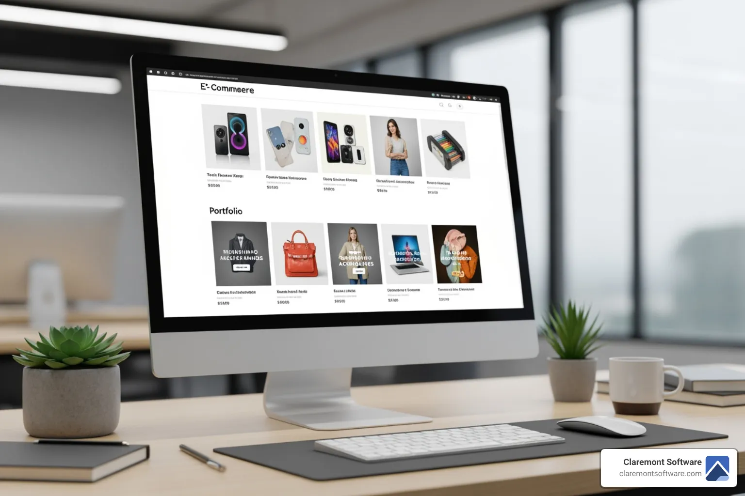
The grid layout is the organizational powerhouse of web design. This business website layout arranges content into cards or boxes in neat columns and rows. This structure is ideal for content-heavy sites, as it keeps dozens or even hundreds of items organized without overwhelming visitors. Each card typically contains an image, title, and brief description, allowing users to scan options quickly.
Grids are perfect for e-commerce products, creative portfolios, and news sites, where multiple items deserve equal visual weight. The structure also provides crucial white space, making the page feel professional and easy to steer. Modern grids are also inherently responsive, automatically adjusting the number of columns to fit perfectly on any screen, from a large desktop to a small phone.
4. The Hero Layout
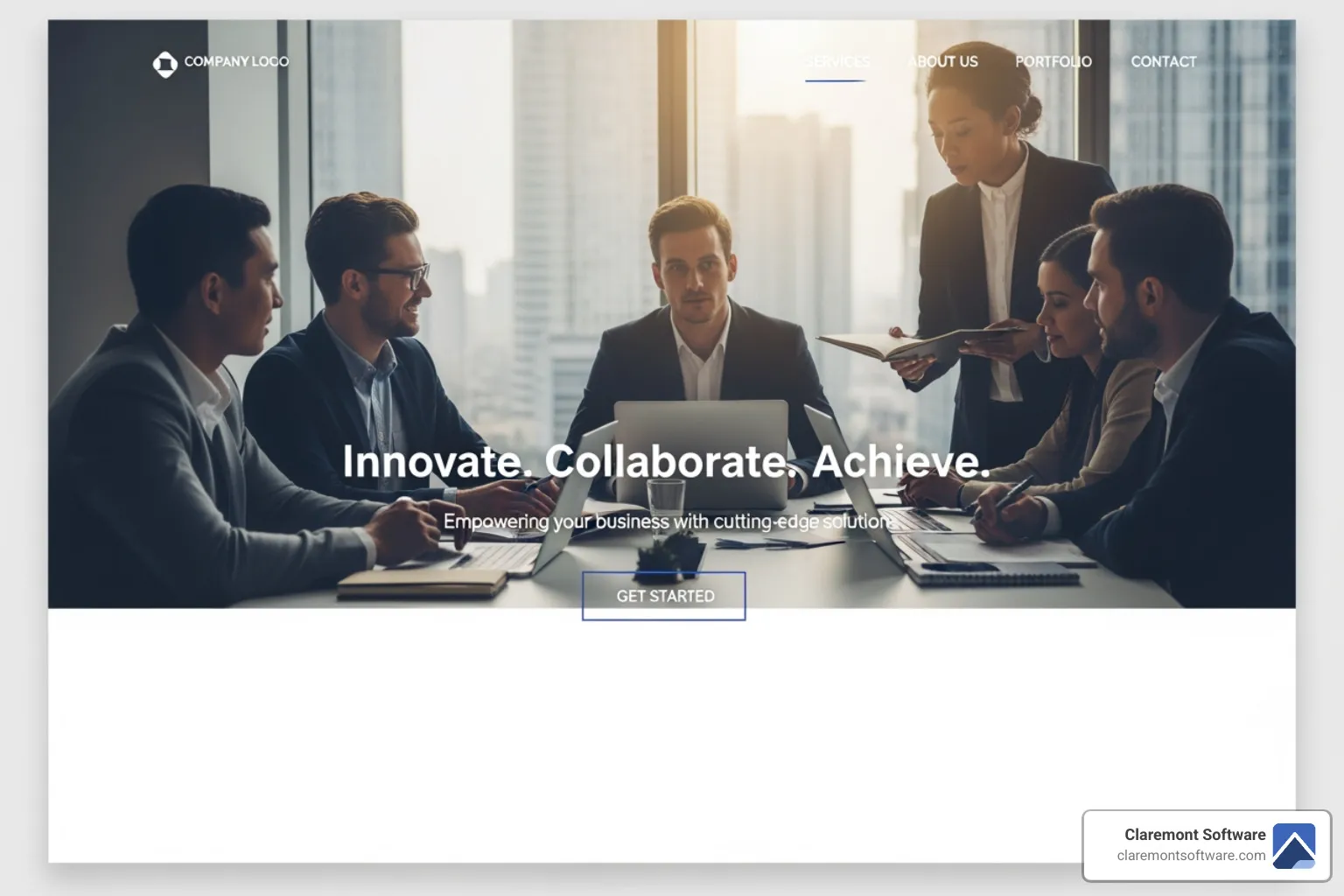
The hero layout is designed to make an instant emotional connection. This business website layout features a large, full-width image or video paired with a compelling headline and a clear call-to-action. Everything else is secondary. The goal is to guide visitors toward one specific action with confidence and clarity.
This layout works because it creates a strong first impression that communicates your value proposition in seconds. A powerful hero image captures attention, evokes emotion, and tells visitors what you offer before they scroll. It excels at showcasing a single, focused message, making it highly effective for product pages, service-based homepages, and conversion-focused landing pages.
We often recommend this layout when designing small business websites that justify their cost in 2025 because it starts converting visitors into leads from the moment they arrive.
5. The Asymmetrical Layout
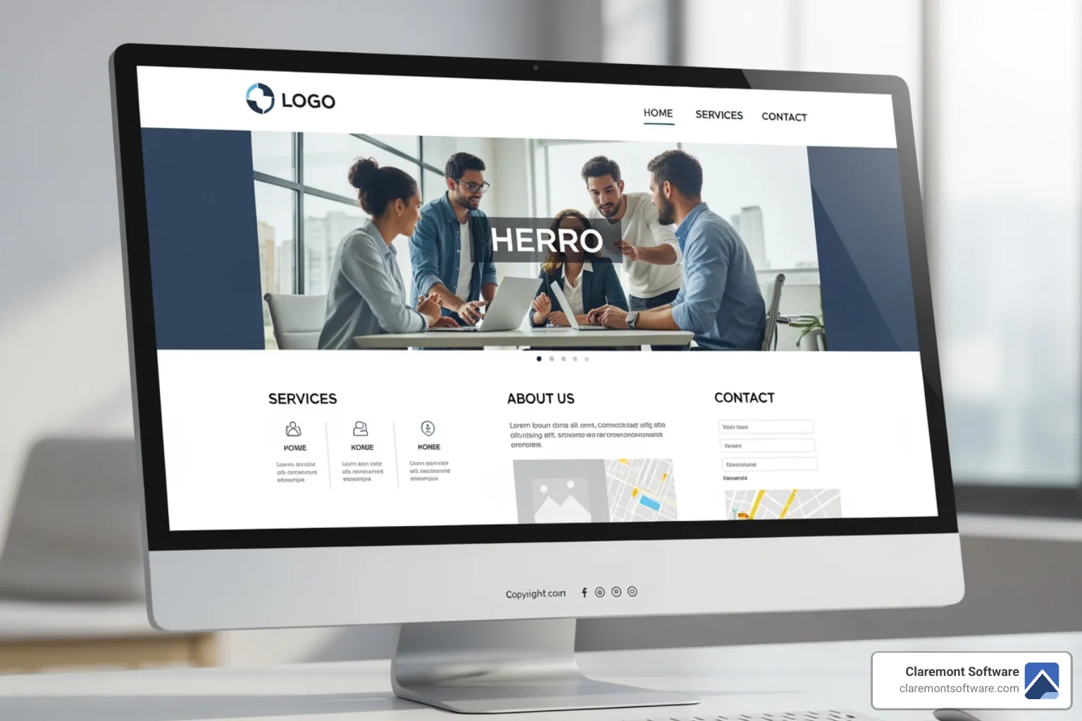
An asymmetrical layout breaks traditional design rules by deliberately using uneven element distribution to create movement, energy, and visual interest. Instead of mirroring elements, this business website layout strategically places different-sized items across the page to achieve balance without being identical. A large image on one side might be counterbalanced by smaller text blocks on the other.
This approach excels at capturing attention creatively and guiding visitors through content in a dynamic way. The unexpected arrangements make your site memorable and signal innovation. It works particularly well for creative brands and portfolios—such as design agencies, photographers, or modern tech startups—that want to communicate a forward-thinking identity. Asymmetry doesn't mean chaos; the design is grounded in a solid structure, ensuring the layout is engaging, modern, and easy to steer.
6. The Magazine Layout
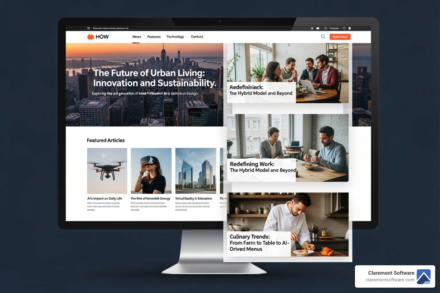
Remember flipping through your favorite magazine, scanning headlines and photos until something catches your eye? That's exactly what the magazine layout brings to the web. This business website layout is built to handle lots of information at once, presenting multiple topics and content types in a way that feels organized rather than overwhelming.
This layout is perfect for showcasing diverse content with equal importance. It's ideal for news websites, large blogs covering various topics (like our Blog), and content hubs with a continuous flow of new information. The key is to balance information density with readability, using clear typography and spacing to ensure the page remains clean and engaging. This style encourages visitors to explore multiple pieces of content during a single visit.
7. The F-Pattern Layout
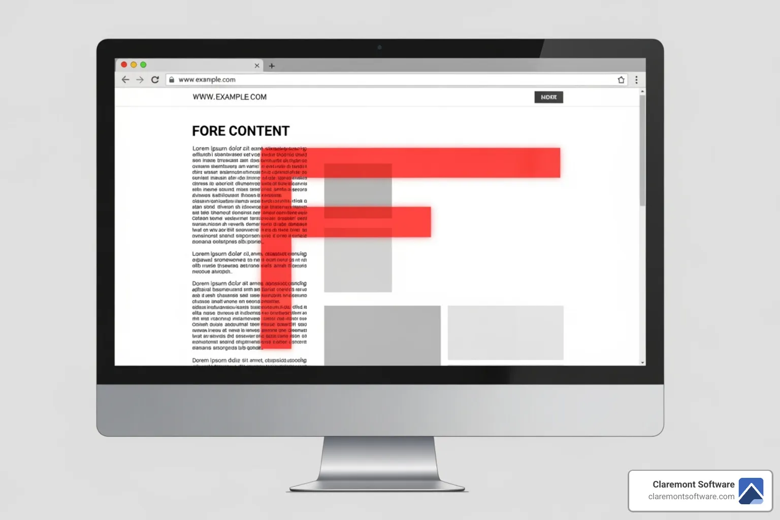
When people land on a text-heavy page, they don't read word-for-word. Research shows that users read online in a distinctive F-shaped pattern: they scan horizontally across the top, then move down the left side with shorter horizontal scans.
An F-pattern business website layout works with this natural behavior. We strategically place your most important information—headlines, key benefits, and calls-to-action—along the top and down the left margin where eyes naturally travel. This approach is highly effective for blog posts, news articles, and search results pages, where users are quickly scanning to find specific information.
To keep users engaged beyond the initial scan, we use formatting like bold keywords, bullet points, and subheadings to pull their attention deeper into the content. The goal is to capture attention with the F-pattern and then reward it with valuable, well-structured information.
Your 3-Step Process to a Profitable Layout
Designing a high-converting business website layout is a systematic process, not a shot in the dark. We follow a proven 3-step approach to ensure your website is a powerful tool for your business.
Step 1: Strategic Planning and Goal Definition
Before any design work begins, we define your business objectives. Are you looking for more leads, direct sales, or brand awareness? We identify the key actions you want visitors to take (e.g., fill out a contact form, call your Gurnee office) and analyze your target audience's needs and behaviors. This strategic foundation informs all subsequent layout decisions.
Step 2: Wireframing – The Blueprint Stage
Wireframing is like creating a blueprint for your website. We create simple sketches that outline the structure, content hierarchy, and user flow of each page without visual distractions. We often develop several versions to explore different approaches, always starting with a mobile-first design to ensure a flawless experience on any device. This is essential for reaching customers wherever they are.
Step 3: Prototyping and User Testing
With a wireframe approved, we build an interactive prototype. This clickable model simulates the user experience, allowing us to test navigation and identify any friction points before development. We can conduct user tests to gather invaluable feedback and refine the layout for optimal performance. This process ensures the final design is responsive, intuitive, and strategically built to achieve your business goals.
Choosing the right business website layout
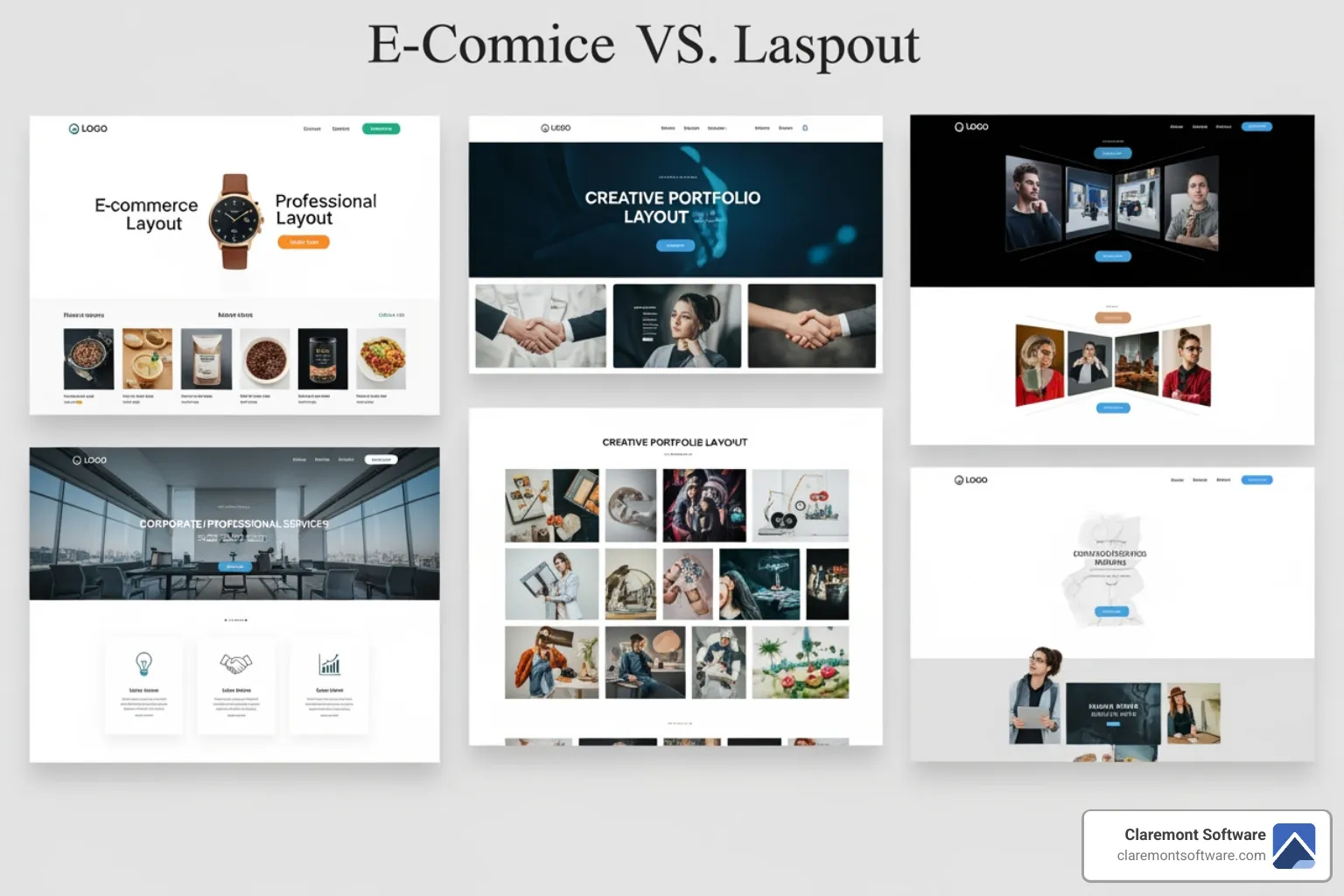
Selecting the right business website layout is a strategic decision that impacts user experience and conversions. The choice depends on your business goals, content type, and target audience. A hero layout is great for direct sales, while a magazine layout suits information-heavy sites. We help our clients in Gurnee, Libertyville, and across Lake County, IL, choose a layout that feels intuitive to their visitors, reduces friction, and guides them effortlessly toward taking action.
Frequently Asked Questions about Business Website Layout
How do I choose the best layout for my business?
Start by defining your primary business goal (e.g., lead generation, sales). Then, consider your content type—visual-heavy content suits grid or hero layouts, while text-heavy content works well with single-column or F-pattern designs. Finally, think about your target audience in a location like Gurnee; their expectations should influence your choice. A clean, focused layout almost always outperforms a cluttered one.
What is the most important element in a website layout?
Visual hierarchy is the most critical element. It uses size, color, contrast, and spacing to guide a visitor's eye to what matters most: your value proposition and calls-to-action. Without a clear hierarchy, nothing stands out, and visitors can become confused or overwhelmed. Good visual hierarchy makes your site intuitive and turns it into a tool that generates customers.
How does website layout affect SEO?
Your business website layout directly impacts SEO. A good layout improves user experience, which leads to better engagement signals like lower bounce rates and longer time on page. Google rewards sites that provide a positive user experience. A logical layout with clear headings also helps search engine crawlers understand your content structure. Finally, clean, responsive layouts load faster and work well on mobile, both of which are important ranking factors. Neglecting layout is one of the common SEO mistakes local businesses make and how to fix them.
Conclusion: Turn Your Website Into a Customer-Generating Asset
Your business website layout isn't just about making things look pretty—it's the strategic framework that either opens the door to new customers or sends them running to your competitors. We've explored how visual hierarchy, reading patterns, white space, and grid systems work together to create an experience that feels natural and intuitive. We've looked at essential elements like headers, hero sections, and CTAs, and discussed why those first few seconds above the fold matter so much.
The seven common layout types we covered—from the focused simplicity of a single-column design to the creative energy of an asymmetrical approach—give you options that can be custom to your specific business goals, content, and audience. Whether you're a contractor in Gurnee looking to generate leads, a landscaping web design project showcasing outdoor transformations, or a retail shop wanting to showcase products, there's a layout strategy that fits your needs.
Here's the truth: your website should work as hard as you do. It should be actively bringing in new business, not just sitting there looking professional. A well-planned business website layout is a strategic investment that pays for itself quickly by turning casual browsers into paying customers. When visitors can easily find what they need, understand your value, and take action without friction, you stop losing revenue to confusing or outdated designs.
Our 3-step process—strategic planning, wireframing, and prototyping—ensures that every layout decision is purposeful. We start with your business goals, build a solid blueprint, and test everything before launch. This systematic approach means your site isn't just another expense; it's a profitable asset that delivers measurable ROI by converting visitors into customers throughout Gurnee, Libertyville, and all of Lake County.
Ready to stop losing leads to a layout that doesn't work? Get a professional website layout that converts visitors into customers with Claremont Software. Let's build something that actually grows your business.
