Mobile-first design is essential for local businesses. Prioritize contact info, fast load times, thumb-friendly navigation, and local SEO to increase visibility, conversions, and foot traffic. Test on real devices and consider PWAs.
In today’s hyper-connected landscape, mobile-first design is not merely a trend but an absolute necessity for local businesses aiming to thrive and outpace competitors. The ubiquity of smartphones has dramatically reshaped how customers discover, engage with, and purchase from businesses in their communities. Local enterprises that neglect the shift towards mobile-first risk irrelevance, loss of revenue, and fewer footfalls as consumers increasingly turn to their devices for real-time decisions and quick interactions.
This article will explore why mobile-first design is now an imperative, not an option, for local businesses, dissecting the core principles, the tangible benefits, the drastic evolution in user behavior, and actionable strategies for implementation.
Understanding Mobile-First Design
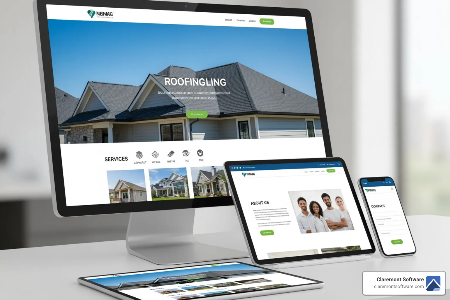
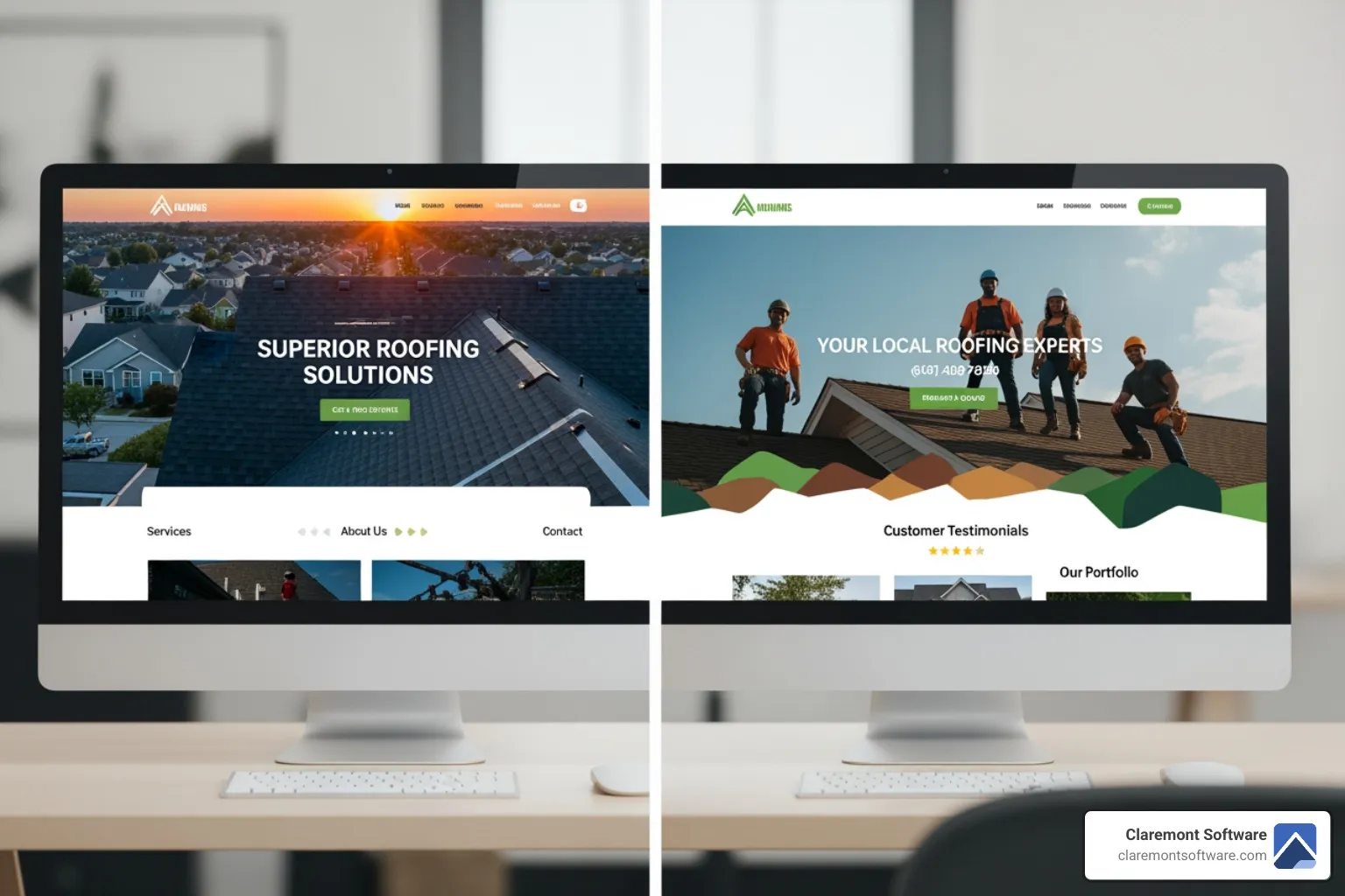
Mobile-first design is a design strategy where the creation of a website or digital product starts with the smallest screen—mobile devices—before scaling up to tablets and desktops. Unlike the traditional “desktop-first” approach, which adapts existing desktop designs for smaller devices (often leading to awkward layouts and missing features), mobile-first considers the constraints, needs, and context of mobile users from the outset.
Designing mobile-first means:
- Prioritizing essential content and functionality due to limited screen size
- Creating intuitive, thumb-friendly navigation systems
- Ensuring fast load times to align with on-the-go usage patterns
- Delivering a seamless, distraction-free browsing experience
Once a site is optimized for mobile, it can then be progressively enhanced for larger screens and additional features—a methodology known as progressive enhancement.
The Data: Mobile Usage Is Dominant—Especially for Local Search
It is no longer theoretical that most digital traffic originates from mobile devices. Recent studies reveal that more than 58% of all web traffic now originates from mobile devices, and this proportion continues to climb each year. For local businesses, this statistic is even more significant because a large volume of mobile searches carries “local intent”—such as users looking for nearby restaurants, plumbers, hair salons, or stores.
Key behavioral trends further underscore the stakes:
- Local searches lead to action: Google reports that nearly 76% of people who search for something nearby on their smartphones visit a related business within a day, and 28% of those searches result in a purchase.
- “Near me” searches have exploded: Consumers expect businesses to be discoverable and accessible instantly via mobile, whether for directions, menus, contact numbers, reviews, or bookings.
- On-the-go decisions: Customers making local choices are often in a hurry, relying solely on their phones to evaluate options, check availability, and follow through.
This profound mobility means local businesses must show up—and show up well—on the small screen.
The Shift from Desktop-First to Mobile-First
For years, websites were constructed for desktop machines. Mobile versions were, at best, an add-on or, more often, an afterthought—frequently stripped-down, awkward to navigate, and lacking essential functionality.
The “mobile-first” era has upended this paradigm. Consumers are rarely tethered to desktops. In their daily life, people surf, shop, and make reservations while commuting, running errands, or sitting at coffee shops. As such, a desktop-centric mindset is not only outdated but detrimental.
Businesses must now design for the world as it is—mobile-centric—not as it once was. This requires a conscious abandonment of the desktop-first mindset and adoption of mobile-first as the foundational approach for new websites and digital overhauls.
Three Pillars of Mobile-First Design for Local Businesses
1. Prioritizing Essential Content and Conversion Elements
Mobile’s limited screen real estate compels businesses to cut the excess and focus only on what matters most:
- Primary navigation must be clear and thumb-friendly.
- Contact information, directions, and calls-to-action (e.g., “Call Now”, “Book Appointment”) need to be immediately accessible on the homepage.
- Menus or product listings must be scannable and easy to interact with, without overwhelming text or graphics.
Mobile-first design enforces discipline: Instead of cramming the site with information, it encourages clarity and hierarchy. This streamlining is critical for fast, distraction-free decisions—crucial for local users seeking quick answers.
2. Faster Loading Times & Seamless User Experience
Speed is a non-negotiable. On mobile, every second counts; delays of even a couple of seconds can mean visitors abandon your site in favor of a quicker competitor. Mobile-first sites are built to be lightweight and efficient, loading quickly even on variable cellular connections.
This isn’t just user-focused design: Google’s algorithms reward fast-loading, mobile-friendly sites with better rankings, giving local businesses much-needed visibility to attract new customers.
3. Discoverability & Local SEO services
Mobile-first design isn’t just about look and feel—it is crucial for search engine optimization (SEO services). Google ranks mobile-optimized sites higher, particularly for queries with local intent. Factors like responsive layouts, readable text without zooming, and touch-friendly buttons influence both user experience and ranking signals.
A mobile-first local site can result in:
- Improved rankings in Google’s “local pack” (the prominent map-based listings)
- Greater click-through rates from search results
- Enhanced opportunities for featured snippets and voice search responses (increasingly accessed on mobile devices)
Why Mobile-First Is Mandatory—Not Optional—for Local Businesses
The Cost of Ignoring Mobile-First
Consider a common scenario: A hungry customer uses their phone to find a nearby restaurant. If your site is slow, hard to navigate, or displays tiny, unreadable menus, that potential diner will likely leave and choose a competitor with a functioning mobile site. You lose not just a single customer, but possibly a recurring patron and even local reputation.
Similar stories echo for salons, clinics, hardware stores, landscaping companies, and any brick-and-mortar that depends on walk-in business or quick local conversions. For landscapers, effective landscaping digital marketing starts with a mobile-optimized website. In an age of impatient, empowered consumers, the smallest friction equals lost revenue.
Customers Expect a Mobile-Optimized Experience
Modern customers are unforgiving. They expect instant access, easy browsing, and immediate action—whether booking a table, checking stock, or reading reviews. A site that frustrates them, even momentarily, risks a lost sale and can drive negative word-of-mouth.
Google’s Mobile-First Indexing
Google’s mobile-first indexing means the search engine primarily uses your site’s mobile version to determine rankings. If your mobile site is sub-par, your search presence suffers. For local businesses, losing ranking translates directly to fewer calls, bookings, and walk-ins.
Competitive Advantage
Adopting mobile-first provides a tangible differentiation. Many local competitors lag behind with clunky or outdated sites. By prioritizing a sleek, enjoyable mobile experience, you:
- Stand out during micro-moments (when customers quickly weigh options)
- Convert more mobile users
- Generate and capture positive online reviews (more easily shared via mobile)
Those who implement mobile-first design win the local game; those who don’t, risk fading into obscurity.
Key Benefits of Mobile-First Design for Local Businesses
1. Broader Reach & Engagement
With the majority of local searches happening on mobile, businesses expand their reach and maximize engagement with current and potential customers where they spend most of their digital time.
2. Higher Conversion Rates
Simplified navigation, faster loading times, and clear calls-to-action together drive higher on-the-spot conversion rates—be it reservations, calls, orders, or appointments.
3. Improved User Experience
Mobile-first design delivers an intuitive, stress-free experience, reducing bounce rates and encouraging repeat interactions.
4. Better SEO and Increased Visibility
Well-optimized mobile sites perform better in Google’s rankings for local queries, leading to more impressions, visits, and business.
5. Customer Loyalty and Positive Perception
A smooth mobile site signals professionalism and customer care, building trust and encouraging positive reviews.
Implementing Mobile-First: Best Practices for Local Businesses
1. Start with the Essentials
Ask: What information or action does a local user need most? Usually, it’s contact info, directions, price lists/menus, hours, and booking or order buttons. Make these front and center.
2. Design for Touch, Not Click
Navigation must be thumb-friendly. Avoid tiny buttons or links; ensure forms are easily fillable and menus are collapsible for clarity.
3. Streamline Content
Say more with less. Use concise language, scannable headers, and bullet points. Limit heavy images and ensure any graphics are optimized for fast loading.
4. Test on Real Devices
Designers should test websites across a mix of real smartphones and tablets, not just desktop emulators. This guarantees usability under actual conditions.
5. Prioritize Speed
Compress images, leverage browser caching, and minimize third-party scripts. A fast site is a usable site.
6. Incorporate Local Features
Embed maps, click-to-call phone numbers, and, if appropriate, integrate online appointment or ordering systems optimized for mobile.
7. Leverage Progressive Web Apps (PWAs)
PWAs can offer local businesses app-like functionality—such as offline access, push notifications, and home screen installation—without the development overhead of native apps. These features, built using mobile-first principles, enhance engagement and drive conversions.
Mobile-First vs. Responsive Design: Clarifying the Distinction
It’s important to note the distinction between mobile-first design and traditional responsive design. Responsive sites adapt their layout for various screen sizes, but often begin with a desktop conception and scale down. Mobile-first reverses this: it starts with the mobile experience at its heart, then gradually enhances the experience for larger screens.
For local businesses, mobile-first is more than just responsive—it means every pixel, feature, and interaction is built for how customers interact with their phones, not simply shrinking a desktop version down.
Future-Proofing Your Local Business
Mobile-first design isn’t a passing phase. With mobile commerce and local search continuing rapid growth—mCommerce sales are projected to account for over 59% of total e-commerce sales by 2025—businesses that adopt mobile-first now are building a durable foundation for the future.
Moreover, mobile represents only one node in the evolving landscape: voice assistants, wearable tech, and on-the-go smart devices all rely on mobile-optimized, streamlined content. By embracing mobile-first, businesses become inherently more adaptable to arising platforms and technologies.
Conclusion: The Mobile-First Imperative
For local businesses, mobile-first design is no longer optional—it’s the lifeblood of digital survival and growth. Successful local enterprises meet customers where they are: in the palm of their hand, needing answers and action now. Those who design from the mobile perspective establish themselves as modern, responsive, and customer-focused—qualities which build loyalty, drive revenues, and ensure a lasting competitive edge.
If you are a local business owner, now is the time to audit your web presence, reprioritize budgets, and put mobile-first design at the forefront. The future of local business belongs to those who put mobile users first, every step of the way.